Category: Design

  • How To Customize Page Builder Sandwich’s Pre-Designed Sections On Your Own

    We’ve been getting quite a few inquiries the past week about Pre-Design Sections (and by extension, the PBS Templates), what they are, and how they can be accessed.

    So in this article, we’ll be teaching you how to not only access them, but also how to maximize these features of Page Builder Sandwich: By customizing them and making them your own.

    Accessing the Pre-Designed Sections

    If you aren’t familiar yet, all you have to do to access the Pre-Designed sections is to hover your mouse onto the left side of your screen, and access the Elements Inspector. This is the sidebar that lets you drag and drop elements directly onto your content area.

    Say hello to the Elements Inspector!

    Once it’s accessed, simply scroll down to the bottom and select Pre-Designed Sections. A library of the sections will pop up. Select one from the collection, drag and drop, and it’ll show up on your content area, like so:

    From here, you can move the elements within the section around, or move the entire thing and adjust its position. And there you have it! You’ve selected a Pre-Designed Section from Page Builder Sandwich.

    Now it’s time to add in your own twist: By customizing and tweaking with the elements’ settings within the selected section.

    Customizing the Pre-Designed Sections

    Each element’s setting within any one Pre-Designed section can be edited and customized according to your website’s needs and your personal taste.

    This means everything included in your selected Pre-Designed section – like text, colors, images, buttons, everything – can be edited and tinkered with by you.

    So for instance, if you’re not happy with the default blue-green tint and the wheat field image in the default Pre-Designed section below…

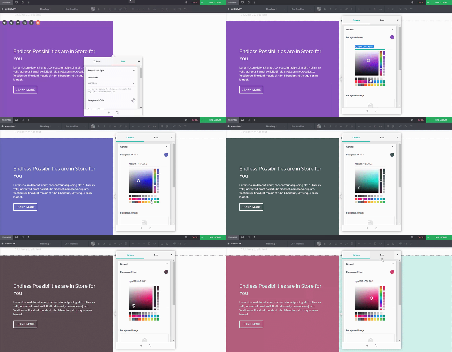
    You can adjust it. For instance, if I wanted a different background tint on the left:
    Or if you wanted to replace the image of the wheat field on the right:
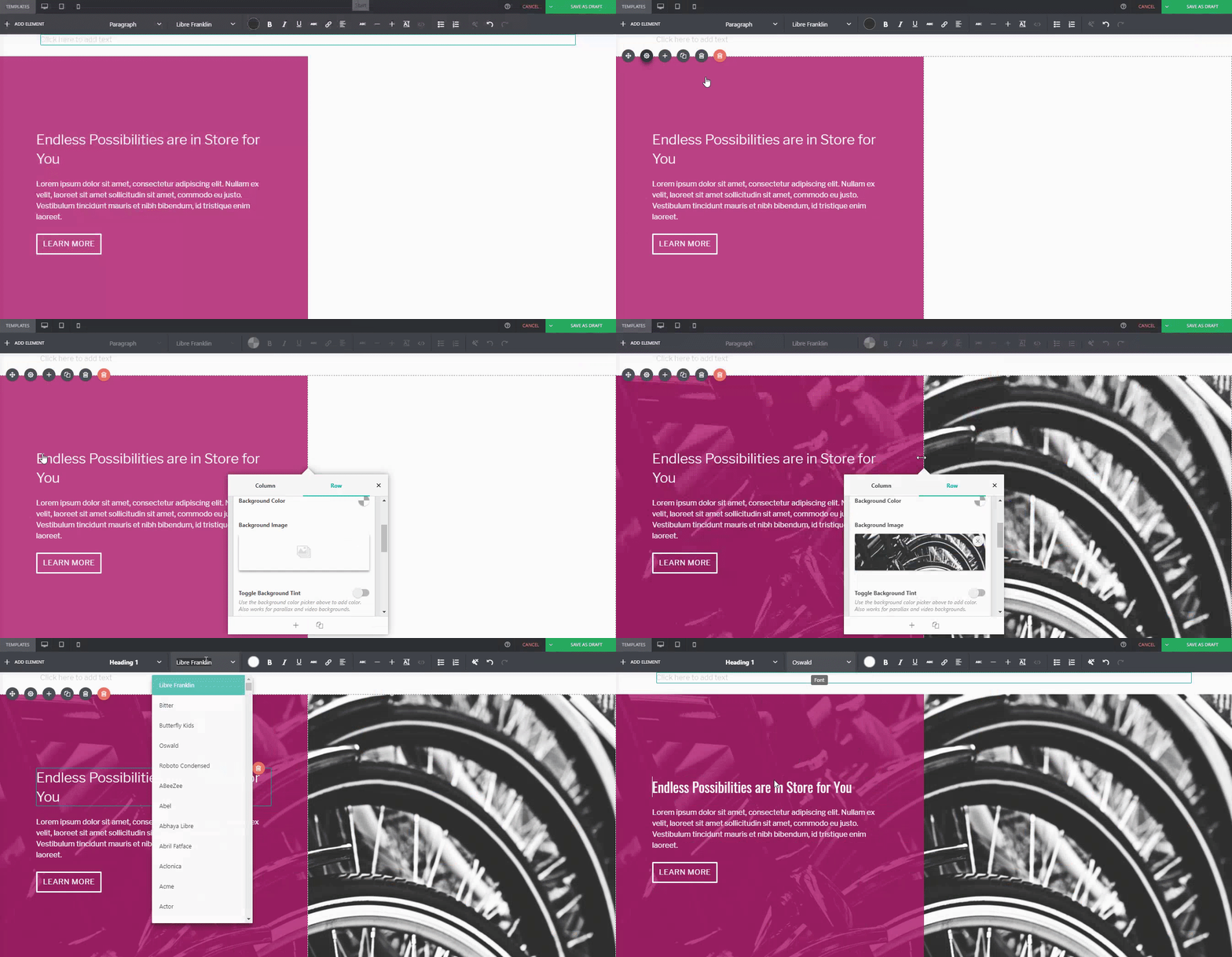
    Or even change the button style, margin, padding, and font:

    …You can.

    For comparison:

    Default PBS Pre-Designed Section

    The same Pre-Designed Section, completely tweaked and customized. Notice the different font, color scheme, button style, photo, and margin width. You can actually take this further, and let your imagination run wild.

    Here are a few more examples on how you can spice up our Pre-Designed Sections

    Default Pre-Designed Section from Sandwich

    The same Pre-Designed Section, customized

    You can do it with our Full-Page Templates, too:

    Default Template from Sandwich

    The same Template, customized

    Conclusion

    There’s more to Page Builder Sandwich’s Pre-Designed Sections than you think.

    Tweak and customize them to make them completely your own, or even use them as a starting point for when you don’t want to design your page from the ground up.

    Remember, Page Builder Sandwich is here to help you design in less time. Making full use of our Pre-Designed Sections and Full Page Templates will help you do just that.

    Design in less time!

    Get access to Sandwich’s Pre-Designed Sections, Templates, and a whole lot more.

    Try Live Preview
  • 4 Website Design Mistakes You Need to Avoid in 2018

    If there’s one thing you need to remember when building a website, it’s to never take good design for granted.

    As we’ve mentioned in a previous article, a site visitor’s first impression on your website can make or break you in just a matter of seconds.

    In other words, if they don’t like what they see within that timeframe, chances are they’re going to close their browser windows and direct their attention elsewhere.

    Fortunately, there are a lot of ways to prevent this from happening; one of them is to familiarize yourself with good web design practices. And the good news is you don’t need to be a professional web designer in order to do so.

    Because while it’s true that not everyone has a good eye for design, preventing bad design becomes easier once you know what to avoid.

    That said, make sure you keep these 4 common web design mistakes in mind. This way, you’ll have one less thing to worry about when you finally start building your website.

    Mistake #1: Using More Than 3 Fonts

    A rule of thumb when designing websites? Try not to have too much visual elements going on within your space. Having more than 3 fonts on your site design is a surefire way to break this one rule. It’ll also overwhelm your site visitors.

    Keeping your website fonts to a minimum of 3 is a general design practice observed by professionals. Plus, it increases your site’s level of readability and consistency, which are key to your site traffic’s success.

    DON’T DO THIS:

    Don’t use more than 3 fonts and try to avoid “fancy fonts” as much as possible. These tend to make your site look unprofessional and outdated.

    DO THIS:

    Use only 2 fonts, or a maximum of 3 if you have to. Notice how the page below looks clean and sleek, all while keeping readability and consistency all throughout the design.

    Try comparing the differences between this example and the previous one. The example below with only two fonts is a website that your visitors will likely take seriously.  This previous one above with the overwhelming amount of fonts isn’t.

    Mistake #2: Failing to Use White Space

    White space is one of the most important aspects of web design. But what is it?

    Put simply, white space is literally the empty space between elements in a composition.

    In other words, it’s negative space. This pertains to anything on your website that isn’t filled with text, photos, or other design elements.

    Now, the problem arises when website owners want to fill all of the white space in, which is an absolute no-no.

    White space matters because it gives your site visitors and readers some breathing space when going through your site. Just how it was mentioned in the first design mistake to avoid, overwhelming your website with too much design elements is more than enough reason for your site visitors to leave and for your traffic to decrease significantly. It also makes for poorly executed design.

    DON’T DO THIS:

    In the example below, take a look at how the text is nearing the edges of the purple section’s margin. Notice as well how all elements leave almost zero room for white space.

    DO THIS INSTEAD:

    Give your site readers some room to breathe. If adding in long paragraphs is unavoidable, just remember to always take the rules of spacing into account—they’re pretty easy to remember anyway ?.  It will leave your page looking cool, crisp, and professional.

    Mistake #3: Designing Websites With Zero Flow in Your Site’s Content

    It’s important to pay attention as to how  information on your website is presented. Moreover, site content should generally follow a logical flow, taking the site viewer’s intuition into consideration.

    Check out the two examples below to see what we mean.

    DON’T DO THIS:

    Unless you’re a graphic designer by profession, it’s probably not a good idea to experiment with the standard flow of your website’s sections.

    Below, you can see that the site’s design lacks both visual and logical flow; everything is all over the place. You don’t want your audience having a hard time navigating through your site, either. This is another surefire way to do it.

    DO THIS INSTEAD:

    Notice how the sections of the website flow depending on what actions the visitor is most likely to take.

    The design is intuitive and has a logical flow: First, the organization introduces itself and fills the audience in on the basics; like what it’s about and what it does. Second, it adds in reliable figures to establish credibility. Lastly, the website gives the audience its contact numbers and a list of events, prompting them to take action.

    Mistake #4: Trying to Fit in Every Bit of Information Onto Your Website

    Adding in walls of uncessary text where white space should can drive your audience away. Remember to only keep important details.

    Studies find that readers only visit 20% of your webpage; everyone else outside that percentage will probably just scroll through your site.

    DON’T DO THIS.

    Don’t overwhelm your visitors with inconsistent, giant walls of text, especially if it means having to sacrifice your website design’s cohesiveness and structure.

    DO THIS INSTEAD:

    Keep your copy short and concise, and take out chunks of unecessary text if you can help it. Only keep vital information that your site visitors absolutely need to know.

    Conclusion

    Website design is important, and can be a huge deciding factor in whether or not you gain site traffic.

    Remember not take it for granted. Always alot time to research, and look up design articles to guide you along the way. Before you know it, you’ll be seeing your site traffic moving upwards. ? Good luck!

    Design in less time!

    Check out how much faster Page Builder Sandwich let you design your web pages.

    Try Live Preview

    This week’s useful resource:

    CANVA has hundreds of resources that you can access on their website. Apart from useful and easy-to-follow design tips, they also have photo editing tools, graphs, and a wide range of useful resources you can use for your creative projects.

    Check out this cool Color Guide from Canva for your next design venture.

    Canva Design Wiki

    Unleash your creativity.

    Check Out the Canva Color Guide

  • How to Add the Parallax Effect, Video Background, and Ken Burns Effect

    Page Builder Sandwich has a feature that we collectively like to call Fancy Background Effects. There are three of them: the Parallax Effect, Video Backgrounds, and the Ken Burns Effect.

    What are the different Fancy Background Effects?

    PBS’ Fancy Background Effects give your website the boost that it needs to attract site viewers. They’re a surefire way to grab attention, and when executed correctly, can yield eye-catching results in website traffic.

    The Parallax Effect

    Implementing the Parallax Effect onto your page gives your background a sense of depth, letting certain elements of your site “pop out” while scrolling. Here’s an example of a page with a parallax background implemented, and one without.

    With Parallax Scrolling

    The background image scrolls at a different rate as the rest of the elements in the page.

    Without Parallax Scrolling

    The elements of the web page – the text, images, buttons, etc – all scroll at the same rate as the background.

    Video Backgrounds

    Video Backgrounds allow you to place looping videos on backgrounds instead of still images. The great thing about PBS’ video backgrounds is that you can simply paste your desired YouTube or Vimeo link when prompted, and we’ll turn it into a video background for you. You can also upload your own videos for this, too.

    Some samples of video backgrounds you can check out:

    The Ken Burns Effect

    Ken Burns, who popularized the Ken Burns effect in film.

    In documentaries, do you ever notice when they show photos that slowly zoom into detail? That’s called the Ken Burns Effect. You can access these effects on Page Builder Sandwich, too.

    How do I add the Fancy Background Effects?

    You can find all the Fancy Background Effects through the following steps:

    Step 1: Choose a row you’d like to add an effect on. Click on this row’s settings button (the gear icon on the left). This will open the Properties Inspector.

    Step 2: Once the Properties Inspector pops up, scroll down a bit until you find the option called “Fancy Background Effects”.

    Step 3: Once you’ve found it, you’ll see that you can click a dropdown button and select which background effect you’d like on your row.

    Step 4: Depending on which Fancy Background Effect you choose, you can adjust each effect’s settings. For example, for the Parallax effect, you can adjust its height and position.

    And you’re done! After this, you should see your Fancy Background Effects appear on your site in full swing.

    Have you used PBS’ Fancy Backgrounds yet?

    Are there any other background effects you’d like to suggest we add to our features? Or show us your PBS-made site with one of the effects? Let us know in the comments section below!

  • 5 Reasons Why Whitespace Matters

    Reasons-Why-Whitespace-MattersBasically, whitespace, at its most basic definition, is the space around and between all the elements of a composition that is left unmarked. It’s not just a waste of screen space, as most websites owners think. When used well, whitespaces can actually provide benefits to better promote a product. It is an important key to creating good design and it makes a website better in every way.

    Although the name whitespace implies that the space is white, it doesn’t always have to be literally white. Whitespace can actually be any color—It can even have a subtle pattern or texture. It’s an area that you don’t want the eye to focus on. Alternatively, it’s called a negative space.

    So, why does whitespace matter?

    newsfeed
    Image Source: News Feed

    Reason #1: Improves readability

    Whitespace between baselines and paragraphs actually help people comfortably read all of the content on the site. Adjusting small details of your site (like line-spacing/leading or the letter-spacing) could make a huge difference in make reading easier.

    The goal is to make people want to keep reading by designing layouts that are easy on the eyes.

    hpmagicwords
    Image Source: HP Magic Words

    Reason #2: Speeds up interaction

    Let’s be honest: most of your visitors won’t have enough patience to look thoroughly when browsing through websites. When a website looks cluttered, it keeps users distracted from finding what they are looking for.

    Whitespaces should help lead the viewer around the page. Less elements competing for attention plus proper use of whitespaces can prevent distractions that slows visitors down.

    google
    Image Source: Google

    Reason #3: Drive attention to the right elements

    Whitespace can give users visual cues on where they should be looking. When used in a correct manner, whitespaces help emphasize information and draw attention to a particular area on you website.

    Remember, if everything stands out, nothing does.

    Image Source: Pocket Penguins

    Reason #4: First impressions matter

    The look and feel of a website is the main key to good first impressions. Good first impressions often leads to longer visit duration. Too little whitespace can make your website look cheap and unreliable. Visitors won’t think the site or the brand is credible unless it looks attractive. Having a good amount of whitespace helps create the right tone for your website. Whitespace can be a way to communicate ingenuity, freshness, and sometimes, elegance.

    Tip: Here’s an idea on how to make your web design simple and familiar.

    flockknitwear
    Image Source: Flock Knitwear

    Reason #5: Helps create breathing room and balance

    A balanced design doesn’t mean symmetrical. A large design element can be balanced by a few smaller once. Adding whitespace is a great way to balance different-sized design elements on your page. Create a flow so the users eyes won’t dart all over the place. A good design should be able to guide the user from one point to another without confusing the visitor.

    Conclusion

    Next time you visit a website and find yourself staying a while, think about what made you stay and read. Do you think the line-spacing makes an article easier to read? Does the experience make you want to keep coming back for more? Did you have a hard time looking for the navigation?

    Take note of the good application of whitespace on the website. If you think it can also work in your website, learn to apply and manage how much space you should allocate on your element until you think you’ve conveyed the right tone and readability without sacrificing the “flow” you want for your website.

    The ultimate goal of any website is communication. Visual appeal goes hand in hand with the success of your website.