The more important question, though, is how and why do you need to do it?
My business is small. Can’t I just wing it?
Email marketing has an average ROI of 3,800 percent. For every dollar invested, the average return is $38, according to Salesforce.
In other words, it’s definitely something worth investing your time in.
Because while there are tons of ways to market your products and capture leads– you can still try to make use of the less-popular cold call, for example– the most sure-fire way to connect and communicate with your target audience in the 21st century is through e-mail marketing.
So if you’re running a business –any kind of business, whether small, big, online or otherwise– digital and e-mail marketing is an absolute must.
Aside from cutting on costs (e-mail is free, after all), businesses rely on it not just because it’s been proven to be successful, but also because it yields results that are both measurable and flexible; you can track your audience’s responses to your e-mails, for example, or note how many clicks and opens your e-mail marketing campaigns get.
How you can do it with Page Builder Sandwich
There are lots of available software you can use to help you market your products and content digitally, like Hubspot’s E-mail Marketing Software, or Mailchimp, which gives you a management system that helps you create, organize, and analyze your newsletters.
But did you know that using Sandwich, you can actually integrate some of the popular software mentioned via the Newsletter Element?
The Newsletter Element (and how it works)
You can find the Newsletter Element by hovering over to the Elements Inspector over to the left side of the screen, and selecting Newsletter from the bottom area.
Using the Properties Inspector, you can also choose which newsletter integration you’d like to use with the Newsletter Element. For this exmple, we’re going to use MailChimp (highlighted in blue in the dropdown below).
And, using the Input Field button, you can try to play around with the Newsletter Element’s settings as well, so you can change colors, customize success message options, and other settings, like so:
By trying your hand at the different available settings for the Newsletter Element’s options, you can end up with something like this:
While other noteworthy marketing trends still exist today, one thing’s for sure: E-mail marketing is definitely here to stay, and it’s important that you utilize it when you can. Who knows? Through e-mail marketing, your business could just get that big break it’s been looking for.
Design in less time!
Get access to Sandwich’s Pre-Designed Sections, Templates, and a whole lot more.
We’ve been getting quite a few inquiries the past week about Pre-Design Sections (and by extension, the PBS Templates), what they are, and how they can be accessed.
So in this article, we’ll be teaching you how to not only access them, but also how to maximizethese features of Page Builder Sandwich: By customizing them and making them your own.
Accessing the Pre-Designed Sections
If you aren’t familiar yet, all you have to do to access the Pre-Designed sections is to hover your mouse onto the left side of your screen, and access the Elements Inspector. This is the sidebar that lets you drag and drop elements directly onto your content area.
Say hello to the Elements Inspector!
Once it’s accessed, simply scroll down to the bottom and select Pre-Designed Sections. A library of the sections will pop up. Select one from the collection, drag and drop, and it’ll show up on your content area, like so:
From here, you can move the elements within the section around, or move the entire thing and adjust its position. And there you have it! You’ve selected a Pre-Designed Section from Page Builder Sandwich.
Now it’s time to add in your own twist:By customizing and tweaking with the elements’ settings within the selected section.
Customizing the Pre-Designed Sections
Each element’s setting within any one Pre-Designed section can be edited and customized according to your website’s needs and your personal taste.
This means everything included in your selected Pre-Designed section – like text, colors, images, buttons,everything– can be edited and tinkered with byyou.
So for instance, if you’re not happy with the default blue-green tint and the wheat field image in the default Pre-Designed section below…
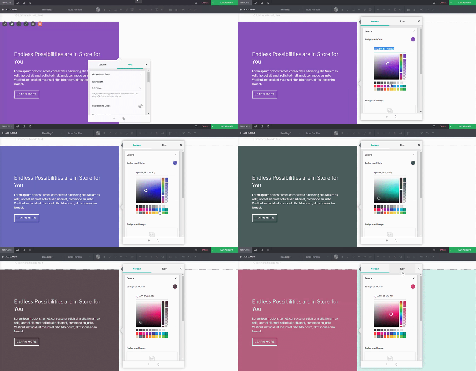
You can adjust it. For instance, if I wanted a different background tint on the left:
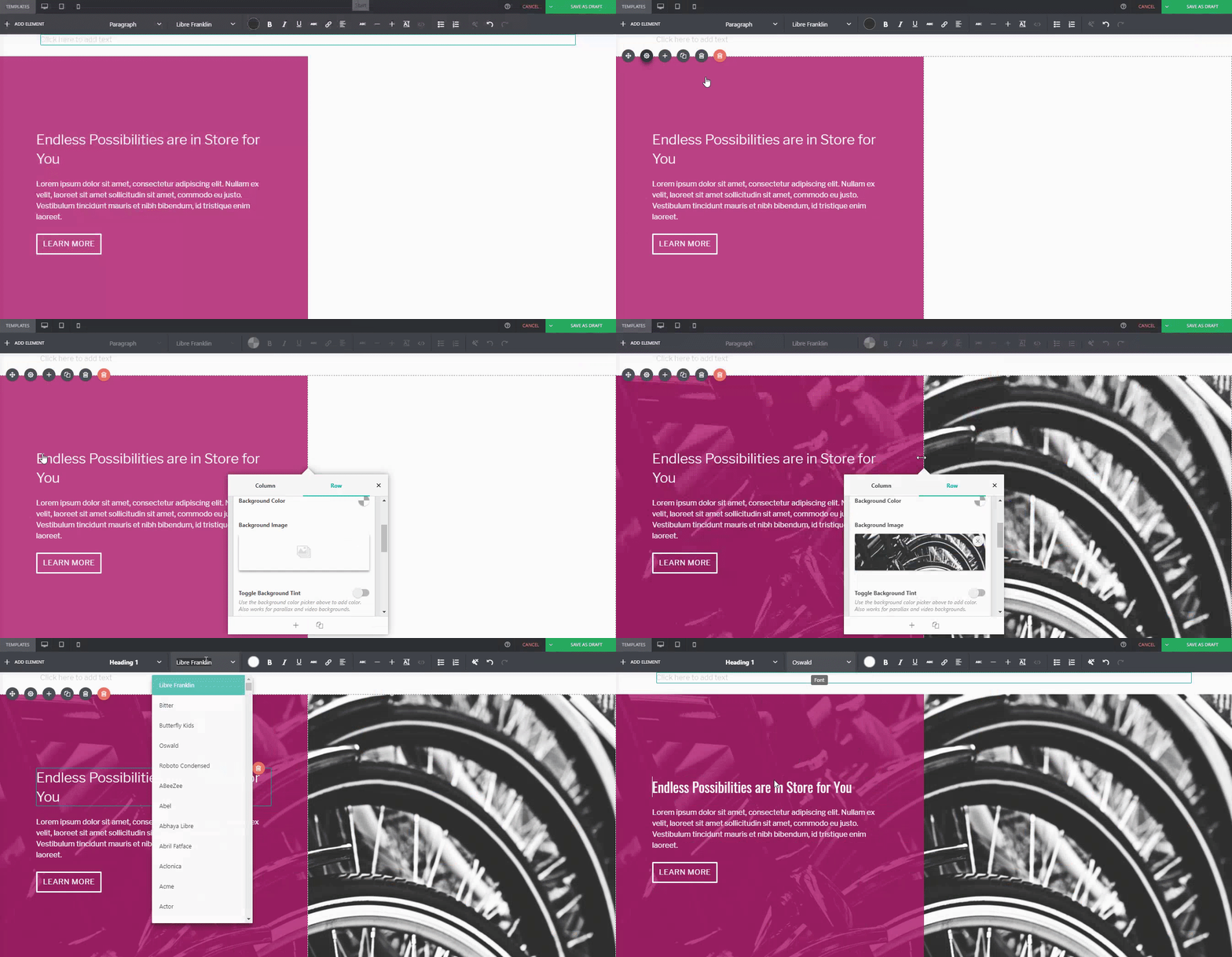
Or if you wanted to replace the image of the wheat field on the right:
Or even change thebutton style, margin, padding, andfont:
…You can.
For comparison:
Default PBS Pre-Designed Section
The same Pre-Designed Section, completely tweaked and customized. Notice the different font, color scheme, button style, photo, and margin width. You can actually take this further, and let your imagination run wild.
Here are a few more examples on how you can spice up our Pre-Designed Sections
DefaultPre-Designed Section from Sandwich
The same Pre-Designed Section, customized
You can do it with our Full-Page Templates, too:
DefaultTemplate from Sandwich
The same Template, customized
Conclusion
There’s more to Page Builder Sandwich’s Pre-Designed Sections than you think.
Tweak and customize them to make them completely your own, or even use them as a starting point for when you don’t want to design your page from the ground up.
Remember, Page Builder Sandwich is here to help you design in less time. Making full use of our Pre-Designed Sections and Full Page Templates will help you do just that.
Design in less time!
Get access to Sandwich’s Pre-Designed Sections, Templates, and a whole lot more.
In other words, if they don’t like what they see within that timeframe, chances are they’re going to close their browser windows and direct their attention elsewhere.
Fortunately, there are a lot of ways to prevent this from happening; one of them is to familiarize yourself with good web design practices. And the good news is you don’t need to be a professional web designer in order to do so.
Because while it’s true that not everyone has a good eye for design, preventing bad design becomes easier once you know what to avoid.
That said, make sure you keep these 4 common web design mistakes in mind. This way, you’ll have one less thing to worry about when you finally start building your website.
Mistake #1: Using More Than 3 Fonts
A rule of thumb when designing websites? Try not to have too much visual elements going on within your space. Having more than 3 fonts on your site design is a surefire way to break this one rule. It’ll also overwhelm your site visitors.
Keeping your website fonts to a minimum of 3 is a general design practice observed by professionals. Plus, it increases your site’s level of readability and consistency, which are key to your site traffic’s success.
DON’T DO THIS:
Don’t use more than 3 fonts and try to avoid “fancy fonts” as much as possible. These tend to make your site look unprofessional and outdated.
DO THIS:
Use only 2 fonts, or a maximum of 3 if you have to. Notice how the page below looks clean and sleek, all while keeping readability and consistency all throughout the design.
Try comparing the differences between this example and the previous one. The example below with only two fonts is a website that your visitors will likely take seriously. This previous one above with the overwhelming amount of fonts isn’t.
Put simply, white space is literally the emptyspacebetween elements in a composition.
In other words, it’s negative space.This pertains toanything on your website that isn’t filled with text, photos, or other design elements.
Now, the problem arises when website owners want to fillall of the white space in, which is an absolute no-no.
White space matters because it gives your site visitors and readers some breathing space when going through your site. Just how it was mentioned in the first design mistake to avoid, overwhelming your website with too much design elements is more than enough reason for your site visitors to leave and for your traffic to decrease significantly. It also makes for poorly executed design.
DON’T DO THIS:
In the example below, take a look at how the text is nearing the edges of the purple section’s margin. Notice as well how all elements leave almost zero room for white space.
DO THIS INSTEAD:
Give your site readers some room to breathe. If adding in long paragraphs is unavoidable, just remember to always take the rules of spacing into account—they’re pretty easy to remember anyway ?. It will leave your page looking cool, crisp, and professional.
Mistake #3: Designing Websites With Zero Flow in Your Site’s Content
It’s important to pay attention as to how information on your website is presented. Moreover, site content should generally follow a logical flow, taking the site viewer’s intuition into consideration.
Check out the two examples below to see what we mean.
DON’T DO THIS:
Unless you’re a graphic designer by profession, it’s probably not a good idea to experiment with the standard flow of your website’s sections.
Below, you can see that the site’s design lacks both visual and logical flow; everything is all over the place. You don’t want your audience having a hard time navigating through your site, either. This is another surefire way to do it.
DO THIS INSTEAD:
Notice how the sections of the website flow depending on what actions the visitor is most likely to take.
The design is intuitive and has a logical flow: First, the organization introduces itself and fills the audience in on the basics; like what it’s about and what it does. Second, it adds in reliable figures to establish credibility. Lastly, the website gives the audience its contact numbers and a list of events, prompting them to take action.
Mistake #4: Trying to Fit in Every Bit of Information Onto Your Website
Adding in walls of uncessary text where white space should can drive your audience away. Remember to only keep important details.
Studies find that readers only visit 20% of your webpage; everyone else outside that percentage will probably just scroll through your site.
DON’T DO THIS.
Don’t overwhelm your visitors with inconsistent, giant walls of text,especially if it means having to sacrifice your website design’s cohesiveness and structure.
DO THIS INSTEAD:
Keep your copy short and concise, and take out chunks of unecessary text if you can help it. Only keep vital information that your site visitorsabsolutely need to know.
Conclusion
Website design is important, and can be a huge deciding factor in whether or not you gain site traffic.
Remember not take it for granted. Always alot time to research, and look up design articles to guide you along the way. Before you know it, you’ll be seeing your site traffic moving upwards. ? Good luck!
Design in less time!
Check out how much faster Page Builder Sandwich let you design your web pages.
CANVA has hundreds of resources that you can access on their website. Apart from useful and easy-to-follow design tips, they also have photo editing tools, graphs, and a wide range of useful resources you can use for your creative projects.
Check out this cool Color Guide from Canva for your next design venture.
Page Builder Sandwich has a feature that we collectively like to call Fancy Background Effects. There are three of them: the Parallax Effect, Video Backgrounds, and the Ken Burns Effect.
What are the different Fancy Background Effects?
PBS’ Fancy Background Effects give your website the boost that it needs to attract site viewers. They’re a surefire way to grab attention, and when executed correctly, can yield eye-catching results in website traffic.
The Parallax Effect
Implementing the Parallax Effect onto your page gives your background a sense of depth, letting certain elements of your site “pop out” while scrolling. Here’s an example of a page with a parallax background implemented, and one without.
With Parallax Scrolling
The background image scrolls at a different rate as the rest of the elements in the page.
Without Parallax Scrolling
The elements of the web page – the text, images, buttons, etc – all scroll at the same rate as the background.
Video Backgrounds
Video Backgrounds allow you to place looping videos on backgrounds instead of still images. The great thing about PBS’ video backgrounds is that you can simply paste your desired YouTube or Vimeo link when prompted, and we’ll turn it into a video background for you. You can also upload your own videos for this, too.
Some samples of video backgrounds you can check out:
You can find all the Fancy Background Effects through the following steps:
Step 1: Choose a row you’d like to add an effect on. Click on this row’s settings button (the gear icon on the left). This will open the Properties Inspector.
Step 2: Once the Properties Inspector pops up, scroll down a bit until you find the option called “Fancy Background Effects”.
Step 3: Once you’ve found it, you’ll see that you can click a dropdown button and select which background effect you’d like on your row.
Step 4: Depending on which Fancy Background Effect you choose, you can adjust each effect’s settings. For example, for the Parallax effect, you can adjust its height and position.
And you’re done! After this, you should see your Fancy Background Effects appear on your site in full swing.
Have you used PBS’ Fancy Backgrounds yet?
Are there any other background effects you’d like to suggest we add to our features? Or show us your PBS-made site with one of the effects? Let us know in the comments section below!
In a previous article, we mentioned that 84% of website conversions occur on the first visit. And during this first visit, the average site visitor is only going to stay on your website for about 10 seconds.
That means that’s all the time you have to make a good impression, convince your visitors to stay on your site, and to (hopefully) convert that site visit into a lead.
Kind of puts on the pressure when you think about it.
But not to worry- landing pages help you do just that. More specifically though, well-crafted landing pages help you to do just that.
So what are they?
In the simplest terms, a landing page is any page that gets traffic from anywhere other than the usual pages on your site (like your Homepage, FAQ, or Contact Us page).
The difference between these “usual pages” though, is that landing pages reel in your audience using content that creates a sense of urgency – like call-to-action buttons and promo pages, for example – and they do it all in one page with a specific goal set in mind: They make your audience take action.
And if all goes as expected, you get to convert your audience and site visitors into leads. This is called lead generation.
Landing pages are a crucial part of any website, especially when you’re trying to build an audience, and generate leads. They’re a huge factor in generating revenue as well.
What do they look like and when do I start making one?
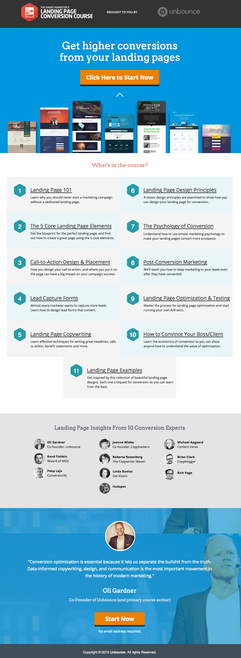
Here’s an example of a great landing page from Unbounce, which we really like:
This has all of the right elements you need to execute the perfect landing page: it’s got just the right amount of text (which is really helpful for boosting SEO), and it’s packaged in a way that it’s not too heavy or intimidating for site visitors.
The imagery is great as well, and the placement of the two call-to-action (or CTA) buttons give the visitors just enough cues to sign up for their service. Not too little, but not too much either.
(Tip: the Unbounce landing page looks pretty fancy – maybe even a tad intimidating if you’re trying to replicate a similar style on your own landing page – but you could actually create page that’s similar and as awesome-looking using PBS).
MAKE YOUR OWN LANDING PAGE: If you’re new to design, First Site Guide’s Elements & Principles of Design Cheat Sheet proves to be friendly and reliable for beginners.
Take note though, that Unbounce’s example isn’t the only way you can create your landing page.
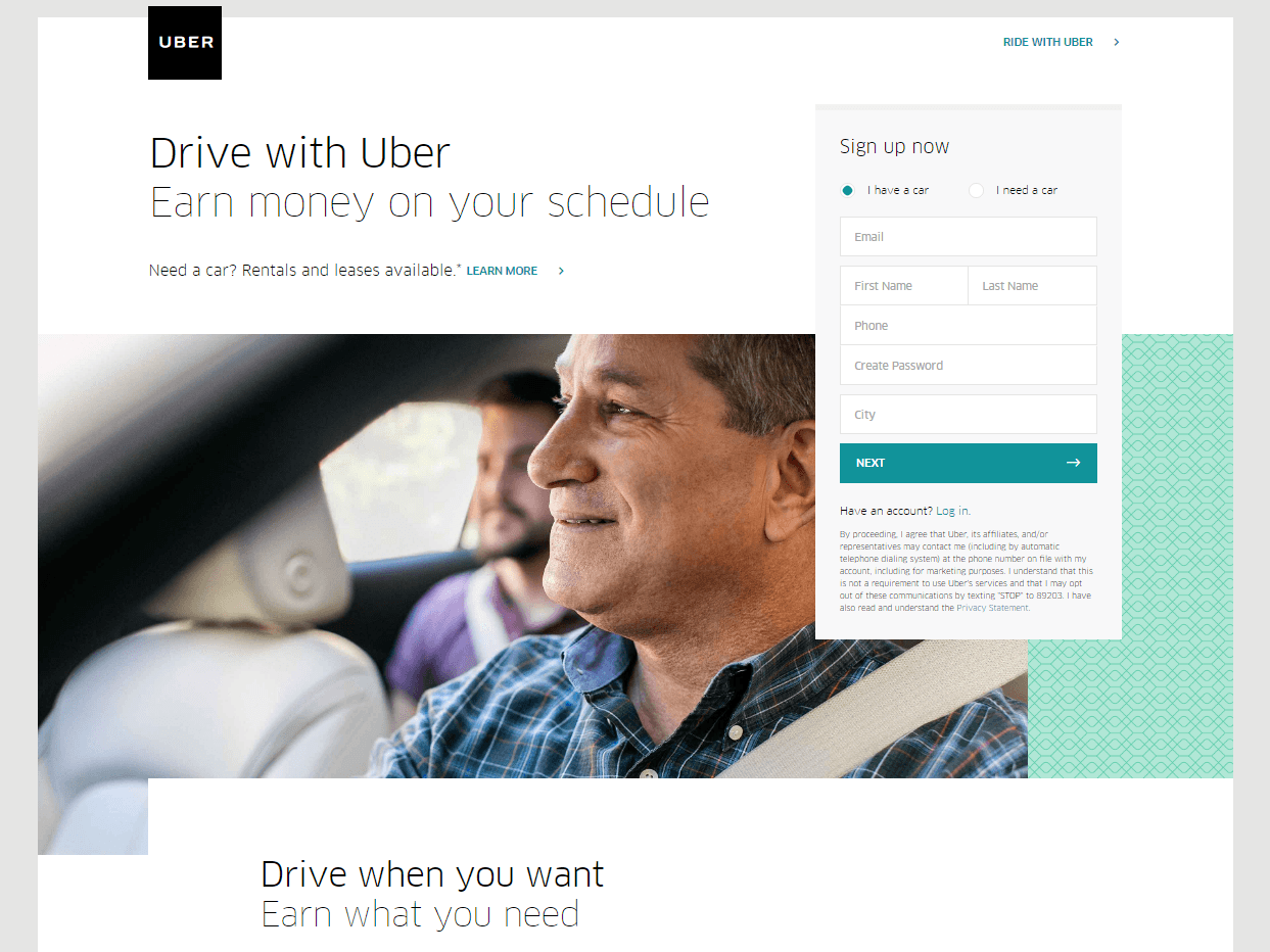
You can always go for a simpler, cleaner look, like Uber’s landing page below:
The text’s placement, along with the sign-up forms look crisp and clean. There’s also minimal distractions on this landing page, which prompts its visitors to sign up right away.
MAKE YOUR OWN LANDING PAGE: First Site Guide’s Psychology of Color Cheat Sheet is a huge helA, which can help you balance out the right kind of colors that create a minimal yet classy effect for your landing pages.
You can have more than one
This is a little tricky because you have to learn how to strike a balance, but if you think it’ll help generate more leads, you can actually build more than one landing page. Again, different landing pages cater to different needs.
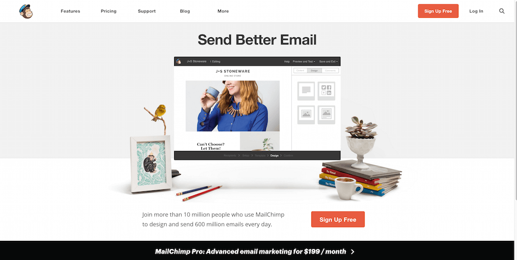
Take this one (out of many) from MailChimp for example, which urges its audience to sign up to their services for free:
(It worked by the way, as we use MailChimp for our newsletter service, too).
Take note of the text – it’s straight to the point, and addresses the target’s audience needs in just three simple, albeit powerful words; enough to catch the visitor’s attention, and convert into a lead.
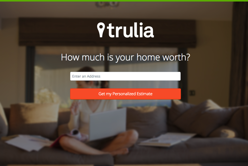
Here’s another from Truila, which helps its users get an estimate of how much their houses are worth.
Unlike the previous examples, Truilia doesn’t offer a catch to their customers in this particular landing page. They simply offer to give the visitor a chance to test out their service.
Again, take note of the copy: no fluff, and it gets straight to the point.
Usually, landing pages like these direct you towards another, one that has more information about what the website is offering. This is also a great technique used to capture more leads.
MAKE YOUR OWN LANDING PAGE: Did you know that “Under Construction” pages count as landing pages, too? This blog post by First Site Guide teaches you how to make one.
More doesn’t always mean merrier
It’s important to remember that the problem isn’t the lack of landing pages per se – but the lack ofwell-created, successful landing pages.
Any website can make a bunch of them, but that doesn’t automatically render successful lead conversions.
Again, the business of landing pages is very tricky– so if you can afford to invest in studying the art and science behind it, it’s highly recommended that you do.
Here are some websites that’ll be really helpful in your journey to creating landing pages
Landing Folio
http://www.landingfolio.com/
Landing Folio is an extensive gallery that’s really useful when it comes to getting inspiration for landing page designs. They also offer some kick-ass, friendly courses on how to perfect the art of creating landing pages. Plus, all the designs are pretty and fun to look at as well.
First Site Guide is one of the most resourceful websites on the internet, especially if you’re new to the web and want to make something out of it. They have resources ranging from lists of tools that create content, product reviews and comparisons, infographics, friendly video tutorials, and more. Definitely helpful if you’re just starting out on creating your first landing page.
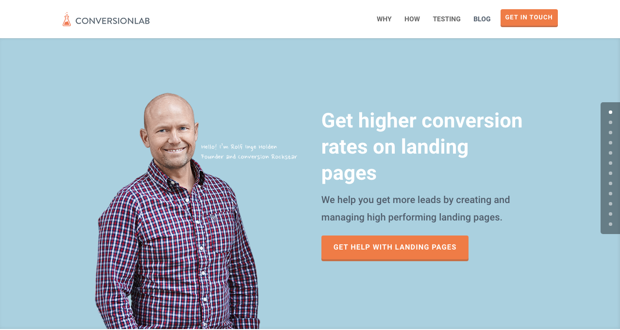
Apart from the fact that their own landing page is pretty well-crafted itself, Conversion Lab does exactly what they say they do: they help you get conversions. They also help out with testing too, which is crucial to any website that’s trying to raise their conversion rates.
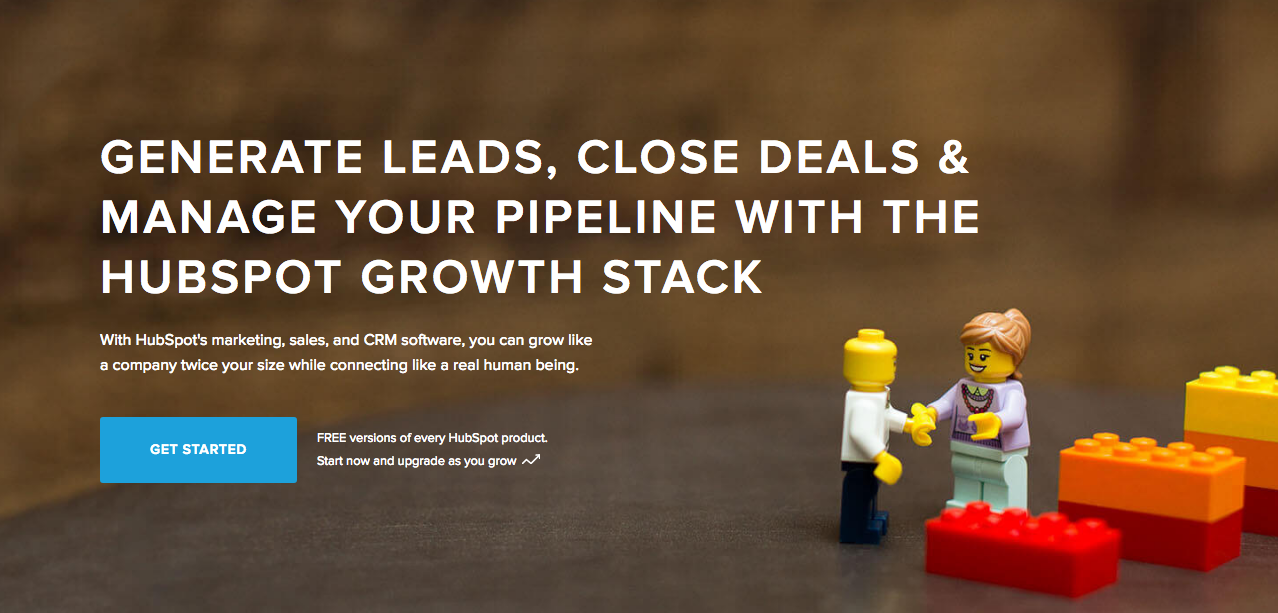
Hubspot is an all-around help site that lends you a hand in almost anything and everything related to online marketing.
They have a diverse collection of articles that range from creating business plans, to content and inbound marketing, and of course- landing pages. It’s a great resource for anyone still new to the realm of digital marketing.
Conclusion
Landing pages can be really tricky, especially if you’re just starting out in any kind of business.
But remember that it’s worth your time to invest into learning how they work and how to make them. Why? Because they generate leads, and leads generate revenue.
Take note that digital marketing trends are changing rapidly. You have to keep with these trends in order for your business to not only survive, but to also thrive.
Do you have any other tips or resources that you’d like to share with us? Comment below, or send us an email at [email protected] if you’d like to get featured as a resource in one of our articles.
Black Friday and Cyber Monday are coming in a couple of days (5 to be exact), but you’ll find that a bunch of websites have already started announcing their discount deals every which way. WordPress tools and plugins are definitely no exception.
So while it’s still (relatively) early, we’ve compiled a list of the best deals we could find for WordPress Black Friday 2017, with essentials you need to make a WordPress site– all within your budget.
Without further ado, here are 5 generously discounted tools and plugins that you’re going to need to build your first basic WordPress website.
Cloudways
Cloudways is a managed cloud hosting platform that’s quick to start, easy to manage, and made to scale. It’s feature-rich, plus it lets you choose your server resources, allowing you to get your site up and running within minutes.
Enter the coupon code HOLIDAY25 upon checkout to get a 25% discount on Cloudways for 3 months, valid until 28th November 2017.
Yoast SEO is one of the most popular (if not most trusted) search optimization plugin for WordPress, and for good reason too. With over 7 million installs, it’s probably the most comprehensive SEO tool in the digital market, and their millions of users (ourselves included) can attest: you simply can’t go wrong with a plugin as functional as Yoast.
While they haven’t announced this year’s Black Friday coupons yet, they’ve made an announcement in one of their articles that they’ll definitely having a sale on November 24 and 25.
WP Rocket offers a good range of caching functions, giving your site the performance boost that it needs. It’s a breeze to configure as well, so it’s great for beginners as it only requires minimal effort for setup.
This year, they’re having their biggest sale yet: 35% off on ALL their licenses.
WeDevs is a collection of nifty WordPress plugins and extensions. They’ve got a pretty solid community, and been around since 2008. For Black Friday 2017 (and the succeeding holidays this year), they’ve put together a list of WordPress Holiday Deals, including a ton of discounts and coupons for awesome WP themes.
First Site Guide is a resource site and tool that contains easily accessible knowledge on how to create your first website, both on WordPress and off of it. It also has great infographics that guide you through the basics of blogging, design, and marketing as well. And best of all, you get this good share of site-building knowledge for free.
We’ll also be featuring a how-to landing page article soon, with awesome resources from First Site Guide, so be on the lookout for that in the following weeks!
We definitely don’t want to miss out on all the fun. So this 2017, we’re giving you guys 33%-off on any license. Just use the promo codeCYBERMONDAY33 upon checkout to start building your site today!
Keeping your audience reeled into your page (and successfully generating leads) is a different story altogether, though.
Don’t get us wrong. Lots of sites can achieve this without a worry, but that’s usually because they spend a significant amount of time and research doing just that.
In contrast, some sites admittedly have a little trouble pulling it off, and more often than not, some of them don’t know where to begin. But don’t worry – Page Builder Sandwich will try to lend you a hand with that very same thing.
Why is it Important to Generate Leads?
One crucial thing to remember is that generating leads takes more than just buying a domain and setting a website up.
Now, before we get too into it, take note that Page Builder Sandwich isn’t a marketing website.
But in any case, it’s important to know that there’s a science behind generating leads, and while we ourselves aren’t digital marketers, it’s essential to note that successful lead conversion also has to do with the proper execution of design and content. That’s where we come in.
“But how can you guys help with the marketing aspect of it all?”
Great question! A few weeks ago we began corresponding with Straight North, a blog that specializes in digital marketing and lead conversion. They’ve given us some really tips which we hope you guys find helpful in your site-building journey.
Now, remember thatthere could belots of factors as to why your website isn’t generating the amount of leads you’d like. The first step is toidentify what these factors are, and hopefully, this list can help you out with doing just that.
TIP #1: Create Content that Stimulates Action
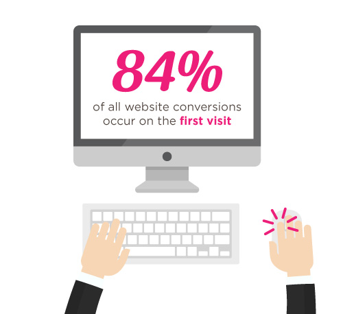
According to Straight North, 84% of website conversions occur on the first visit, and only 11% convert in the second.
In other words, first impressions matter.
Much like how bad auditions don’t result in actors getting lead roles, someone’s first visit to your website could either make or break you.
That’s why it’s you and your team’s job to try and convince people to stay glued to your page.
Straight North suggests that posting copy and content (both text and images) is a great way to catch your visitors’ attention. Remember to always allot sufficient time to research on what makes good copy and good content, and never underestimate either.
Here are a couple of websites that might help you on your journey towards creating successful leads:
Wow your site visitors by using interactive PBS elements like the Carousel, or use Parallax Scrolling, and Video Backgrounds to catch their attention. Remember to execute their placement in a balanced way though, as to not overwhelm your audience.
TIP #2: Intuitive Navigation
In the realm of web development and site-building, intuitiveness in the user interface (or UI) is key.
This means that when your visitors or users find their way around your site byintuition (i.e. easy site-navigation and straightforward instructions), they’re more likely to stay glued on your site.
Now, if navigating around your website proves to be a frustrating experience, chances are your visitors might not stick around long enough to hear what you have to say, and what you have to offer them.
Straight North adds thatgetting too “clever and creative” with navigation labels is a bad idea,and suggest that you use terms like “Contact Us” for call-to-action buttons, rather than using vague labels like “Interact!” or “Dialog.” Remember thatbombarding your site with too much jargon can cause frustration to your audience as well.
So as long as navigating through your website comes to the user assecond nature, then you have one less thing to worry about when trying to convert leads.
How PBS Can Help:
Page Builder Sandwich’s UI is highly intuitive, and is akin to using a Word processor (like Google Docs and Microsoft Word). Check out ourdemo to get some inspiration on how you can apply intuitive changes to your site, too!
OTHER PAGE BUILDERS
…have too much stuff going on.
PAGE BUILDER SANDWICH
…gets straight to the point.
TIP #3: Use Relevant, Custom Imagery
Your images and how they’re presented also matter, and they matter a lot.
While it may seem trivial to some, uploading boring stock images, stretched out/pixelzed photos, or badly-presented typography is a huge factor that dictates whether your visitors stay on your site, or move to a better, more credible-looking alternative.
How PBS Can Help:
Because it’s WordPress-run,PBS lets you post high-quality photos in your website. As long as you have the right image dimensions, you shouldn’t have a problem with posting photos.
Additional lifehack: You can also check out Pexels.com and Unsplash.com to get awesome, high-quality stock photos!
TIP #4: Persuasive Credibility Elements
Skepticism is ahuge conversion killer.
That’s why more often than not, it’s always a good idea to add in elements that back up your credibility as a website (or business), like testimonials from credible sources, and logos of reputable companies or groups that you’ve worked with.So use customer testimonials, show logos of well-known customers, and include third-party mentions in your content.
How PBS Can Help:
Use PBS features to vouch for you. Display your customers’ testimonials in a Carousel, or use the Featurette element to showcase third-party mentions, or make use of the column element to effectively display logos of your well-known customers (like in the graphic above).
TIP #5: Get Personal!
Straight North says thatusing a lighter, casual tone makes all the difference when writing content (such as articles and bio’s) on your site. This lets your users know that you’re human too, and not just some bot trying to get a run for their money (which we hope you aren’t).
How PBS Can Help:
While this part is entirely up to you and your team, it wouldn’t hurt to use elements such as the Featurette, Gallery, and Image Box to liven up your bio’s as well. Adding in other PBS elements like Social Media Icons can help put a personal touch to your pages, too.
PBS’ Industry Template makes full use of the Image Box Elements for its About Us and Feature Sections.
TIP #6: Irresistible Calls-to-Action
Calls-to-Action (CTA) are a crucial part of generating leads.
You will FAIL to capture first-visit conversions unless you ASK. – Straight North
Just asking isn’t enough, though. According to Straight North, your calls-to-action should be executed both “skillfully and persuasively”.
The trick is to have effective Calls-to-Actions plus a good combination of smart consistent placement, offers that give off substance, time-sensitive offers (giving them offers for a set, limited time will give them a sense of urgency), and most importantly, guaranteed offers.
You want your site to trust you. “Take away all arguments for delay, and conversions will increase”, Straight North says.
How PBS Can Help:
PBS’ Call-to-Action Button – as well as other elements such as the Countdown and Page Heading element – can help ease your burden regarding this task.
Executing them correctly is up to you and your team though, so make sure to give time to research about CTA placements and other marketing tips.
Here are some resources that can help boost your CTA game:
A person submitting their information to you via a form on your website is ultimately what measures a successful lead conversion.
This is why placing user-friendly contact forms on your site is of the utmost importance. They’re the ultimate “make-or-break stage of a great conversion opportunity”, says Straight North.
A couple of PBS’ third-party plugins available for shortcode mapping
So don’t intimidate your site visitors by overwhelming them with too many question forms, or have them exhaust too much energy, like having them type long sentences instead of choosing their answers from a drop-down list.
Letting them know that you value their privacy is also a must. Be sure to place clean, good-looking forms on your site so as to boost credibility.
TIP #8: Prominently Displayed Phone Numbers (or Contact Details)
Contact number and social media buttons displayed prominently in PBS’ Restaurant Template
A consistent, prominent display of phone numbers is a must if you’re a type of business that offers support through phone calls. Straight North adds that investing in toll-free numbers can also give you a good boost in conversion.
If you’re a tech company like us, then it’s also a good idea to display your e-mail address (or other ways your visitors can reach you) on your website.
How PBS Can Help:
PBS’ Full Page Niche-Based Templates have fields that let you feature phone numbers and other contact information more prominently, so that your visitors can reach you right away.
TIP #9: Continuous Testing
Straight North attests to the importance of site maintenance and testing: “No matter how good your website is in converting leads, it can always be better.”
This is true for any website, and not just one that’s attempting to convert leads. Making sure your site is in tip-top shape and that your customers are always pleased will help your business go a long way.
How PBS Can Help:
This one is up to you, but if you’d like a tip: the PBS Team continuously tests the site and page builder for any bugs, and always work to make sure you guys are satisfied. We don’t exactly have a feature for making sure you do regular tests on your site, so this one’s entirely up to you and your team.Do it, and do it well!
TIP #10: Mobile-Friendly Design
Almost everyone has a cellphone or tablet; but whileonly 23 percent of lead conversion rates comefrom mobile devices, it absolutely will not do to ignore any sort of potential conversions, no matter the percentage (leads are still leads, after all).
“Users converting from desktop view may have seen the site initially on a mobile device,” Straight North says. “Mobile conversions are (also) likely to grow as mobile Internet access continues to soar at the expense of desktops.”
You can preview your site on mobile view directly on desktop
How PBS Can Help:
Page Builder Sandwich is Mobile Responsive. You can view PBS-built sites on mobile, as well as check previews of your mobile site directly through desktop while editing. This way, you won’t have to keep switching to your phone in order to check if your site looks good on mobile.
Everything Matters in Site-Building
At the root of it all, it’s very, very important to understand that everything on your website – down to the smallest of details – has an impact on your audience.
The quality of your copy, images, your layout – all of it matters, and it matters a lot.
And one of the biggest mistakes people make when trying to trying to generate leads is this very thing: Taking small aspects of what makes up the website (like design, text, and other content) for granted.
Hopefully your website garners the success it very well deserves; it’s been built with PBS, after all.
Best of luck to you and all your endeavors, and thank you, as always, for using Page Builder Sandwich!
A few decades ago, scientists and professionals kept racking their brains out trying to find a better alternative to snail-mail. We had beepers for a while, as well as those too-large cellphones we couldn’t keep in our pockets. But while nostalgic at best, technology from the past is most definitely no match to the communication methods of the 21st century. Now, in the year 2016, our friends, family, and colleagues, can be contacted in a little more than a second. As the cliche goes: “Everything’s literally at the touch of our fingertips”. Literally.
Slowly veering away from tradition?
It’s hard to deny just how much traditional routines we’ve had to give up due to the fast-paced innovations of today. It’s taken us a bit of getting used to (especially for the older generations), but truth be told, this isn’t exactly a bad thing. In fact, it’s the opposite.
For example, in 1993, the amount of time and effort it would take a baker to inquire about a new oven model would usually take weeks, if not months. Now, the same task can be achieved in 2016 by simply browsing the oven manufacturer’s website. Additionally, if the same oven company announces they’re going to have a sale the following weekend, and the baker wants to tell their friends about it, all they’d need to do is post about it on Facebook, Twitter, or other popular social media websites. In this day and age, we’ve all succumbed to this routine at some point in our lives, so we’re pretty confident that you’re familiar with the process.
Case in point, social media is a great way to get word out in the open about almost anything. Its influence today is incredibly powerful, and because of this, your presence online can be a key factor to the success of your site-building journey, as well as its maintenance. In fact, magazines regularly sold in newsstands— like Time and The Economist– have their content available both through physical copies and online ones, which ensured reaching an even broader audience. Likewise, if an influential person coming across your site, and find that they love your content (or at least find it relevant enough to share), they’ll most likely be spreading your content through other social media outlets as well.
That’s a lot of people. Rest assured, your target audience is going to be in that demographic.
Extending Social Media’s Functionality
Apart from getting your content out in the open, social media’s relevance also extends to staying up-to-date with the latest trends in any audience or market. This will hold especially true when gauging what your audience’s wants and needs are, and will extend further into how you can reach and cater to them better; remember, reaching out is always and important factor to your site’s success.
While you may not magically gain 15,000 followers on the first month or even in the first years of your site, having an online presence active on social media accounts will surely give you a significant boost in the long run, one way or annother. Remember: Rome wasn’t built in a day, so stay determined!
Plugins of the same category, but with respective features, are developed and enhanced every day. This gave birth to the variety of WordPress-powered websites – and later on, websites catering to several functions. For instance, there is a number of plugins which enables a developer and/or user to create, schedule, invite an interested person to an event.
The Events Calendar isthe events calendar you’ll need
There are a lot of available events calendar in the WordPress market. So how do you choose? There are recommendation blogs, plugin face-off blogs, and of course testimonials from different users. All of these have one thing in common: they include The Events Calendar by Modern Tribe in their list.
An example of a minimal event post of The Events Calendar
What’s with The Events Calendar, anyway?
The Events Calendar by Modern Tribe is the frontline plugin in the said category. It provides professional quality of event posts. It has a pretty simple interface, with the title at the top, date and time, the price if applicable, a featured image and or map, and additional details about the event. You can view all your events by date, keyword, and location if Pro.
You can do much more with The Events Calendars Pro and its official add-ons:
The Events Calendar PRO
Recurring events
Week view
Photo view
Location search
Map view
Venue and organizer view
Advanced widgets
Additional fields
The Events Calendar ADD-ONs
RSVP tickets
Event ticket plus via WooCommerce, Shopp, WPeCommerce, Easy Digital Downloads)
Community Events
Community Tickets
Filter Bar
Facebook Events
iCal Importer
Eventbrite Tickets
Integrating it with Page Builder Sandwich makes it even cooler
Recent posts were made to highlight the benefits of using PBS and its Shortcode Mapper. This is to make sure that you guys are taking advantage of the latest innovation that the Sandwich Team can develop plus notify the plugin developers that their creation gave birth to another awesome feature.
For the case of The Events Calendar plugin, we came up with 2 mind blowing reasons as to why the combination needs to exist:
Page Builder Sandwich was also reviewed recently by Pippin, together with the other established and rising page builders in the market. In his in-depth critique, he concluded that indeed, PBS is one of the most powerful drag-and-drop page builders. He highlighted that only Page Builder Sandwich was able to create a functioning Shortcode Mapper.
2. Shortcode options: from backend to frontend editing
By default, the plugin’s shortcode options can be accessed through the backend admin panel. Then, the same process of backend plugins takes place: go to the backend editor, input the wanted changes and then save. Only when the refresh button is clicked would the edited content be seen. All-in-all, that’s 4 steps.
But that long procedure has been turned into a real time frontend editing by Page Builder Sandwich – in just 2 steps:
Instead of going to the backend panel to access the shortcode options, click on the Shortcode Mapper and select on The Events Calendar. You’d be redirected to a pop-up window as seen below. Click on The Events Calendar. View of The Events Calendar in the Page Builder Sandwich Shortcode Mapper
Close look at The Events Calendar Shortcode Properties
The Inspector on the left displays the initial properties of the shortcode. Clicking on the “Open Editor” button, the shortcode controls displayed at the backend can now be accessed on the frontend via a pop-up window.
See? The Events Calendar looks like you’re just making an event post.
There are a lot of benefits, right?
With the integration of a page builder that doesn’t lock you in and leaves shortcode mess, and the most popular events calendar, your workflow would not only smoothen but also increase in productivity. Additionally, you can look into what Modern Tribe offers: the bundle of plugins that go with The Events Calendar.
So far, The Events Calendar plugin by Modern Tribe was the only one mapped in our Shortcode Mapper. This doesn’t mean however that the mapping stops there. Just comment what plugin of Modern Tribe that you would like to see in our Shortcode Mapper.
Some of WordPress’ features (especially the more complex ones) may take newer users some time to be familiar with. And if you are one of these newer users, WordPress’ intricate jargon might have the tendency to send you towards a spiral of intimidation, especially when getting that near-inevitable feel of information overload. Yikes.
Now, if you’re a part of this particular percentage of WordPress users, we implore you not to fret; the good news is that it is but a misconception that being a WordPress noob automatically equates to a limited WordPress experience. This brand of thinking is a common error that almost anyone makes, and we urge you not to make that very same mistake.
The truth is, you needn’t have that much of an in-depth grasp of the inner workings of software and code in order to begin building a site– or to get one to work in your desired way, for the matter. “How is that possible?” you might ask? Well, one of the ways this can be achieved is in the form of creating pages on your site, and adding in plugins.
In the realm of WordPress, the term “page” is almost always associated with the term “post” –as in “pages and posts”– and there are times when people mistake them for interchangeable terms. Arguably, it’s easy to get confused between the two (especially if you’re still wading around the shallow end of the WordPress Beginner pool). So with that in mind, take note that while these things may seem trivial, it’s always a good idea to familiarize yourself around WordPress’ little things, especially if you’re just starting out.
An easy identifier for differentiating between posts and pages is that posts are the individual entries you create on your site (this article you’re reading right now, for instance, is a post). These entries aren’t exactly a necessity for websites, unless yours has an active blog like ours. However, what may be a crucial element of your site are setting up pages, which is what this article will be a bit more centered on.
Pages are Building Blocks
Unless you’ve never touched a computer before (which we assume is unlikely), chances are, you’ve already seen or heard of website pages before, or at least have a fair idea of what they might be. If you are unfamiliar, don’t worry; it’s also likely that you’ve already stumbled upon pages on your visits to other websites: FAQ and/or About sections, contact forms, and picture galleries. For beginners and freshly-built websites, they can be akin to building blocks, in a sense. If put together, they make up the essentials of what your site’s all about, and what it has to offer.
So it’s all well and good to be wary of these basic differences, yes. But combined with your basic plugin know-how, you’re actually in a perfect position to take advantage of your newfound knowledge on WordPress pages, even if you are a beginner. The question now though, is how.
Taking Advantage: Basic Plugins You Can Install
On a basic WordPress site, creating pages is easy, sure. You’d just have to work your way through it, read a few instructions, click a few buttons and you’re good to go. If you want anything more than that, though, you’re going to have to install a couple of plugins.
SEO (Search Engine Optimization) plugins
Getting your site out there in the open is hard enough, and the task of spreading word about your site is much harder. Believe me. That’s why a little help from SEO plugins are crucial for your site to get that boost in ranking.
Here at Sandwich, we use Yoast, which is often dubbed as today’s leading SEO plugin in the market. There are a bunch of other SEO’s to choose from though, and there are numerous sites, such as SitePoint, that compare and contrast the different SEO plugins if you want to weigh in your options.
Back-Up plugins
Backing up is one of the most important precautions you have to take when you set up your site; you really can never be too careful. After all, it’s better to take a few minutes (or hours, depending on your experience) to set up a good back-up plugin, than spending an eternity setting up your site all over again if your data accidentally gets wiped clean.
Security plugins
It’s a cruel, cruel world out there, even in the realm of the interwebz. Bad guys will want to steal your data and even hack into your site, among other things. And so it’s always a good idea to install a security plugin along with your back-up for good measure. We use VaultPress for both back-up and security.
Anti-Spam plugins
No one wants spam, unless it’s the food. Delicious.
Well, popular canned goods aside, there are plenty of ways unwanted spam can creep its way into your WordPress site. According to WPExplorer, while it’s possible to manually tweak WordPress to prevent spam, you can also opt for a quicker solution: installing an anti-spam plugin for your site.
Cache
Installing a caching plugin is a sure-fire way to speed up your site’s and server’s performance. We’ve been using WP Fastest Cache for some time now, but there are a lot of other high-rated, trusted cache plugins too – like W3 Total Cache – which you may also want to give a go.
As the site owner, you are responsible for answering your audience’s queries and responding to their suggestions. So at some point, after your site-building journey, they may want – or even need – to reach you; and this is what contact forms plugins are for. While it is possible to build a contact form for your site from scratch, we have to admit there are times when doing so wouldn’t be very practical, considering that it will definitely take some time for you to do so, especially if you’re a beginner.
Unless you’re a website that people frequently flock to, it’s admittedly a bit challenging to get your site’s content (such as articles) going around. This is why there are times when the need for a social media plugin arises. Chances are, if your audience finds your content interesting enough, they might want to share it with their friends on social media outlets.
3. Commenting Tools / Disqus
Like we’ve mentioned, communicating with your audience is a must, especially if your site content revolves around feature articles. Getting to know your audience gives you a leverage too; you can use whatever feedback they have to better your site and/or your products.
Disqus is a very popular commenting tool, and one of the most popular ones in the market. Kikolani also has a very handy article that might help you in deciding which commenting tool will work best for your site.
There Are More Plugins Than You Think
The list of plugins available for WordPress sites doesn’t stop with this article. These are but a few that we find very helpful; the realm of WordPress plugins definitely holds more than the eight we’ve enumerated above.
That being said, we probably didn’t get to cover anything. So do you have a plugin in mind that you think should make the list? Tell us in the comments section below, and we might just take in your suggestions for one of our future articles!














 Plugins of the same category, but with respective features, are developed and enhanced every day. This gave birth to the variety of WordPress-powered websites – and later on, websites catering to several functions. For instance, there is a number of plugins which enables a developer and/or user to create, schedule, invite an interested person to an event.

 Recent posts were made to highlight the


