
If there’s one thing you need to remember when building a website, it’s to never take good design for granted.
As we’ve mentioned in a previous article, a site visitor’s first impression on your website can make or break you in just a matter of seconds.
In other words, if they don’t like what they see within that timeframe, chances are they’re going to close their browser windows and direct their attention elsewhere.
Fortunately, there are a lot of ways to prevent this from happening; one of them is to familiarize yourself with good web design practices. And the good news is you don’t need to be a professional web designer in order to do so.
Because while it’s true that not everyone has a good eye for design, preventing bad design becomes easier once you know what to avoid.
Detto questo, assicurati di tenere a mente questi 4 errori comuni di web design. In questo modo, avrai una preoccupazione in meno quando inizierai finalmente a creare il tuo sito web.
Errore n. 1: utilizzare più di 3 font
A rule of thumb when designing websites? Try not to have too much visual elements going on within your space. Having more than 3 fonts on your site design is a surefire way to break this one rule. It’ll also overwhelm your site visitors.
Limitare i font del tuo sito web a un massimo di 3 è una pratica generale di design seguita dai professionisti. Inoltre, aumenta il livello di leggibilità e coerenza del tuo sito, elementi chiave per il successo del tuo traffico.
DON’T DO THIS:
Don’t use more than 3 fonts and try to avoid “fancy fonts” as much as possible. These tend to make your site look unprofessional and outdated.

DO THIS:
Use only 2 fonts, or a maximum of 3 if you have to. Notice how the page below looks clean and sleek, all while keeping readability and consistency all throughout the design.
Try comparing the differences between this example and the previous one. The example below with only two fonts is a website that your visitors will likely take seriously. This previous one above with the overwhelming amount of fonts isn’t.
Mistake #2: Failing to Use White Space
White space is one of the most important aspects of web design. But what is it?
Put simply, white space is literally the empty space between elements in a composition.
In other words, it’s negative space. This pertains to anything on your website that isn’t filled with text, photos, or other design elements.
Now, the problem arises when website owners want to fill all of the white space in, which is an absolute no-no.
White space matters because it gives your site visitors and readers some breathing space when going through your site. Just how it was mentioned in the first design mistake to avoid, overwhelming your website with too much design elements is more than enough reason for your site visitors to leave and for your traffic to decrease significantly. It also makes for poorly executed design.
DON’T DO THIS:
In the example below, take a look at how the text is nearing the edges of the purple section’s margin. Notice as well how all elements leave almost zero room for white space.

DO THIS INSTEAD:
 Give your site readers some room to breathe. If adding in long paragraphs is unavoidable, just remember to always take the rules of spacing into account—they’re pretty easy to remember anyway ?. It will leave your page looking cool, crisp, and professional.
Mistake #3: Designing Websites With Zero Flow in Your Site’s Content
It’s important to pay attention as to how information on your website is presented. Moreover, site content should generally follow a logical flow, taking the site viewer’s intuition into consideration.
Dai un’occhiata ai due esempi qui sotto per capire cosa intendiamo.
DON’T DO THIS:
Unless you’re a graphic designer by profession, it’s probably not a good idea to experiment with the standard flow of your website’s sections.
Below, you can see that the site’s design lacks both visual and logical flow; everything is all over the place. You don’t want your audience having a hard time navigating through your site, either. This is another surefire way to do it.

DO THIS INSTEAD:
Notice how the sections of the website flow depending on what actions the visitor is most likely to take.

Il design è intuitivo e presenta un flusso logico: in primo luogo, l’organizzazione si presenta e informa il pubblico sugli aspetti fondamentali, come la sua missione e le sue attività. In secondo luogo, inserisce dati affidabili per stabilire credibilità. Infine, il sito web fornisce al pubblico i numeri di contatto e un elenco di eventi, spingendolo ad agire.
Mistake #4: Trying to Fit in Every Bit of Information Onto Your Website
Aggiungere muri di testo non necessario dove invece dovrebbe esserci spazio bianco può allontanare il tuo pubblico. Ricordati di mantenere solo i dettagli importanti.
Studies find that readers only visit 20% of your webpage; everyone else outside that percentage will probably just scroll through your site.
DON’T DO THIS.
Don’t overwhelm your visitors with inconsistent, giant walls of text, especially if it means having to sacrifice your website design’s cohesiveness and structure.

DO THIS INSTEAD:
Keep your copy short and concise, and take out chunks of unecessary text if you can help it. Only keep vital information that your site visitors absolutely need to know.

Conclusion
Website design is important, and can be a huge deciding factor in whether or not you gain site traffic.
Ricorda di non darlo per scontato. Dedica sempre del tempo alla ricerca e consulta articoli di design che possano guidarti lungo il percorso. Prima che tu te ne accorga, vedrai il traffico del tuo sito crescere. ? Buona fortuna!
Design in less time!
Check out how much faster Page Builder Sandwich let you design your web pages.
Try Live Preview
This week’s useful resource:
CANVA has hundreds of resources that you can access on their website. Apart from useful and easy-to-follow design tips, they also have photo editing tools, graphs, and a wide range of useful resources you can use for your creative projects.
Dai un’occhiata a questa fantastica Guida ai colori di Canva per il tuo prossimo progetto di design.


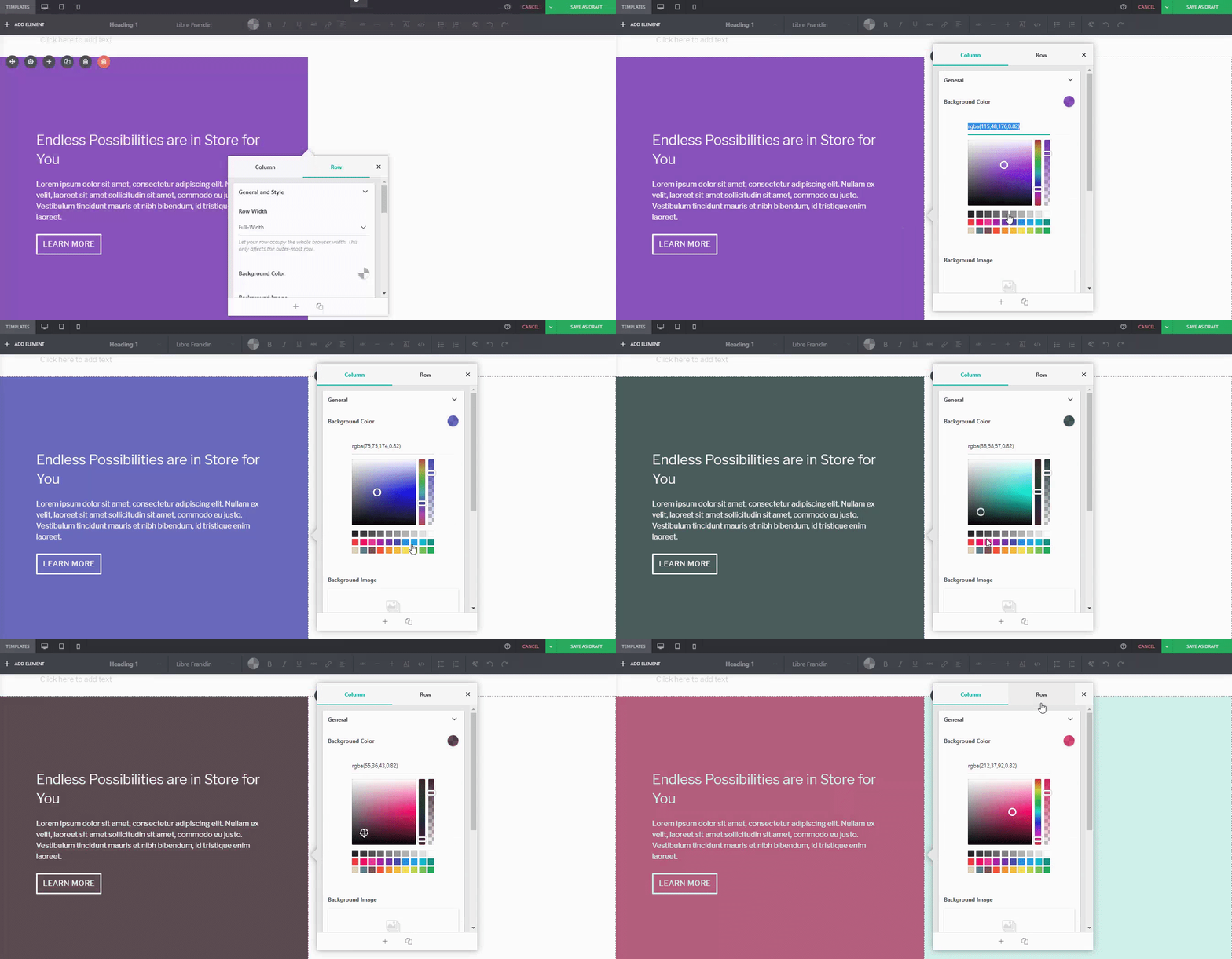
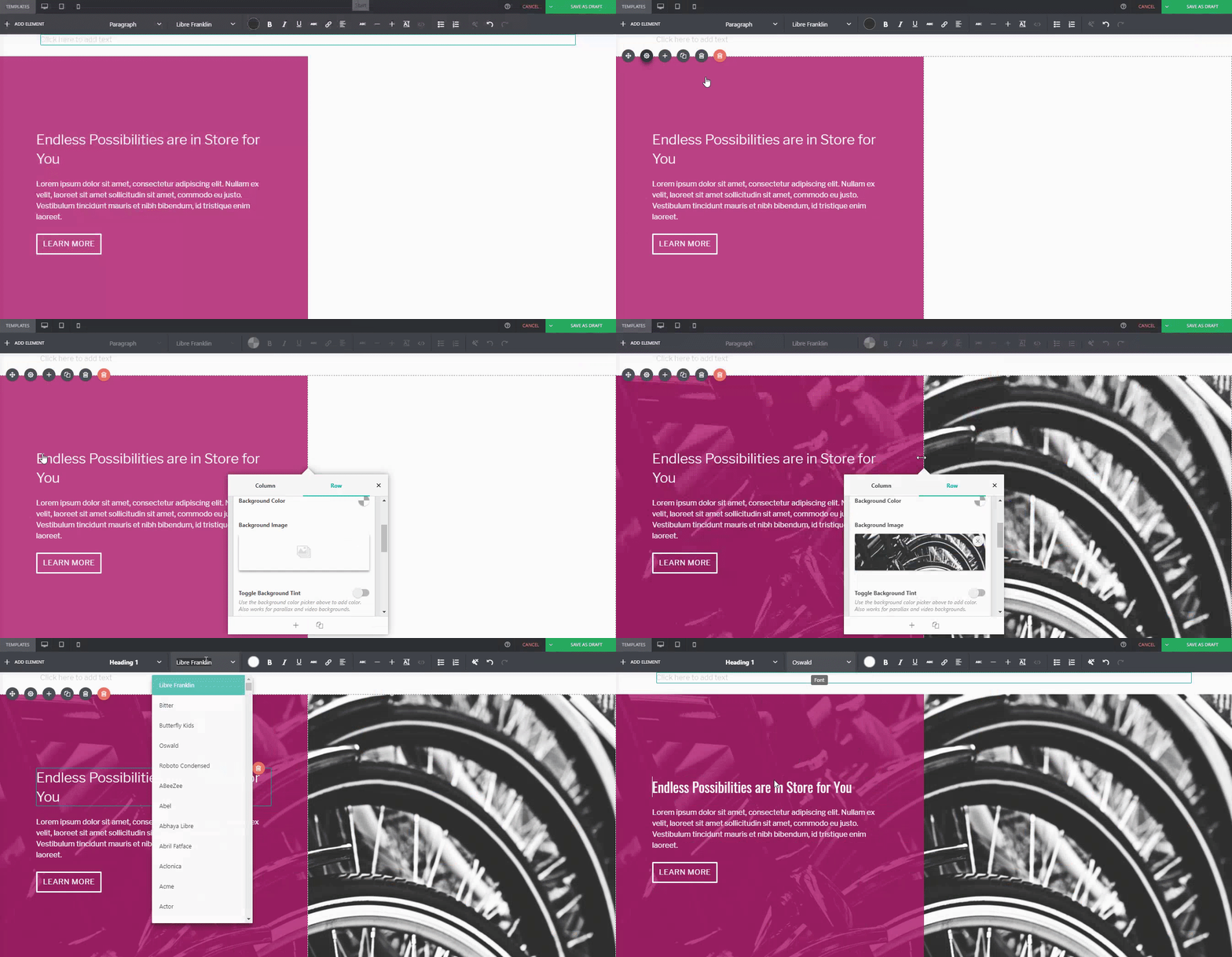


 Sono passati 10 mesi da quando abbiamo lanciato Page Builder Sandwich al pubblico. Ora abbiamo circa 6.000 installazioni attive, e questo è un bel traguardo per noi. Abbiamo anche ricevuto una valanga di feedback grazie a ciò, sia positivi che negativi. Il consenso generale, tuttavia, è che le persone apprezzano quanto sia facile creare layout e realizzare i propri contenuti rispetto agli altri page builder disponibili sul mercato.




 Dopo il rilascio della versione 4.0 lo scorso gennaio, abbiamo continuato a lavorare sullo sviluppo di PBS, aggiungendo sia correzioni che miglioramenti. Siamo entusiasti di condividerli con voi, quindi ecco cosa abbiamo in serbo per l’aggiornamento alla versione 4.1.


 New in Page Builder Sandwich is the
 Ne

