
If there’s one thing you need to remember when building a website, it’s to never take good design for granted.
As we’ve mentioned in a previous article, a site visitor’s first impression on your website can make or break you in just a matter of seconds.
In other words, if they don’t like what they see within that timeframe, chances are they’re going to close their browser windows and direct their attention elsewhere.
Fortunately, there are a lot of ways to prevent this from happening; one of them is to familiarize yourself with good web design practices. And the good news is you don’t need to be a professional web designer in order to do so.
Because while it’s true that not everyone has a good eye for design, preventing bad design becomes easier once you know what to avoid.
Thënë kjo, sigurohuni të mbani parasysh këto 4 gabime të zakonshme në dizajnimin e faqeve të internetit. Në këtë mënyrë, do të keni një gjë më pak për t’u shqetësuar kur më në fund të filloni ndërtimin e faqes suaj të internetit.
Gabimi #1: Përdorimi i më shumë se 3 fonteve
A rule of thumb when designing websites? Try not to have too much visual elements going on within your space. Having more than 3 fonts on your site design is a surefire way to break this one rule. It’ll also overwhelm your site visitors.
Mbajtja e fonteve të faqes suaj të internetit në një minimum prej 3 është një praktikë e përgjithshme dizajni e ndjekur nga profesionistët. Përveç kësaj, kjo rrit nivelin e lexueshmërisë dhe qëndrueshmërisë së faqes suaj, të cilat janë kyçe për suksesin e trafikut të faqes suaj.
DON’T DO THIS:
Don’t use more than 3 fonts and try to avoid “fancy fonts” as much as possible. These tend to make your site look unprofessional and outdated.

DO THIS:
Use only 2 fonts, or a maximum of 3 if you have to. Notice how the page below looks clean and sleek, all while keeping readability and consistency all throughout the design.
Try comparing the differences between this example and the previous one. The example below with only two fonts is a website that your visitors will likely take seriously. This previous one above with the overwhelming amount of fonts isn’t.
Mistake #2: Failing to Use White Space
White space is one of the most important aspects of web design. But what is it?
Put simply, white space is literally the empty space between elements in a composition.
In other words, it’s negative space. This pertains to anything on your website that isn’t filled with text, photos, or other design elements.
Now, the problem arises when website owners want to fill all of the white space in, which is an absolute no-no.
White space matters because it gives your site visitors and readers some breathing space when going through your site. Just how it was mentioned in the first design mistake to avoid, overwhelming your website with too much design elements is more than enough reason for your site visitors to leave and for your traffic to decrease significantly. It also makes for poorly executed design.
DON’T DO THIS:
In the example below, take a look at how the text is nearing the edges of the purple section’s margin. Notice as well how all elements leave almost zero room for white space.

DO THIS INSTEAD:
 Give your site readers some room to breathe. If adding in long paragraphs is unavoidable, just remember to always take the rules of spacing into account—they’re pretty easy to remember anyway ?. It will leave your page looking cool, crisp, and professional.
Mistake #3: Designing Websites With Zero Flow in Your Site’s Content
It’s important to pay attention as to how information on your website is presented. Moreover, site content should generally follow a logical flow, taking the site viewer’s intuition into consideration.
Shikoni dy shembujt më poshtë për të parë se çfarë duam të themi.
DON’T DO THIS:
Unless you’re a graphic designer by profession, it’s probably not a good idea to experiment with the standard flow of your website’s sections.
Below, you can see that the site’s design lacks both visual and logical flow; everything is all over the place. You don’t want your audience having a hard time navigating through your site, either. This is another surefire way to do it.

DO THIS INSTEAD:
Notice how the sections of the website flow depending on what actions the visitor is most likely to take.

Dizajni është intuitiv dhe ka një rrjedhë logjike: Së pari, organizata prezantohet dhe e njeh audiencën me gjërat bazë; si për çfarë bëhet fjalë dhe çfarë bën ajo. Së dyti, ajo shton shifra të besueshme për të krijuar besueshmëri. Së fundi, faqja e internetit i jep audiencës numrat e saj të kontaktit dhe një listë ngjarjesh, duke i nxitur ata të ndërmarrin veprime.
Mistake #4: Trying to Fit in Every Bit of Information Onto Your Website
Shtimi i mureve me tekst të panevojshëm aty ku duhet të ketë hapësirë boshe mund ta largojë audiencën tuaj. Mos harroni të mbani vetëm detajet e rëndësishme.
Studies find that readers only visit 20% of your webpage; everyone else outside that percentage will probably just scroll through your site.
DON’T DO THIS.
Don’t overwhelm your visitors with inconsistent, giant walls of text, especially if it means having to sacrifice your website design’s cohesiveness and structure.

DO THIS INSTEAD:
Keep your copy short and concise, and take out chunks of unecessary text if you can help it. Only keep vital information that your site visitors absolutely need to know.

Conclusion
Website design is important, and can be a huge deciding factor in whether or not you gain site traffic.
Mos harroni të mos e merrni si të mirëqenë. Ndani gjithmonë kohë për kërkime dhe kërkoni artikuj dizajni për t’ju udhëhequr gjatë rrugës. Para se ta kuptoni, do të shihni që trafiku i faqes suaj po rritet. ? Suksese!
Design in less time!
Check out how much faster Page Builder Sandwich let you design your web pages.
Try Live Preview
This week’s useful resource:
CANVA has hundreds of resources that you can access on their website. Apart from useful and easy-to-follow design tips, they also have photo editing tools, graphs, and a wide range of useful resources you can use for your creative projects.
Shikoni këtë Udhëzues fantastik Ngjyrash nga Canva për sipërmarrjen tuaj të ardhshme të dizajnit.

 Kanë kaluar 10 muaj që kur kemi lëshuar Page Builder Sandwich për publikun. Tani kemi rreth 6,000 instalime aktive, dhe kjo është një arritje mjaft e madhe për ne. Kemi marrë gjithashtu shumë reagime falë saj, si të mira ashtu edhe të këqija. Sidoqoftë, konsensusi është se njerëzit e shijojnë lehtësinë me të cilën mund të ndërtojnë struktura dhe të krijojnë përmbajtjen e tyre krahasuar me ndërtuesit e tjerë të faqeve në treg.


 Në


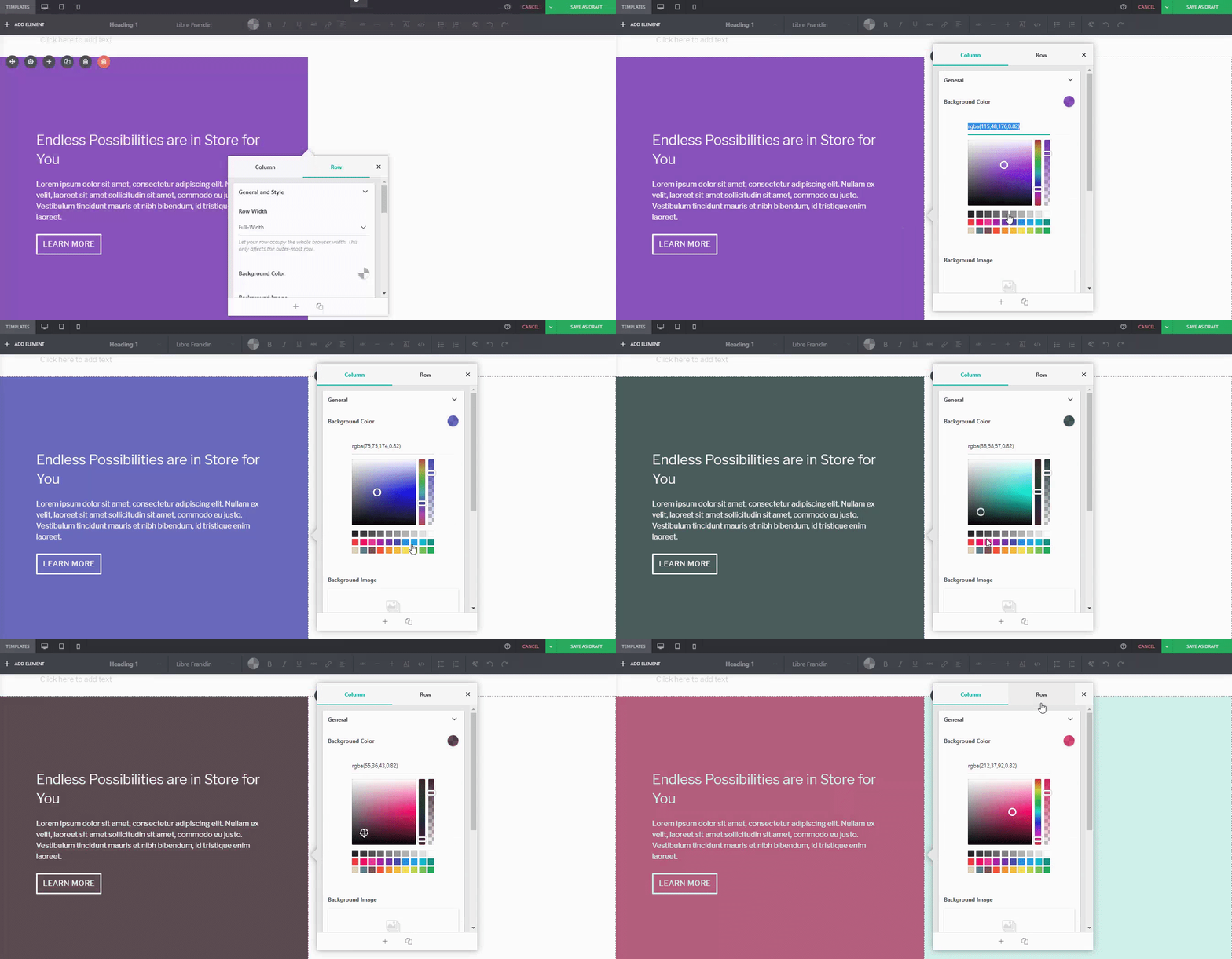
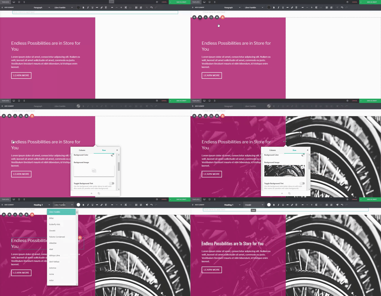



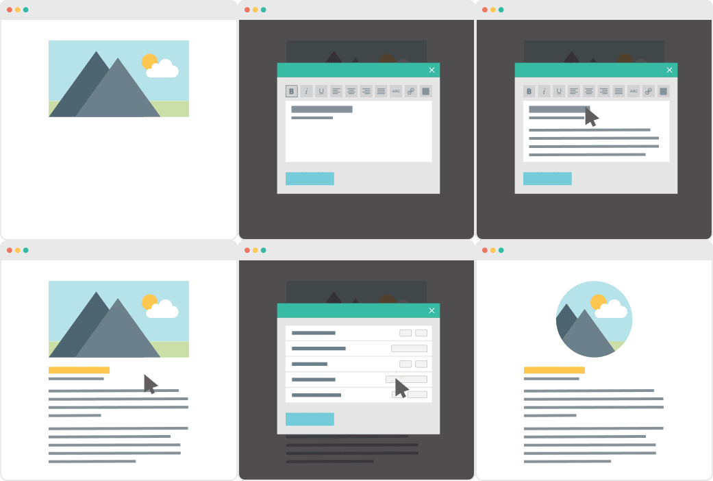
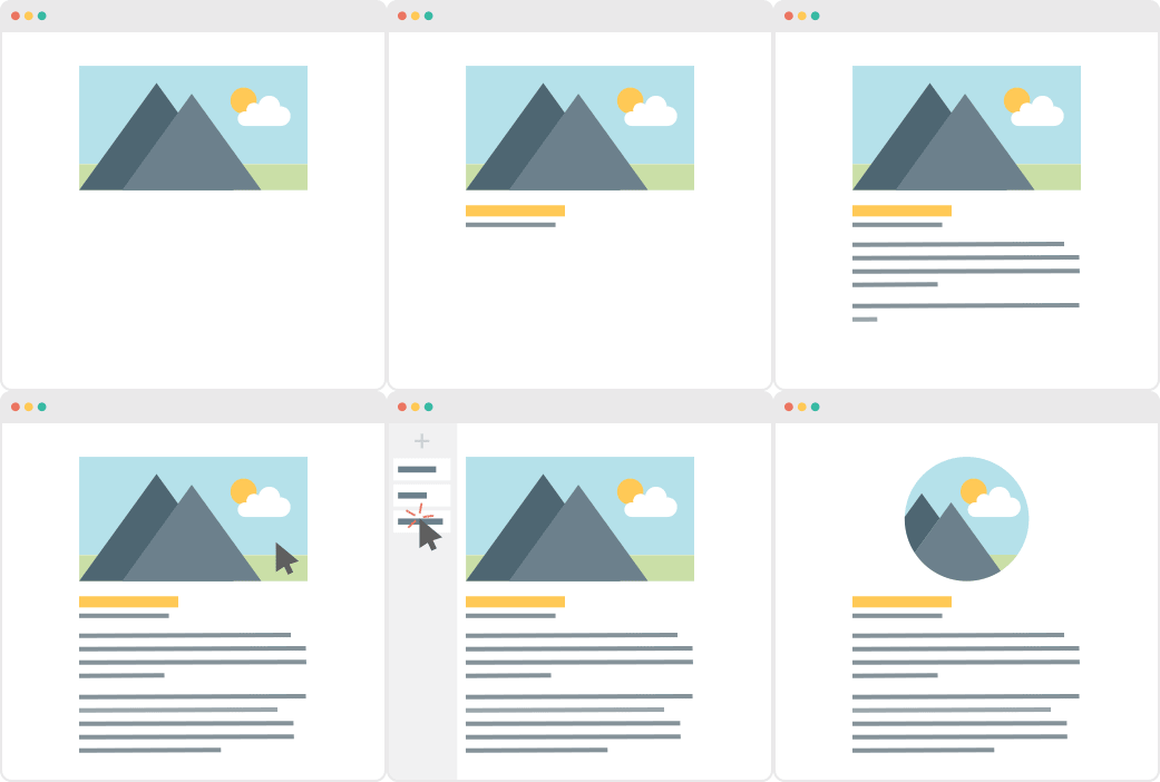



 Pas publikimit të Versionit 4.0 janarin e kaluar, kemi vazhduar të punojmë në zhvillimin e PBS-së, duke shtuar si rregullime ashtu edhe përmirësime. Jemi të emocionuar t’i ndajmë ato me ju, prandaj ja çfarë kemi përgatitur për përditësimin e Versionit 4.1.

 Imagjinoni këtë: Faqja juaj e parë e internetit në WordPress, më në fund është aktive dhe funksionon. Nuk jeni ndier kaq të realizuar prej muajsh. I jepni vetes një rrahje shpatullash të merituar, dhe po ashtu bëjnë edhe njerëzit që ju ndihmuan të arrini frytin e punës suaj. Instaloni shtojcat që ju nevojiten dhe filloni të planifikoni më tej për të ardhmen e faqes suaj të internetit. Ajo duket e ndritur dhe gjithçka po shkon për mrekulli.
