
If there’s one thing you need to remember when building a website, it’s to never take good design for granted.
As we’ve mentioned in a previous article, a site visitor’s first impression on your website can make or break you in just a matter of seconds.
In other words, if they don’t like what they see within that timeframe, chances are they’re going to close their browser windows and direct their attention elsewhere.
Fortunately, there are a lot of ways to prevent this from happening; one of them is to familiarize yourself with good web design practices. And the good news is you don’t need to be a professional web designer in order to do so.
Because while it’s true that not everyone has a good eye for design, preventing bad design becomes easier once you know what to avoid.
とはいえ、これら4つのよくあるウェブデザインの間違いを心に留めておいてください。そうすれば、いざウェブサイトの構築を始める際、心配事が1つ減るはずです。
間違い #1: 3種類以上のフォントを使用している
A rule of thumb when designing websites? Try not to have too much visual elements going on within your space. Having more than 3 fonts on your site design is a surefire way to break this one rule. It’ll also overwhelm your site visitors.
ウェブサイトのフォントを最大3つまでに抑えることは、プロが実践している一般的なデザイン慣行です。さらに、サイトの読みやすさと一貫性が向上し、これらはサイトトラフィックを成功させるための鍵となります。
DON’T DO THIS:
Don’t use more than 3 fonts and try to avoid “fancy fonts” as much as possible. These tend to make your site look unprofessional and outdated.

DO THIS:
Use only 2 fonts, or a maximum of 3 if you have to. Notice how the page below looks clean and sleek, all while keeping readability and consistency all throughout the design.
Try comparing the differences between this example and the previous one. The example below with only two fonts is a website that your visitors will likely take seriously. This previous one above with the overwhelming amount of fonts isn’t.
Mistake #2: Failing to Use White Space
White space is one of the most important aspects of web design. But what is it?
Put simply, white space is literally the empty space between elements in a composition.
In other words, it’s negative space. This pertains to anything on your website that isn’t filled with text, photos, or other design elements.
Now, the problem arises when website owners want to fill all of the white space in, which is an absolute no-no.
White space matters because it gives your site visitors and readers some breathing space when going through your site. Just how it was mentioned in the first design mistake to avoid, overwhelming your website with too much design elements is more than enough reason for your site visitors to leave and for your traffic to decrease significantly. It also makes for poorly executed design.
DON’T DO THIS:
In the example below, take a look at how the text is nearing the edges of the purple section’s margin. Notice as well how all elements leave almost zero room for white space.

DO THIS INSTEAD:
 Give your site readers some room to breathe. If adding in long paragraphs is unavoidable, just remember to always take the rules of spacing into account—they’re pretty easy to remember anyway ?. It will leave your page looking cool, crisp, and professional.
Mistake #3: Designing Websites With Zero Flow in Your Site’s Content
It’s important to pay attention as to how information on your website is presented. Moreover, site content should generally follow a logical flow, taking the site viewer’s intuition into consideration.
私たちが言いたいことを理解するために、以下の2つの例をご覧ください。
DON’T DO THIS:
Unless you’re a graphic designer by profession, it’s probably not a good idea to experiment with the standard flow of your website’s sections.
Below, you can see that the site’s design lacks both visual and logical flow; everything is all over the place. You don’t want your audience having a hard time navigating through your site, either. This is another surefire way to do it.

DO THIS INSTEAD:
Notice how the sections of the website flow depending on what actions the visitor is most likely to take.

デザインは直感的で、論理的な流れを持っています。まず、組織の自己紹介を行い、どのような組織で何を行っているのかといった基本情報をユーザーに伝えます。次に、信頼性を確立するために信頼できる数値を提示します。最後に、連絡先番号とイベントのリストを掲載し、ユーザーに行動を促します。
Mistake #4: Trying to Fit in Every Bit of Information Onto Your Website
余白であるべき場所に不要なテキストをびっしり詰め込むと、訪問者を遠ざけてしまう可能性があります。重要な情報のみを残すように心がけましょう。
Studies find that readers only visit 20% of your webpage; everyone else outside that percentage will probably just scroll through your site.
DON’T DO THIS.
Don’t overwhelm your visitors with inconsistent, giant walls of text, especially if it means having to sacrifice your website design’s cohesiveness and structure.

DO THIS INSTEAD:
Keep your copy short and concise, and take out chunks of unecessary text if you can help it. Only keep vital information that your site visitors absolutely need to know.

Conclusion
Website design is important, and can be a huge deciding factor in whether or not you gain site traffic.
当たり前だと思わないようにしましょう。常に調査のための時間を確保し、役立つデザイン記事を調べて参考にしてください。そうすれば、いつの間にかサイトトラフィックが増加していることに気づくはずです。幸運を祈ります!
Design in less time!
Check out how much faster Page Builder Sandwich let you design your web pages.
Try Live Preview
This week’s useful resource:
CANVA has hundreds of resources that you can access on their website. Apart from useful and easy-to-follow design tips, they also have photo editing tools, graphs, and a wide range of useful resources you can use for your creative projects.
次回のデザインの参考として、Canvaによるこの素晴らしいカラーガイドをチェックしてみてください。


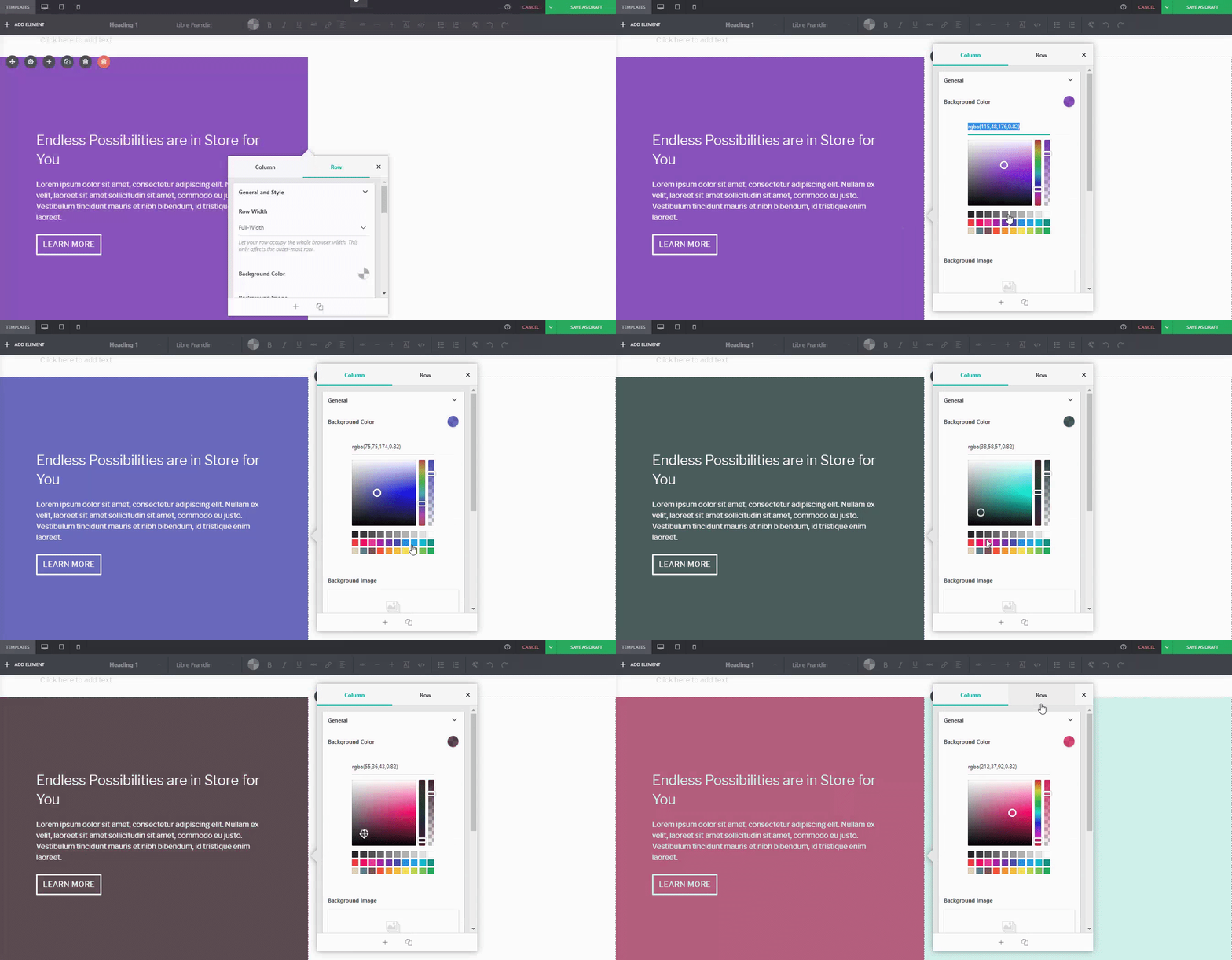
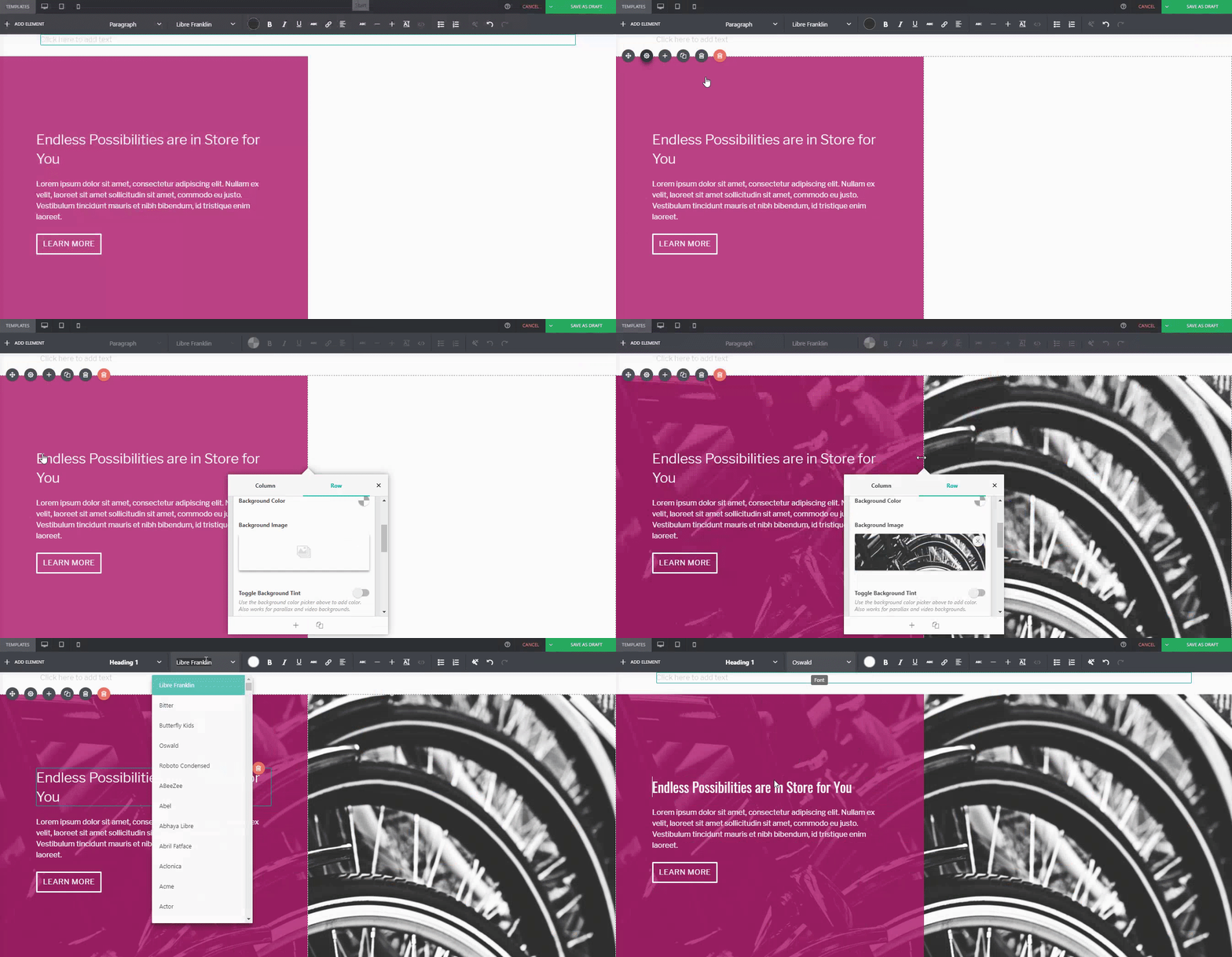


 Page Builder Sandwichを一般公開してから10ヶ月が経ちました。現在、有効インストール数は約6,000件に達しており、私たちにとって大きな成果となっています。その過程で、良い意見も悪い意見も含め、非常に多くのフィードバックをいただきました。しかし共通しているのは、他のページビルダーと比較して、レイアウトの構築やコンテンツの作成がいかに簡単であるかを皆さんが気に入ってくださっている点です。

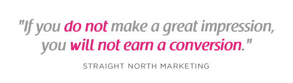
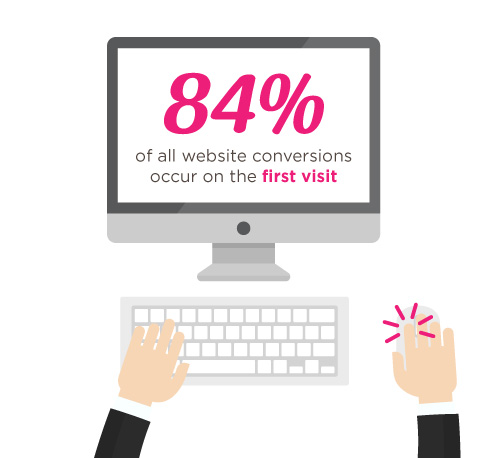
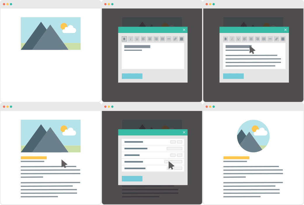
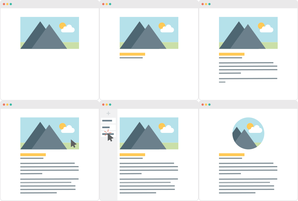



 昨年1月のバージョン4.0リリース後も、修正と改善の両方を加えながらPBSの開発を継続してきました。皆様にお届けできることを楽しみにしています。今回のバージョン4.1アップデートの主な内容をご紹介します。


 New in Page Builder Sandwich is the