
If there’s one thing you need to remember when building a website, it’s to never take good design for granted.
As we’ve mentioned in a previous article, a site visitor’s first impression on your website can make or break you in just a matter of seconds.
In other words, if they don’t like what they see within that timeframe, chances are they’re going to close their browser windows and direct their attention elsewhere.
Fortunately, there are a lot of ways to prevent this from happening; one of them is to familiarize yourself with good web design practices. And the good news is you don’t need to be a professional web designer in order to do so.
Because while it’s true that not everyone has a good eye for design, preventing bad design becomes easier once you know what to avoid.
Иймээс вэб дизайны эдгээр нийтлэг 4 алдааг анхаарахаа мартуузай. Ингэснээр та вэбсайтаа эцэст нь бүтээж эхлэхдээ санаа зовох зүйл нэгээр цөөрөх болно.
Алдаа №1: 3-аас дээш фонт ашиглах
A rule of thumb when designing websites? Try not to have too much visual elements going on within your space. Having more than 3 fonts on your site design is a surefire way to break this one rule. It’ll also overwhelm your site visitors.
Вэбсайтынхаа фонтыг цөөн буюу 3 хүртэл байлгах нь мэргэжилтнүүдийн баримталдаг дизайны нийтлэг дүрэм юм. Түүнчлэн энэ нь таны сайтын уншигдах чадвар болон уялдаа холбоог сайжруулдаг бөгөөд энэ нь таны сайтын хандалтын амжилтад чухал ач холбогдолтой юм.
DON’T DO THIS:
Don’t use more than 3 fonts and try to avoid “fancy fonts” as much as possible. These tend to make your site look unprofessional and outdated.

DO THIS:
Use only 2 fonts, or a maximum of 3 if you have to. Notice how the page below looks clean and sleek, all while keeping readability and consistency all throughout the design.
Try comparing the differences between this example and the previous one. The example below with only two fonts is a website that your visitors will likely take seriously. This previous one above with the overwhelming amount of fonts isn’t.
Mistake #2: Failing to Use White Space
White space is one of the most important aspects of web design. But what is it?
Put simply, white space is literally the empty space between elements in a composition.
In other words, it’s negative space. This pertains to anything on your website that isn’t filled with text, photos, or other design elements.
Now, the problem arises when website owners want to fill all of the white space in, which is an absolute no-no.
White space matters because it gives your site visitors and readers some breathing space when going through your site. Just how it was mentioned in the first design mistake to avoid, overwhelming your website with too much design elements is more than enough reason for your site visitors to leave and for your traffic to decrease significantly. It also makes for poorly executed design.
DON’T DO THIS:
In the example below, take a look at how the text is nearing the edges of the purple section’s margin. Notice as well how all elements leave almost zero room for white space.

DO THIS INSTEAD:
 Give your site readers some room to breathe. If adding in long paragraphs is unavoidable, just remember to always take the rules of spacing into account—they’re pretty easy to remember anyway ?. It will leave your page looking cool, crisp, and professional.
Mistake #3: Designing Websites With Zero Flow in Your Site’s Content
It’s important to pay attention as to how information on your website is presented. Moreover, site content should generally follow a logical flow, taking the site viewer’s intuition into consideration.
Бид юу хэлэх гээд байгааг ойлгохын тулд доорх хоёр жишээг харна уу.
DON’T DO THIS:
Unless you’re a graphic designer by profession, it’s probably not a good idea to experiment with the standard flow of your website’s sections.
Below, you can see that the site’s design lacks both visual and logical flow; everything is all over the place. You don’t want your audience having a hard time navigating through your site, either. This is another surefire way to do it.

DO THIS INSTEAD:
Notice how the sections of the website flow depending on what actions the visitor is most likely to take.

Дизайн нь ойлгомжтой бөгөөд логик дараалалтай: Нэгдүгээрт, байгууллага өөрийгөө танилцуулж, юу хийдэг, ямар чиглэлээр ажилладаг зэрэг суурь мэдээллийг үзэгчдэд өгдөг. Хоёрдугаарт, найдвартай тоо баримтуудыг нэмж итгэл үнэмшил бий болгодог. Эцэст нь, вэбсайт нь үзэгчдэд холбоо барих дугаар болон арга хэмжээнүүдийн жагсаалтыг өгч, тэднийг үйлдэл хийхэд уриалдаг.
Mistake #4: Trying to Fit in Every Bit of Information Onto Your Website
Цагаан зай байх ёстой хэсэгт хэрэггүй их хэмжээний текст оруулах нь таны үзэгчдийг үргээж болзошгүй. Зөвхөн чухал нарийн ширийн зүйлсийг үлдээхээ мартуузай.
Studies find that readers only visit 20% of your webpage; everyone else outside that percentage will probably just scroll through your site.
DON’T DO THIS.
Don’t overwhelm your visitors with inconsistent, giant walls of text, especially if it means having to sacrifice your website design’s cohesiveness and structure.

DO THIS INSTEAD:
Keep your copy short and concise, and take out chunks of unecessary text if you can help it. Only keep vital information that your site visitors absolutely need to know.

Conclusion
Website design is important, and can be a huge deciding factor in whether or not you gain site traffic.
Үүнийг бүү хөнгөнөөр хүлээж аваарай. Үргэлж судалгаа хийх цаг гаргаж, таныг чиглүүлэх дизайны нийтлэлүүдийг хайж уншаарай. Тэгвэл удалгүй та өөрийн сайтын хандалт өсөж байгааг харах болно. ? Амжилт хүсье!
Design in less time!
Check out how much faster Page Builder Sandwich let you design your web pages.
Try Live Preview
This week’s useful resource:
CANVA has hundreds of resources that you can access on their website. Apart from useful and easy-to-follow design tips, they also have photo editing tools, graphs, and a wide range of useful resources you can use for your creative projects.
Дараагийн дизайны төсөлдөө зориулж Canva-гийн гаргасан энэхүү гайхалтай Өнгөний гарын авлагыг сонирхоорой.

 Бид Page Builder Sandwich-ийг олон нийтэд хүргэснээс хойш 10 сар өнгөрчээ. Бид одоо 6,000 орчим идэвхтэй суулгалттай болоод байгаа бөгөөд энэ нь бидний хувьд том амжилт юм. Үүний үр дүнд бид сайн, муу маш их санал сэтгэгдэл хүлээн авсан. Гэсэн хэдий ч нийтлэг санал дүгнэлт нь хүмүүс зах зээл дээрх бусад хуудас бүтээгчидтэй харьцуулахад бүтэц (layout) угсрах, агуулга үүсгэхэд хэр хялбар байгаад сэтгэл хангалуун байдаг явдал юм.


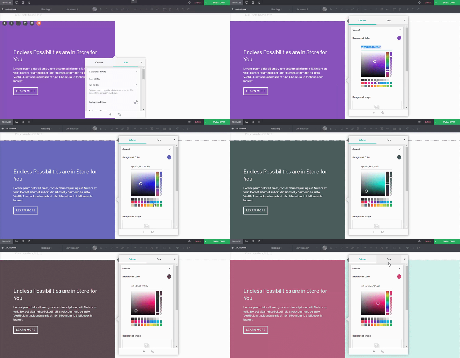
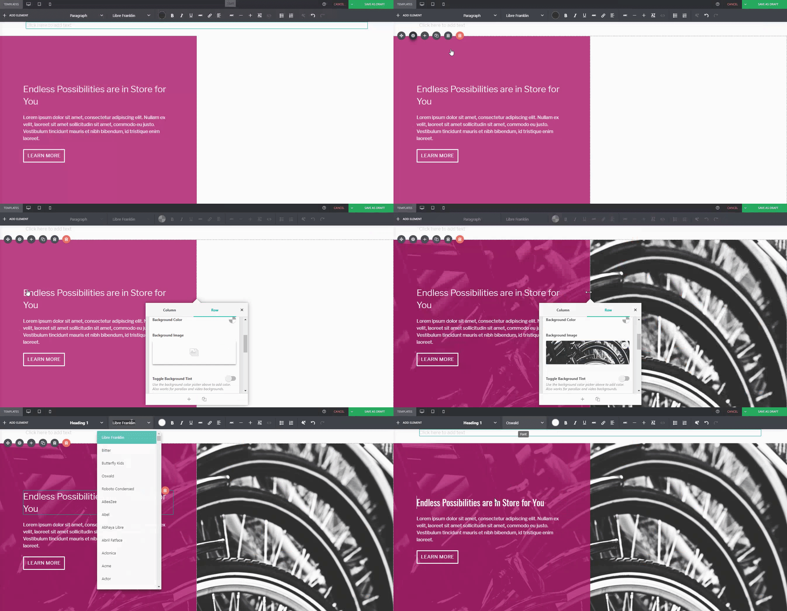






 Өнгөрсөн нэгдүгээр сард 4.0 хувилбар гарснаас хойш бид PBS-ийн хөгжүүлэлт дээр үргэлжлүүлэн ажиллаж, алдаа засалт болон сайжруулалтуудыг нэмсээр ирсэн. Бид тэдгээрийг та бүхэнтэй хуваалцахдаа баяртай байгаа бөгөөд 4.1 хувилбарын шинэчлэлтэд юу бэлдсэнийг сонирхуулъя.


 New in Page Builder Sandwich is the