The parallax scrolling effect is a design technique that’s relatively new in development and web design. Over the past few years since it’s hit the scene though, it’s grown pretty popular in its own right, and with good reason, too.
视差滚动的定义
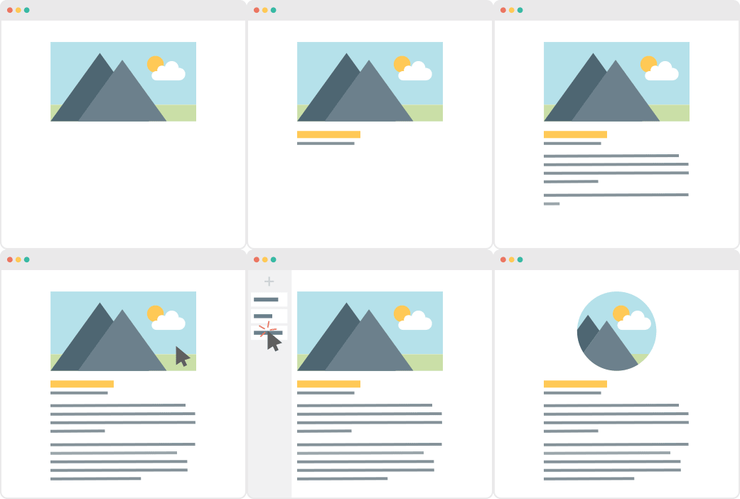
Parallax scrolling is a technique wherein your web page’s background image scrolls at a slower rate compared to the foreground image. It gives the user a unique sense of depth and action while scrolling through a page when used on a website.
Without Parallax Scrolling
The elements of the web page – the text, images, buttons, etc – all scroll at the same rate as the background.
With Parallax Scrolling
The background image scrolls at a different rate as the rest of the elements in the page.
Parallax scrolling as used in a version of Super Mario Brothers. Notice how the hills in the background move in slightly varying speeds, as compared to Mario and the other characters in the foreground.
In other words, if they don’t like what they see within that timeframe, chances are they’re going to close their browser windows and direct their attention elsewhere.
Fortunately, there are a lot of ways to prevent this from happening; one of them is to familiarize yourself with good web design practices. And the good news is you don’t need to be a professional web designer in order to do so.
Because while it’s true that not everyone has a good eye for design, preventing bad design becomes easier once you know what to avoid.
A rule of thumb when designing websites? Try not to have too much visual elements going on within your space. Having more than 3 fonts on your site design is a surefire way to break this one rule. It’ll also overwhelm your site visitors.
Don’t use more than 3 fonts and try to avoid “fancy fonts” as much as possible. These tend to make your site look unprofessional and outdated.
DO THIS:
Use only 2 fonts, or a maximum of 3 if you have to. Notice how the page below looks clean and sleek, all while keeping readability and consistency all throughout the design.
Try comparing the differences between this example and the previous one. The example below with only two fonts is a website that your visitors will likely take seriously. This previous one above with the overwhelming amount of fonts isn’t.
Put simply, white space is literally the emptyspacebetween elements in a composition.
In other words, it’s negative space.This pertains toanything on your website that isn’t filled with text, photos, or other design elements.
Now, the problem arises when website owners want to fillall of the white space in, which is an absolute no-no.
White space matters because it gives your site visitors and readers some breathing space when going through your site. Just how it was mentioned in the first design mistake to avoid, overwhelming your website with too much design elements is more than enough reason for your site visitors to leave and for your traffic to decrease significantly. It also makes for poorly executed design.
DON’T DO THIS:
In the example below, take a look at how the text is nearing the edges of the purple section’s margin. Notice as well how all elements leave almost zero room for white space.
DO THIS INSTEAD:
Give your site readers some room to breathe. If adding in long paragraphs is unavoidable, just remember to always take the rules of spacing into account—they’re pretty easy to remember anyway ?. It will leave your page looking cool, crisp, and professional.
Mistake #3: Designing Websites With Zero Flow in Your Site’s Content
It’s important to pay attention as to how information on your website is presented. Moreover, site content should generally follow a logical flow, taking the site viewer’s intuition into consideration.
查看下面的两个示例,了解我们的意思。
DON’T DO THIS:
Unless you’re a graphic designer by profession, it’s probably not a good idea to experiment with the standard flow of your website’s sections.
Below, you can see that the site’s design lacks both visual and logical flow; everything is all over the place. You don’t want your audience having a hard time navigating through your site, either. This is another surefire way to do it.
DO THIS INSTEAD:
Notice how the sections of the website flow depending on what actions the visitor is most likely to take.
Mistake #4: Trying to Fit in Every Bit of Information Onto Your Website
在原本应该留白的地方添加大量不必要的文本可能会赶走你的受众。请记住只保留重要细节。
Studies find that readers only visit 20% of your webpage; everyone else outside that percentage will probably just scroll through your site.
DON’T DO THIS.
Don’t overwhelm your visitors with inconsistent, giant walls of text,especially if it means having to sacrifice your website design’s cohesiveness and structure.
DO THIS INSTEAD:
Keep your copy short and concise, and take out chunks of unecessary text if you can help it. Only keep vital information that your site visitorsabsolutely need to know.
Conclusion
Website design is important, and can be a huge deciding factor in whether or not you gain site traffic.
CANVA has hundreds of resources that you can access on their website. Apart from useful and easy-to-follow design tips, they also have photo editing tools, graphs, and a wide range of useful resources you can use for your creative projects.
Only a few weeks ago, we released PBS Version 4.1. This update included tweaks on the formatting bar and some text formatting updates, among others. For Version 2.0 though, while we made additional features, we decided to focus more on PBS’ overall performance.
200% Performance Increase & A Little Help from CodeInWP
With Page Builder Sandwich you won’t also lose your content and will be able to continue updating the page easily via a default WordPress editor.
读到这些内容促使我们的团队进一步改进 PBS。而且,既然我们没有被列入名单,我们同时也很好奇我们具体有哪些不足之处。随后不久,我们联系了 CodeInWP,希望他们能对 PBS 给出一个简短的评测,特约作者 Ann Taylor 给予了我们非常具有建设性且有用的回复:
“…I played around with a free version a bit. It shows a lot of promise: lots of modules, pretty intuitive UI, great WYSIWYG experience, everything is dragged around easily. However, when I had around 10 modules on the page, it became hard to continue working with it because of low editing speed…”
Since all of the Featurette Elements are pre-designed, all you’ll have to do is simply drag the “Featurette” button from the Elements Tab, and choose what you want to add on your workspace from there.
Keeping your audience reeled into your page (and successfully generating leads) is a different story altogether, though.
Don’t get us wrong. Lots of sites can achieve this without a worry, but that’s usually because they spend a significant amount of time and research doing just that.
In contrast, some sites admittedly have a little trouble pulling it off, and more often than not, some of them don’t know where to begin. But don’t worry – Page Builder Sandwich will try to lend you a hand with that very same thing.
Why is it Important to Generate Leads?
One crucial thing to remember is that generating leads takes more than just buying a domain and setting a website up.
Now, before we get too into it, take note that Page Builder Sandwich isn’t a marketing website.
Great question! A few weeks ago we began corresponding with Straight North, a blog that specializes in digital marketing and lead conversion. They’ve given us some really tips which we hope you guys find helpful in your site-building journey.
Now, remember thatthere could belots of factors as to why your website isn’t generating the amount of leads you’d like. The first step is toidentify what these factors are, and hopefully, this list can help you out with doing just that.
TIP #1: Create Content that Stimulates Action
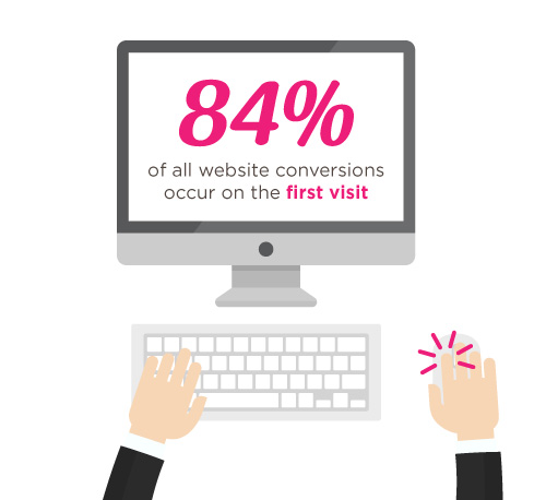
According to Straight North, 84% of website conversions occur on the first visit, and only 11% convert in the second.
换句话说,第一印象至关重要。
就像糟糕的试镜不会让演员获得主角一样,用户对你网站的初次访问可能会决定你的成败。
That’s why it’s you and your team’s job to try and convince people to stay glued to your page.
Straight North suggests that posting copy and content (both text and images) is a great way to catch your visitors’ attention. Remember to always allot sufficient time to research on what makes good copy and good content, and never underestimate either.
Wow your site visitors by using interactive PBS elements like the Carousel, or use Parallax Scrolling, and Video Backgrounds to catch their attention. Remember to execute their placement in a balanced way though, as to not overwhelm your audience.
TIP #2: Intuitive Navigation
In the realm of web development and site-building, intuitiveness in the user interface (or UI) is key.
This means that when your visitors or users find their way around your site byintuition (i.e. easy site-navigation and straightforward instructions), they’re more likely to stay glued on your site.
Straight North adds thatgetting too “clever and creative” with navigation labels is a bad idea,and suggest that you use terms like “Contact Us” for call-to-action buttons, rather than using vague labels like “Interact!” or “Dialog.” Remember thatbombarding your site with too much jargon can cause frustration to your audience as well.
So as long as navigating through your website comes to the user assecond nature, then you have one less thing to worry about when trying to convert leads.
How PBS Can Help:
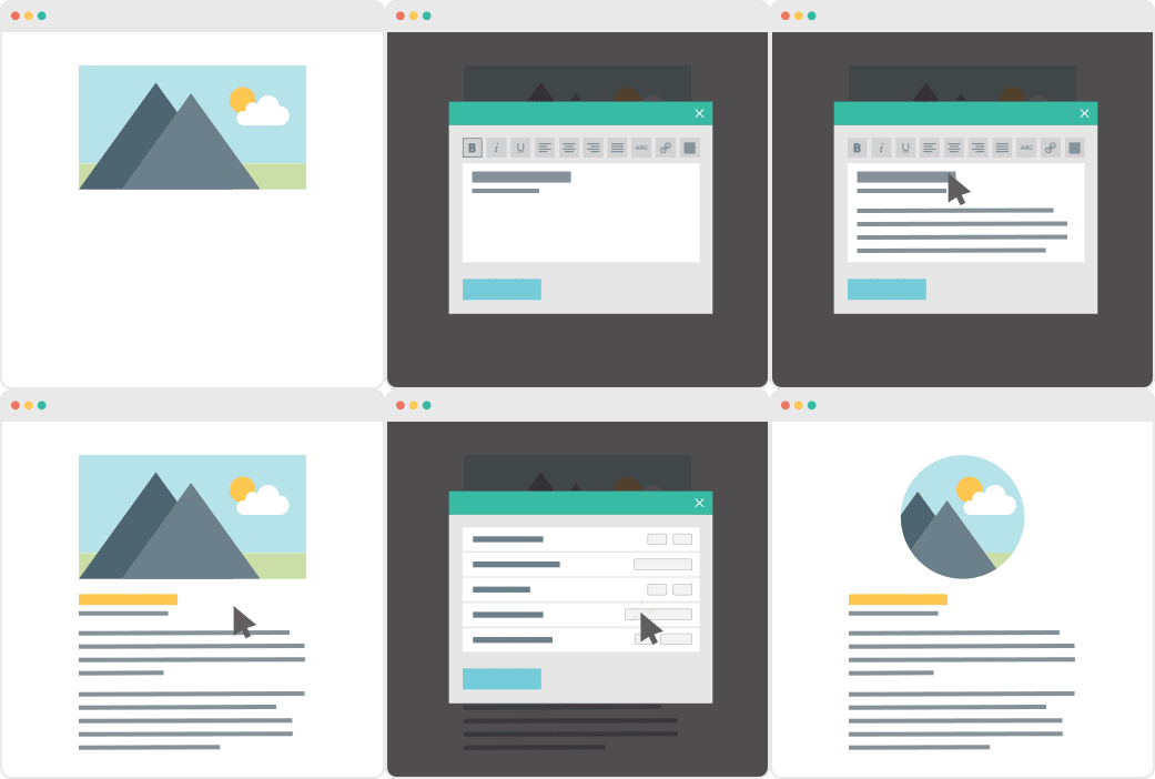
Page Builder Sandwich’s UI is highly intuitive, and is akin to using a Word processor (like Google Docs and Microsoft Word). Check out ourdemo to get some inspiration on how you can apply intuitive changes to your site, too!
OTHER PAGE BUILDERS
…have too much stuff going on.
PAGE BUILDER SANDWICH
…gets straight to the point.
TIP #3: Use Relevant, Custom Imagery
Your images and how they’re presented also matter, and they matter a lot.
While it may seem trivial to some, uploading boring stock images, stretched out/pixelzed photos, or badly-presented typography is a huge factor that dictates whether your visitors stay on your site, or move to a better, more credible-looking alternative.
How PBS Can Help:
Because it’s WordPress-run,PBS lets you post high-quality photos in your website. As long as you have the right image dimensions, you shouldn’t have a problem with posting photos.
Additional lifehack: You can also check out Pexels.com and Unsplash.com to get awesome, high-quality stock photos!
TIP #4: Persuasive Credibility Elements
Skepticism is ahuge conversion killer.
That’s why more often than not, it’s always a good idea to add in elements that back up your credibility as a website (or business), like testimonials from credible sources, and logos of reputable companies or groups that you’ve worked with.So use customer testimonials, show logos of well-known customers, and include third-party mentions in your content.
How PBS Can Help:
Use PBS features to vouch for you. Display your customers’ testimonials in a Carousel, or use the Featurette element to showcase third-party mentions, or make use of the column element to effectively display logos of your well-known customers (like in the graphic above).
TIP #5: Get Personal!
Straight North says thatusing a lighter, casual tone makes all the difference when writing content (such as articles and bio’s) on your site. This lets your users know that you’re human too, and not just some bot trying to get a run for their money (which we hope you aren’t).
How PBS Can Help:
While this part is entirely up to you and your team, it wouldn’t hurt to use elements such as the Featurette, Gallery, and Image Box to liven up your bio’s as well. Adding in other PBS elements like Social Media Icons can help put a personal touch to your pages, too.
PBS’ Industry Template makes full use of the Image Box Elements for its About Us and Feature Sections.
TIP #6: Irresistible Calls-to-Action
Calls-to-Action (CTA) are a crucial part of generating leads.
You will FAIL to capture first-visit conversions unless you ASK. – Straight North
Just asking isn’t enough, though. According to Straight North, your calls-to-action should be executed both “skillfully and persuasively”.
The trick is to have effective Calls-to-Actions plus a good combination of smart consistent placement, offers that give off substance, time-sensitive offers (giving them offers for a set, limited time will give them a sense of urgency), and most importantly, guaranteed offers.
You want your site to trust you. “Take away all arguments for delay, and conversions will increase”, Straight North says.
How PBS Can Help:
PBS’ Call-to-Action Button – as well as other elements such as the Countdown and Page Heading element – can help ease your burden regarding this task.
Executing them correctly is up to you and your team though, so make sure to give time to research about CTA placements and other marketing tips.
This is why placing user-friendly contact forms on your site is of the utmost importance. They’re the ultimate “make-or-break stage of a great conversion opportunity”, says Straight North.
A couple of PBS’ third-party plugins available for shortcode mapping
So don’t intimidate your site visitors by overwhelming them with too many question forms, or have them exhaust too much energy, like having them type long sentences instead of choosing their answers from a drop-down list.
Letting them know that you value their privacy is also a must. Be sure to place clean, good-looking forms on your site so as to boost credibility.
PBS’ Full Page Niche-Based Templates have fields that let you feature phone numbers and other contact information more prominently, so that your visitors can reach you right away.
TIP #9: Continuous Testing
Straight North attests to the importance of site maintenance and testing: “No matter how good your website is in converting leads, it can always be better.”
This one is up to you, but if you’d like a tip: the PBS Team continuously tests the site and page builder for any bugs, and always work to make sure you guys are satisfied. We don’t exactly have a feature for making sure you do regular tests on your site, so this one’s entirely up to you and your team.Do it, and do it well!
TIP #10: Mobile-Friendly Design
Almost everyone has a cellphone or tablet; but whileonly 23 percent of lead conversion rates comefrom mobile devices, it absolutely will not do to ignore any sort of potential conversions, no matter the percentage (leads are still leads, after all).
“Users converting from desktop view may have seen the site initially on a mobile device,” Straight North says. “Mobile conversions are (also) likely to grow as mobile Internet access continues to soar at the expense of desktops.”
You can preview your site on mobile view directly on desktop
How PBS Can Help:
Page Builder Sandwich is Mobile Responsive. You can view PBS-built sites on mobile, as well as check previews of your mobile site directly through desktop while editing. This way, you won’t have to keep switching to your phone in order to check if your site looks good on mobile.
Everything Matters in Site-Building
At the root of it all, it’s very, very important to understand that everything on your website – down to the smallest of details – has an impact on your audience.
The quality of your copy, images, your layout – all of it matters, and it matters a lot.
We’ve been getting quite a few inquiries the past week about Pre-Design Sections (and by extension, the PBS Templates), what they are, and how they can be accessed.
So in this article, we’ll be teaching you how to not only access them, but also how to maximizethese features of Page Builder Sandwich: By customizing them and making them your own.
Accessing the Pre-Designed Sections
If you aren’t familiar yet, all you have to do to access the Pre-Designed sections is to hover your mouse onto the left side of your screen, and access the Elements Inspector. This is the sidebar that lets you drag and drop elements directly onto your content area.
Say hello to the Elements Inspector!
Once it’s accessed, simply scroll down to the bottom and select Pre-Designed Sections. A library of the sections will pop up. Select one from the collection, drag and drop, and it’ll show up on your content area, like so:
From here, you can move the elements within the section around, or move the entire thing and adjust its position. And there you have it! You’ve selected a Pre-Designed Section from Page Builder Sandwich.
Now it’s time to add in your own twist:By customizing and tweaking with the elements’ settings within the selected section.
Customizing the Pre-Designed Sections
Each element’s setting within any one Pre-Designed section can be edited and customized according to your website’s needs and your personal taste.
This means everything included in your selected Pre-Designed section – like text, colors, images, buttons,everything– can be edited and tinkered with byyou.
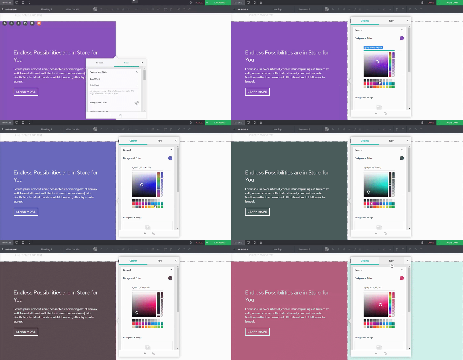
举例来说,如果您对下方默认预设计板块中的默认蓝绿调和麦田图片不满意……
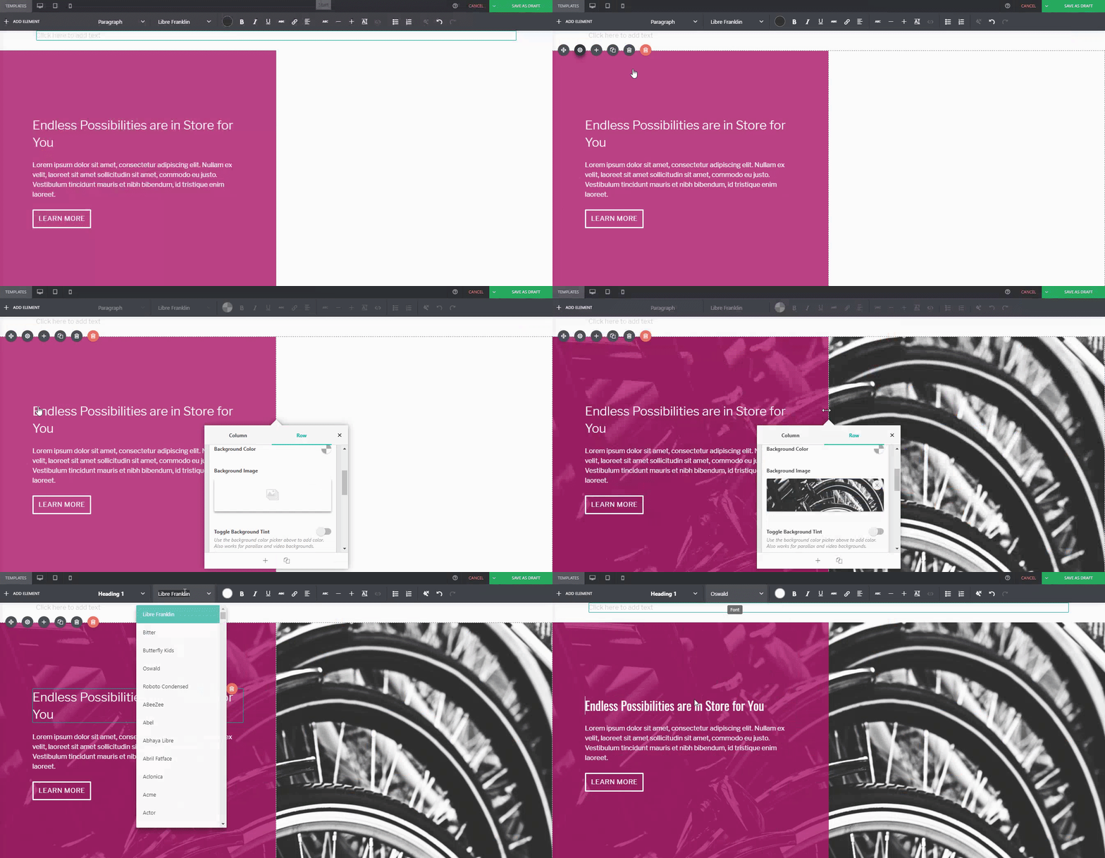
You can adjust it. For instance, if I wanted a different background tint on the left:
Or if you wanted to replace the image of the wheat field on the right:
Or even change thebutton style, margin, padding, andfont:
…You can.
作为对比:
Default PBS Pre-Designed Section
The same Pre-Designed Section, completely tweaked and customized. Notice the different font, color scheme, button style, photo, and margin width. You can actually take this further, and let your imagination run wild.
Here are a few more examples on how you can spice up our Pre-Designed Sections
DefaultPre-Designed Section from Sandwich
The same Pre-Designed Section, customized
You can do it with our Full-Page Templates, too:
DefaultTemplate from Sandwich
The same Template, customized
Conclusion
Page Builder Sandwich 的预设计板块远比你想象的更强大。
Tweak and customize them to make them completely your own, or even use them as a starting point for when you don’t want to design your page from the ground up.


 在


 自去年1月发布4.0版本后,我们继续致力于PBS的开发,不仅修复了问题,还进行了多项改进。我们很高兴与大家分享这些更新,以下是我们在4.1版本中为大家准备的内容。
 想象一下:你的第一个 WordPress 网站终于上线并运行起来了。几个月来,你从未感到如此有成就感。你给了自己一个应得的鼓励,帮助你收获劳动果实的人们也是如此。你安装了所需的插件,并开始规划网站的未来。前景看起来一片光明,一切进展顺利。