Tag: page builder sandwich

  • How To Customize Page Builder Sandwich’s Pre-Designed Sections On Your Own

    We’ve been getting quite a few inquiries the past week about Pre-Design Sections (and by extension, the PBS Templates), what they are, and how they can be accessed.

    So in this article, we’ll be teaching you how to not only access them, but also how to maximize these features of Page Builder Sandwich: By customizing them and making them your own.

    Accessing the Pre-Designed Sections

    If you aren’t familiar yet, all you have to do to access the Pre-Designed sections is to hover your mouse onto the left side of your screen, and access the Elements Inspector. This is the sidebar that lets you drag and drop elements directly onto your content area.

    Say hello to the Elements Inspector!

    Once it’s accessed, simply scroll down to the bottom and select Pre-Designed Sections. A library of the sections will pop up. Select one from the collection, drag and drop, and it’ll show up on your content area, like so:

    From here, you can move the elements within the section around, or move the entire thing and adjust its position. And there you have it! You’ve selected a Pre-Designed Section from Page Builder Sandwich.

    Now it’s time to add in your own twist: By customizing and tweaking with the elements’ settings within the selected section.

    Customizing the Pre-Designed Sections

    Each element’s setting within any one Pre-Designed section can be edited and customized according to your website’s needs and your personal taste.

    This means everything included in your selected Pre-Designed section – like text, colors, images, buttons, everything – can be edited and tinkered with by you.

    So for instance, if you’re not happy with the default blue-green tint and the wheat field image in the default Pre-Designed section below…

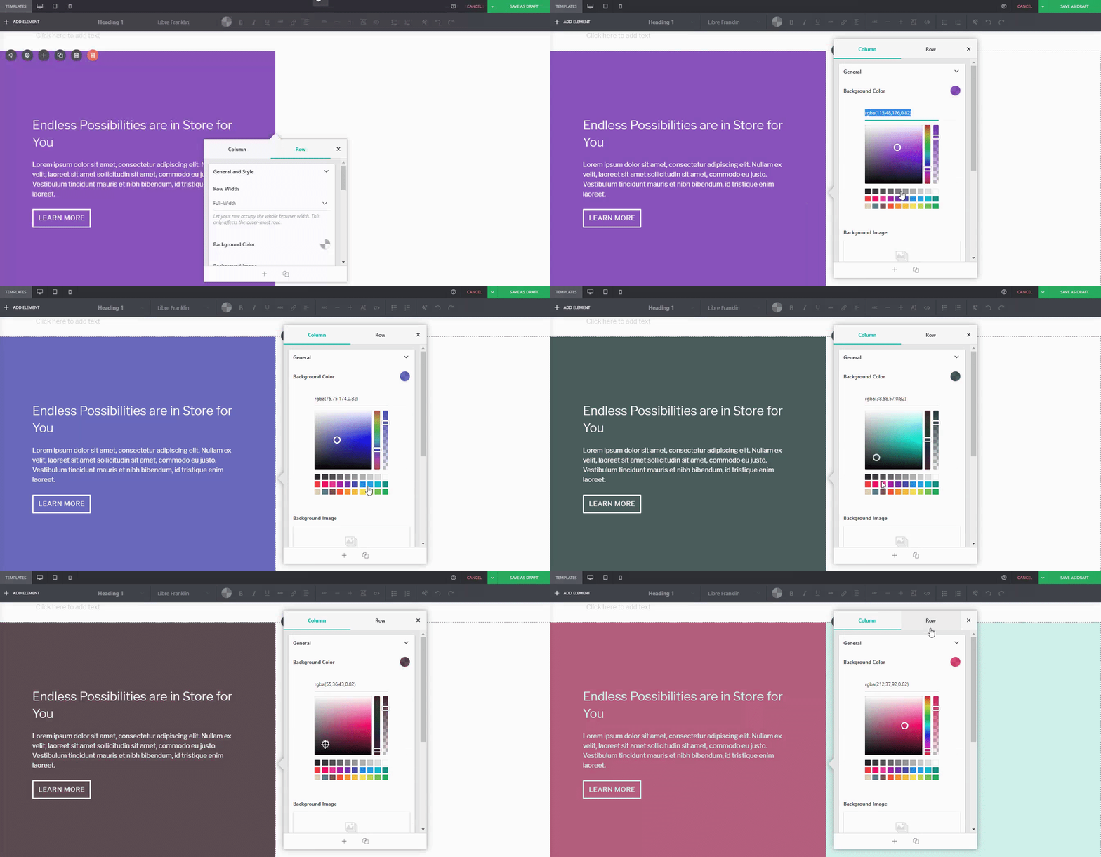
    You can adjust it. For instance, if I wanted a different background tint on the left:

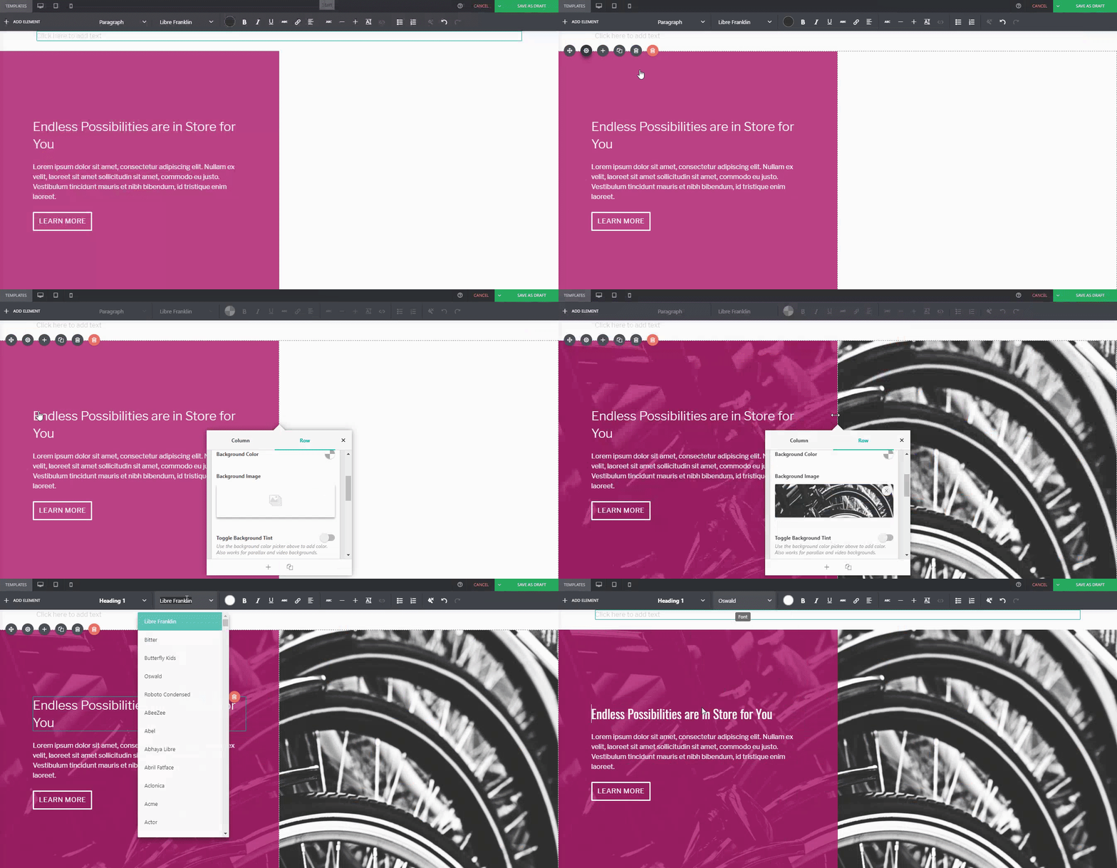
    Or if you wanted to replace the image of the wheat field on the right:

    Or even change the button style, margin, padding, and font:

    …You can.

    For comparison:

    Default PBS Pre-Designed Section

    The same Pre-Designed Section, completely tweaked and customized. Notice the different font, color scheme, button style, photo, and margin width. You can actually take this further, and let your imagination run wild.

    Here are a few more examples on how you can spice up our Pre-Designed Sections

    Default Pre-Designed Section from Sandwich

    The same Pre-Designed Section, customized

    You can do it with our Full-Page Templates, too:

    Default Template from Sandwich

    The same Template, customized

    Conclusion

    There’s more to Page Builder Sandwich’s Pre-Designed Sections than you think.

    Tweak and customize them to make them completely your own, or even use them as a starting point for when you don’t want to design your page from the ground up.

    Remember, Page Builder Sandwich is here to help you design in less time. Making full use of our Pre-Designed Sections and Full Page Templates will help you do just that.

    Design in less time!

    Get access to Sandwich’s Pre-Designed Sections, Templates, and a whole lot more.

    Try Live Preview
  • Social Media Strategy: Its Important Role in Site Building

    social-media-strategy-its-important-role-in-site-building

    A few decades ago, scientists and professionals kept racking their brains out trying to find a better alternative to snail-mail. We had beepers for a while, as well as those too-large cellphones we couldn’t keep in our pockets. But while nostalgic at best, technology from the past is most definitely no match to the communication methods of the 21st century. Now, in the year 2016, our friends, family, and colleagues, can be contacted in a little more than a second. As the cliche goes: “Everything’s literally at the touch of our fingertips”. Literally.

    Slowly veering away from tradition?

    It’s hard to deny just how much traditional routines we’ve had to give up due to the fast-paced innovations of today. It’s taken us a bit of getting used to (especially for the older generations), but truth be told, this isn’t exactly a bad thing. In fact, it’s the opposite.

    For example, in 1993, the amount of time and effort it would take a baker to inquire about a new oven model would usually take weeks, if not months. Now, the same task can be achieved in 2016 by simply browsing the oven manufacturer’s website. Additionally, if the same oven company announces they’re going to have a sale the following weekend, and the baker wants to tell their friends about it, all they’d need to do is post about it on Facebook, Twitter, or other popular social media websites. In this day and age, we’ve all succumbed to this routine at some point in our lives, so we’re pretty confident that you’re familiar with the process.

    Case in point, social media is a great way to get word out in the open about almost anything. Its influence today is incredibly powerful, and because of this, your presence online can be a key factor to the success of your site-building journey, as well as its maintenance. In fact, magazines regularly sold in newsstands— like Time and The Economist– have their content available both through physical copies and online ones, which ensured reaching an even broader audience. Likewise, if an influential person coming across your site, and find that they love your content (or at least find it relevant enough to share), they’ll most likely be spreading your content through other social media outlets as well.

    Keep in mind though, that it doesn’t exactly need to take a person of influence to spread word about your site; merely sharing your stuff by yourself (or with the help of a few others) via social media can open a lot of doors for you too, whoever your target audience may be. In fact, an article from BrandWatch.com cites that 2.3 billion people (out of the world’s total population of 3.17 billion) are present in social media.

    That’s a lot of people. Rest assured, your target audience is going to be in that demographic.

    Extending Social Media’s Functionality

    Apart from getting your content out in the open, social media’s relevance also extends to staying up-to-date with the latest trends in any audience or market. This will hold especially true when gauging what your audience’s wants and needs are, and will extend further into how you can reach and cater to them better; remember, reaching out is always and important factor to your site’s success.

    While you may not magically gain 15,000 followers on the first month or even in the first years of your site, having an online presence active on social media accounts will surely give you a significant boost in the long run, one way or annother. Remember: Rome wasn’t built in a day, so stay determined!

    Possibly more

    A premium video on Treehouse.com cites that compared to e-mail and traditional promo events, social media is twice as effective than any other means of reaching out to the audience. Indeed, social media remains a powerful tool that can make a huge difference in your audience reach. What’s groundbreaking with social media is that of most of the time, it’s free (and thank God for that). So use it to your advantage!

    Happy Site-Building!

  • Version 3.0: Rethinking How a Page Builder Should Work

    version-3-0-rethinking-how-a-page-builder-should-workIt’s been 10 months since we’ve unleashed Page Builder Sandwich to the public. We now have around 6,000 active installs, and that’s quite an achievement for us. We’ve gotten a ton of feedback because of it as well, both good and bad. The consensus however, is that people enjoy how easy it is to build layouts and create their content compared to the other page builders out there.

    A large amount of the feedback we got were feature requests, and we’ve added in a lot of those features the past few months. But as we kept doing so, we were also began slowly changing the user interface in the process. And, consequentially, we were also changing the user experience… for the worst. It had come to the point though that we needed to rethink the interface, because it simply did not work smoothly anymore, and the different features did not jive together with it too.

    The Defunct Interface

    In the previous versions of PBS, we wanted everything to be in the form of buttons. Why? Because buttons are easy to use. You just… click on them. On the older versions of the inspector (the sidebar on the image above), clicking a button would increase a value, then shift+clicking a button would decrease it. That sounds easy enough. But with the addition of carousels, tabs, maps and other new elements and features, all those buttons became a mash of different icons with different designs, and kinda started looking more like hieroglyphics than a cool interface. This wasn’t a problem for seasoned users, but it’s quite intimidating to look at if you’re new to PBS.

    Next, there were a couple of problems showing up on the inspector. The original idea was to make everything simple and available inside the inspector. And by everything, I meant everything – from turning text into headings, to changing background colors, font colors, you name it. In its current state however, the inspector now contains a lot of options that will have you use the mouse wheel to scroll up and down consistently. Quite different from the inspector I formerly hoped to make for users.

    Lastly, we recently introduced shortcode mapping for your favorite plugins. This feature required us to create text fields, number sliders, checkboxes, and additional new option types needed to make your shortcode editing experience more pleasant. Initially, it was a good idea, and yes, it made manipulating shortcodes easier for you. But again, this feature deviated from our “buttons only” interface. In retrospect, it was really impossible to use only buttons for changing shortcode attributes. Now, in the latest version, we ended up with 2 types of controls: the buttons and the shortcode fields.

    There are a few more reasons that made us decide that our interface was no longer effected (or suited for our needs), but the above points are the major ones. One thing was always for sure though: we knew that had to update the interface.

    Defining How A Page Builder Should Ideally Work

    Instead of jumping in and changing things right away, we took a hundred steps back to take a look at the whole page builder experience. We wanted to bring in a new life to the interface. Truthfully, we didn’t want to keep rebuilding it year after year. It’s  exhausting and definitely does not bring significant help to the WordPress community. This time, we decided to do things slowly and carefully. We’ve studied every corner of Page Builder Sandwich and what makes it a good page builder, and finally  fleshed out the whole editing experience into a few core concepts.

    Essential Concept #1: Typing Directly in your Content to Edit Stuff

    One of the main reasons for installing a page builder is to get out from the constraints of the backend text editor of WordPress. It’s not that the backend editor isn’t good, but when creating your webpages, it doesn’t immediately show you what your webpage would look like to your site visitors, nor does it allow you to layout your content outside a one-column layout. You can only see your text there and some images, but none of the more elaborate stuff (e.g. contact forms). You can add shortcodes, yes, but they won’t show up in their rendered form*.

    * There are plugins being made by others to address this such as Shortcake UI, but that’s beside the point.

    That’s where front end page builders come in. They bring the editing experience out from the backend, and into the front end, with you editing your site the way your visitors would really see it. As Pippin would phrase it: What you see is what you get (WYSIWYG).

    Another good thing about being a frontend editor is that it allows you to edit your text directly. Typing in headings and paragraphs gives the ease of using the usual word processor in website building. Buttons and tab labels should be also changeable by simply clicking on them and typing.

    This is the area most other page builders don’t deliver well on. Most of them force you to type inside a text field to edit everything. Again, this shouldn’t be the case in real frontend page builders. Typing and editing text directly has been a strong point of Page Builder Sandwich since version 2, and we made sure that this is still upheld in version 3.

    Essential Concept #2: Utilizing the Mouse for Quick Tweaks

    The mouse is a powerful tool that often gets neglected in page builders. Often times, page builders use it to allow people to drag stuff around and drop them in different locations, or to click on buttons or input fields. While this is okay, there is so much more that you can do with the mouse in terms of page building.

    For one, there is awesome visual feedback in using the mouse as the tool in editing the page, especially in adjust visual properties like margins, paddings and sizes. Now, tweaking your elements becomes a natural experience.

    In PBS version 3, you will be able to adjust a number of things using your mouse. You can adjust margins/spacings between individual elements, the paddings within your columns, as well as the sizes of images, icons and maps. We’ve also replaced buttons that allow you to change numerical values into sliders.

    Essential Concept #3: Text Should be Easy to Style

    If you take a step back from your monitor, you’ll notice that most of what you add in your webpages are text content. Yes, we do have images and icons in there to accompany them – and lately we tend to add in larger images in our sites. But the majority of the important content are all text: headings, bullet lists, paragraphs, quotes, etc. Alongside it is how we style our text to suit our designs. We either change their sizes and colors, or make it bold or italicized. This is for our content more readable, relevant, and attractive to our respective readers.

    Because we style the text often, buttons which allows us to change styles should be very accessible. They shouldn’t be tucked inside a pop up box that we need to open up first. Most page builders suffer from this sickness. In order for their user interface to be labeled as ‘clutter-free’, even the most-used options are shielded in plain view.

    To solve this, we took a look at the most commonly used word processors. We noticed that they usually have a row with a ton of buttons near the top of the screen used to format text and copied the same layout for version 3. We now have a row of all the text styling buttons always present on the top of your screen. This makes styling really quick and close to your second nature in text editing.

    Essential Concept #4: Advanced Styling Options Should be Flexible Yet Easy to Understand

    The bottom line with a page builder is that it should allow people to create stunning designs easily. This means that we should provide a lot of different settings and options without compromising a difficult learning curve. Being able to adjust margins, paddings and styling text are great, but those can only do so much. You’ll need much more elaborate options to get the job done, options like background images, patterns, borders, fixed backgrounds and more. Stacking in all of those different settings can get a little overwhelming, so we’ve simplified some of them and organized them in categories to make things friendlier in version 3.

    Essential Concept #5: Shortcode Support

    Lastly, let’s not forget that our page builder stands on top of WordPress. We should embrace the platform and its features and not restrict them or deviate from them. One huge feature that WordPress provides are shortcodes. It doesn’t mean that the whole content should be composed of shortcodes – that would be messy – but instead we should just be compatible with them. A lot of plugins and themes use shortcodes, and it would be such a loss if ignored them all. In fact, shortcodes gives the users utmost flexibility when it comes to creating pages.

    We introduced a few weeks ago our shortcode mapping system, and because of it we have mapped hundreds of shortcodes from hundreds of plugins. We have prioritized the most popular plugins found in the WordPress plugin directory, so chances are you’ll encounter them in your own sites. This has only strengthened in version 3, and we will continue to improve this on the way forward.

    Conclusion

    We’ve taken all those essential properties above and built them into Page Builder Sandwich version 3. It’s the best page builder we have built for WordPress so far. It’s more intuitive and more natural to use, it performs faster, easier to use, and more friendly than ever.

    If you have any thoughts on an essential page builder feature, let us know by commenting it below.

  • A Tour of Page Builder Sandwich Version 3

    a-tour-of-page-builder-sandwich-version-3

    We’ve changed a lot things in Page Builder Sandwich version 3. If you’ve been using Page Builder Sandwich for quite some time, you’ll notice that the changes are quite drastic. There is a big difference between the version 1, version 2, and the current version. In the previous versions, everything was located in the inspector on the side. We’ve since gone through and split its components into different, more logical partitions. We have listed reasons for this upgrade in the previous blog post.

    Current users may find the changes cumbersome at first. Give it a few minutes of trials, and we trust that you’ll feel right at home. We’ve carefully designed each aspect of the interface for your second nature in word processors to function in website building.

    Watch The Tour of The New Interface

  • Shortcode Mapper Plugin Feature: The Events Calendar by Modern Tribe

    shortcode-mapper-plugin-feature-the-events-calendar-by-modern-tribePlugins of the same category, but with respective features, are developed and enhanced every day. This gave birth to the variety of WordPress-powered websites – and later on, websites catering to several functions. For instance, there is a number of plugins which enables a developer and/or user to create, schedule, invite an interested person to an event.

    The Events Calendar is the events calendar you’ll need

    There are a lot of available events calendar in the WordPress market. So how do you choose? There are recommendation blogs, plugin face-off blogs, and of course testimonials from different users. All of these have one thing in common: they include The Events Calendar by Modern Tribe in their list.

    screenshot-2016-10-05-20-00-09
    An example of a minimal event post of The Events Calendar

    What’s with The Events Calendar, anyway?

    The Events Calendar by Modern Tribe is the frontline plugin in the said category. It provides professional quality of event posts. It has a pretty simple interface, with the title at the top, date and time, the price if applicable, a featured image and or map, and additional details about the event. You can view all your events by date, keyword, and location if Pro.

    You can do much more with The Events Calendars Pro and its official add-ons:

    The Events Calendar PRO

    • Recurring events
    • Week view
    • Photo view
    • Location search
    • Map view
    • Venue and organizer view
    • Advanced widgets
    • Additional fields

    The Events Calendar ADD-ONs

    • RSVP tickets
    • Event ticket plus via WooCommerce, Shopp, WPeCommerce, Easy Digital Downloads)
    • Community Events
    • Community Tickets
    • Filter Bar
    • Facebook Events
    • iCal Importer
    • Eventbrite Tickets

    Integrating it with Page Builder Sandwich makes it even cooler

    screenshot-2016-10-04-17-46-04Recent posts were made to highlight the benefits of using PBS and its Shortcode Mapper. This is to make sure that you guys are taking advantage of the latest innovation that the Sandwich Team can develop plus notify the plugin developers that their creation gave birth to another awesome feature.

    For the case of The Events Calendar plugin, we came up with 2 mind blowing reasons as to why the combination needs to exist:

    1.      Reviewed by WordPress plugin royalties

    The Modern Tribe assured their customers that the product and service they offered was of quality. Creator of Easy Digital Downloads, Pippin Williamson gave his inputs about The Events Calendar. Alongside him was Mark Jaquith, one of the leading WordPress developers, who made sure that the plugin was secure.

    Page Builder Sandwich was also reviewed recently by Pippin, together with the other established and rising page builders in the market. In his in-depth critique, he concluded that indeed, PBS is one of the most powerful drag-and-drop page builders. He highlighted that only  Page Builder Sandwich was able to create a functioning Shortcode Mapper.

    2.      Shortcode options: from backend to frontend editing

    By default, the plugin’s shortcode options can be accessed through the backend admin panel. Then, the same process of backend plugins takes place: go to the backend editor, input the wanted changes and then save. Only when the refresh button is clicked would the edited content be seen. All-in-all, that’s 4 steps.

    But that long procedure has been turned into a real time frontend editing by Page Builder Sandwich – in just 2 steps:

    1. Instead of going to the backend panel to access the shortcode options, click on the Shortcode Mapper and select on The Events Calendar. You’d be redirected to a pop-up window as seen below. Click on The Events Calendar.
      screenshot-2016-10-04-17-43-37
      View of The Events Calendar in the Page Builder Sandwich Shortcode Mapper
    2. screenshot-2016-10-05-19-57-11
      Close look at The Events Calendar Shortcode Properties
      The Inspector on the left displays the initial properties of the shortcode. Clicking on the “Open Editor” button, the shortcode controls displayed at the backend can now be accessed on the frontend via a pop-up window.
    screenshot-2016-10-06-13-25-04
    See? The Events Calendar looks like you’re just making an event post.

    screenshot-2016-10-06-14-37-52

    There are a lot of benefits, right?

    With the integration of a page builder that doesn’t lock you in and leaves shortcode mess, and the most popular events calendar, your workflow would not only smoothen but also increase in productivity. Additionally, you can look into what Modern Tribe offers: the bundle of plugins that go with The Events Calendar.

    So far, The Events Calendar plugin by Modern Tribe was the only one mapped in our Shortcode Mapper. This doesn’t mean however that the mapping stops there. Just comment what plugin of Modern Tribe that you would like to see in our Shortcode Mapper.

  • Shortcode Mapper Plugin Feature: WP Job Manager by Automattic

    how-to-create-a-website-from-scratch-for-under-100A month had passed since we’ve released the newest feature of Page Builder Sandwich – the Shortcode Mapper. We’ve integrated more than 100 plugins (144 plugins to be exact) regardless of the number of shortcodes they have. It was a tedious task but we did it!

    In order to let you know more about it, we’ve started featuring the plugins fully integrated with Page Builder Sandwich. First stop: WP Job Manager by Automattic.

    WP Job Manager at a glance

    screenshot-2016-09-16-03-21-46

    Basically WP Job Manager serves as the plugin for you to generate money – either you have a client who needs a job board function for their website or you simply found yourself needing more people in your growing company.

    What makes this plugin a very good-buy would be that your possible employees are not restricted to using their laptops. WP Job Manager has a mobile support feature that makes revenue flow. It is also easy to use with a search and filter interface. Along with it is the job and company information, which means no need to search the validity of the company. In one job search, everything is provided.

    If you need jobs filled in, WP Job Manager makes accepting applications an easy thing.

    Page Builder Sandwich Makes Using WP Job Manager Easier

    You don’t have to squint your eyes and squeeze out info from anything to connect the page builder and the plugin. Here are 3 things why these two are compatible with each other:

    screenshot-2016-09-16-03-24-32
    Overview of how Page Builder Sandwich and WP Job Manager work together

    Insert job shortcodes faster

    PBS Shortcode Mapper detected 6 shortcodes used in the plugin, and we’ve integrated them all. Each shortcode has different arguments which allow you to display a job search form, or specifics of a job placement. Each shortcode’s details are available in their site’s shortcode reference. Now you won’t have to check the docs on how to tweak these shortcodes, all the shortcodes and their attributes are presented in PBS complete with descriptions.

    screenshot-2016-09-15-18-58-29
    Available shortcodes from WP Job Manager

    screenshot-2016-09-15-18-54-362
    Jobs Shortcode Attributes

    It works with any theme

    Using Page Builder Sandwich as your page builder editor, by default, does not destroy the theme that you’ve chosen to use. Plus to ensure total website optimization, we’ve created the PBS Shortcode Mapper. Same principle goes with the WP Job Manager! Astoundify, one of the themes developers in ThemeForest, supports the said plugin in their Listify – WordPress Directory Theme. For more themes with WP Job Manager fully integrated, look into their official list.

    Manage jobs in the frontend

    Lessening the effort of switching between frontend and backend plus refreshing the page to see the changes made is the thing that we are against. With PBS, you can edit the jobs you picked without checking the backend, you will also be able to edit the plugin’s settings while editing your page. Without PBS, users will have to exert more effort, and it requires too much time that could be allotted for developing other WordPress projects. This feature of WP Job Manager is the one we like the most!

    Final thoughts

    Being built by the same company who created WordPress.com, this plugin has already the advantage of being on the spotlight. But it also bears a lot of expectation, from WordPress developers to loyal WordPress enthusiasts. So far, it met everyone’s needs – as far as light-weight job-board functionality speaking. WordPress developers liked the plugin so much that they even made extensions to enhance the utility of the plugin.

    More plugins would be featured in the coming weeks! If you have suggestions who and what we should write next, leave a comment below.

    See you soon!

  • 5 Reasons Why Whitespace Matters

    Reasons-Why-Whitespace-MattersBasically, whitespace, at its most basic definition, is the space around and between all the elements of a composition that is left unmarked. It’s not just a waste of screen space, as most websites owners think. When used well, whitespaces can actually provide benefits to better promote a product. It is an important key to creating good design and it makes a website better in every way.

    Although the name whitespace implies that the space is white, it doesn’t always have to be literally white. Whitespace can actually be any color—It can even have a subtle pattern or texture. It’s an area that you don’t want the eye to focus on. Alternatively, it’s called a negative space.

    So, why does whitespace matter?

    newsfeed
    Image Source: News Feed

    Reason #1: Improves readability

    Whitespace between baselines and paragraphs actually help people comfortably read all of the content on the site. Adjusting small details of your site (like line-spacing/leading or the letter-spacing) could make a huge difference in make reading easier.

    The goal is to make people want to keep reading by designing layouts that are easy on the eyes.

    hpmagicwords
    Image Source: HP Magic Words

    Reason #2: Speeds up interaction

    Let’s be honest: most of your visitors won’t have enough patience to look thoroughly when browsing through websites. When a website looks cluttered, it keeps users distracted from finding what they are looking for.

    Whitespaces should help lead the viewer around the page. Less elements competing for attention plus proper use of whitespaces can prevent distractions that slows visitors down.

    google
    Image Source: Google

    Reason #3: Drive attention to the right elements

    Whitespace can give users visual cues on where they should be looking. When used in a correct manner, whitespaces help emphasize information and draw attention to a particular area on you website.

    Remember, if everything stands out, nothing does.

    Image Source: Pocket Penguins

    Reason #4: First impressions matter

    The look and feel of a website is the main key to good first impressions. Good first impressions often leads to longer visit duration. Too little whitespace can make your website look cheap and unreliable. Visitors won’t think the site or the brand is credible unless it looks attractive. Having a good amount of whitespace helps create the right tone for your website. Whitespace can be a way to communicate ingenuity, freshness, and sometimes, elegance.

    Tip: Here’s an idea on how to make your web design simple and familiar.

    flockknitwear
    Image Source: Flock Knitwear

    Reason #5: Helps create breathing room and balance

    A balanced design doesn’t mean symmetrical. A large design element can be balanced by a few smaller once. Adding whitespace is a great way to balance different-sized design elements on your page. Create a flow so the users eyes won’t dart all over the place. A good design should be able to guide the user from one point to another without confusing the visitor.

    Conclusion

    Next time you visit a website and find yourself staying a while, think about what made you stay and read. Do you think the line-spacing makes an article easier to read? Does the experience make you want to keep coming back for more? Did you have a hard time looking for the navigation?

    Take note of the good application of whitespace on the website. If you think it can also work in your website, learn to apply and manage how much space you should allocate on your element until you think you’ve conveyed the right tone and readability without sacrificing the “flow” you want for your website.

    The ultimate goal of any website is communication. Visual appeal goes hand in hand with the success of your website.

  • 3 Things to Consider Before Diving Into Page Builders

    3-Things-to-Consider-Before-Diving-Into-Page-BuildersThere’s an off-chance you’re here because you’ve heard that PBS is quite possibly one of the quickest shortcuts to site building. While page builders, in general, exist to make things easier, there are still a few things you might want to take into account before diving deeper into this particular realm of WordPress development.

    Learning WordPress: A Crucial Page Builder Prerequisite

    This is probably the most obvious item on this list, but still the most important one. Page Builders aren’t quite purchasable on their own, unfortunately. They come in the form of plugins in WordPress, which you’ll need to install and learn in order to manipulate. Rest assured that WordPress is one of the easiest and most legitimate ways to create a website. You won’t regret knowing something technical, considering the age we are in right now. There is a difference between WordPress.com and WordPress.org, and  knowing which one caters to your need saves time too!

    If you’re a little intimidated by the abundance of some of the technical terms in this article, though, fret not. There are few helpful sites you can visit to help get you started. Some of these areWordPress Codex, and Treehouse. It houses WordPress tips  and website building, depending on your need and level of knowledge.

    You might want to test out the waters first, just to be sure

    It’s always a good idea to give free and/or trial versions a go before making any huge purchases you might end up regretting in the future. Thankfully, most page builders come with free/demo versions. Of course, we could also look into  a ton of reliable reviews about page builders while otherscompares and contrasts  page builders.  Make sure to weigh in your options carefully!

    Aside from going through articles and reviews, one of the things we like about WordPress is that it has a huge community behind it. There are individuals, teams, and even businesses, willing to lend a helping hand their fellow WordPress users, especially new ones like you! The community basically works on a pay-it-forward scheme than a give-and-take.

    Designs make a huge difference

    WordPress Enthusiast Donna Fontenot Cavalier makes a very good point regarding drag and drop Page Builders, and the importance of basic design. While drag-and-drop builders like PBS can save you a lot of time, basic know-how and at least some familiarity in aesthetics is another crucial thing to consider when creating websites. Imagine a scenario– let’s say you get your hands on a nifty page builder of your choice: that’s great! But then let’s say you’re a person who doesn’t exactly have the best eye for art, design and functionality: uh-oh.

    Don’t worry, though. Page Builder Sandwich isn’t just a Page Builder; our team is also dedicated to giving other WordPress users a hand, too. So if you’re dealing with a bit of trouble regarding design, don’t worry– we have a bunch of articles here on the PBS Blog with a lot of useful tips to help you get started. That way, you get to do more, learn more, and worry less.

    Remember, if you have any questions or concerns regarding page builders, or anything relating to the items above, feel free to drop us a line in the comments section below. We’re always happy to help our customers out.

    Happy Site-Building!

  • How to Create Basic Hero Headers in 3 Easy Steps

    How-to-Create-Basic-Hero-Headers-2

    061716_PBS_Jihan_How to Create Basic Hero Headers_Done

    When your dream website finally becomes a reality, the first thing you want your audience to know is what your site’s all about. The trick to reel them in is to give them a good but quick summary of your site’s content – and the easiest way to do that is by creating a Hero Header for your page.

    What are Hero Headers?

    The purpose of the Hero Header is to visually communicate with your target audience in the fastest and most efficient way possible. You need to grab their attention quickly, in a way that it says: “Hey, this is my website, and here are the reasons it may be worth your time.”

    Typically, hero headers take up most of the space on the page, usually with large text and an equally large background image in order to give your readers a quick but firm-enough grasp as to what your website can offer them.

    To get started on your first ever PBS hero header, follow the quick steps below:

    Step 1: Insert Column and adjust Row Width

    061716_PBS_Jihan_How-to-Create-Basic-Hero-HeadersClick 1 Column below the Insert Content tab on the inspector (that thing on the left/sidebar). Make sure your caret (the blinking cursor on the text box) is inside the text box.

    061716_PBS_Jihan_How to Create Basic Hero Headers_Step-1-b_Revised-1Under the Row Properties tab, you may change the background color in order to use it as a guide for the next steps. Change Row Width from Normal to Full-Width: Retained Content Width using the toggle button shown above.

    What’s the difference between Normal, Full-Width and Full-Width: Retained Content Width?

    Row Width-Normal

    Normal – Background, text and other elements are contained within the bounds of your current theme’s row width

    Row Width-Full-Width

    Full-Width – Background, text and other elements fill the entire width of your browser window

    Row Width-Full-Width Retain

    Full Width: Retained Content Width – Only the background fills the entire width of your browser window. Text and other elements are contained within the bounds of your current theme’s row width

    In this layout, Full Width: Retained Content Width is used because the text that will be applied is centered; not full-width.

    Step 2: Adjust margin to create Whitespace

    061716_PBS_Jihan_How to Create Basic Hero Headers_Step-2-revisedIncrease the top and bottom margin by hovering the cursor on the arrow pointing to the margin you want to adjust. When the cursor turns into a double-headed arrow, click and drag down to your desired margin height. Its important to put Whitespace (also called Negative Space) between elements in a composition to create flow and help draw focus to the content on the page.

    Step 3: Add background with text and element overlays

    061716_PBS_Jihan_How to Create Basic Hero Headers_Step-3-aTo add a background image with text and element overlays, simply click the Background Image icon under the Row Properties tab, upload your desired background image, and select to apply.

    061716_PBS_Jihan_How to Create Basic Hero HeadersTip #1: For Premium users, using the Background Image Tint option, helps to provide more contrast for text, buttons or other elements. You can select a tint color and adjust its value by clicking on the Background Color icon. Both icons can be found under Background on the Row Properties tab.

    061716_PBS_Jihan_How-to-Create-Basic-Hero-Headers_Step-3-cType in the message for your header. See Text Formatting tab to adjust the style. Choose typefaces that are easy to read and goes well with the background image. Remember to show contrast from the background image.

    Tip #2: For branding elements, consider use a white or black logo so it does not clash with a colorful background image.

    061716_PBS_Jihan_How to Create Basic Hero Headers_Step-3-dYou can also add buttons by clicking on Button below the Insert Content tab.

    Don’f forget to save your work and you’re all set!

    Congratulations on making your first hero header with PBS! In case you don’t though, no need to fret; starting from scratch is arguably easier with PBS, so it shouldn’t be that much trouble.

    Happy website building!