Blog

  • #PBSUpdate: Full Page, Niche-Based Templates

    PBS Version 4.0 has been our biggest update yet, and with its release, we’ve included a new game-changing feature, the Full Page, Niche-Based Templates.

    The Full Page Templates are a set of 10 professionally designed, niche-based templates. They’re ready to use upon downloading PBS, and can be used as is, or may be tweaked to fit your taste.

    Use as a Starting Point for Your Page

    The use of templates is one of the most efficient ways to produce webpages. They’re commonly offered as a quick solution to problems regarding site design and layout, offering the user with several (usually different-themed) options to choose from. With the Version 4.0 update, Page Builder Sandwich has finally released a set of their own.

    A screenshot of one of our templates, the PBS Farm Template

    The Benefits

    PBS’ Full Page Templates are tailored to relieve the burden of designing your webpage from scratch. Each template is designed to cater to a specific niche, with each one containing elements that are suited for a particular industry. For example, the Hotel template includes features such as a Google Map, contact form, and sections that are designed to feature your hotel’s amenities. The Fashion template, on the other hand, includes a carousel where you can showcase your latest products with their prices below.

    Tweak, Tweak, Tweak

    Because the templates are pre-designed, they also ease the page building process by saving both time and resources. But if your chosen template doesn’t include a feature you might want on your page (like if you want a video background hero header for the Industrial Template), there’s no need to worry. You can simply tweak the template’s design to suit your taste and needs by adjust the elements’s properties directly from PBS.

    A section of the PBS Farm Template with tweaked colors and different photo that may cater to a different niche

    The 10 templates we currently have available (we’ll be releasing more soon!) are themed according to the following common niches and industries:

    1. Hotel Template

    • For hotels, spas, or similar business.
    • Includes video background hero header, carousel testimonials, contact form, Google Map, and more.

    2. Law/Corporate Template

    • For law firms and other corporate businesses.
    • Includes about us section, carousel testimonials, meet the team section, and more.

    3. Fashion Template

    • Use for online clothing stores and other e-commerce sites. Includes featured products carousel, call–to–action buttons, latest blogpost previews, and more.
    • Includes featured products carousel, call–to–action buttons, latest blogpost previews, and more.

    4. Farm Template

    • Ideal for subscription e–commerce sites.
    • Includes promo header, call–to–action buttons, subscription plan sections, and more.

    5. Restaurant Template

    • Perfect for restaurants and other delivery service businesses.
    • Includes hero header with space for delivery numbers, menu section, business hours section, and more.

    6. Concert Template

    • Ideal for concerts and other big events or gatherings.
    • Includes countdown, video background, affiliates section, prices section, subscription button, and more.

    7. Forum Template

    • Use for communities, small organizations, and more.Includes call-to-action buttons, about section, count up, meet the team section, and more.
    • Includes call-to-action buttons, about section, count up, meet the team section, and more.

    8. Portfolio Template

    • For photography or art portfolios, and more.
    • Includes iconified skillset section, gallery, social media buttons, and more.

    9. Industrial Template

    • Use for industrial or manufacturing businesses, and more.
    • Includes hero header with video background, about us/featured product sections, carousel testimonials, and more.

    10. Wedding Template

    • Perfect for weddings and other small intimate events.
    • Includes hero header with video background, photo gallery, RSVP section, Google Map, and more.

    Some samples of PBS’ Full Page Templates: the Law, Forum, and Hotel Templates

    The Future of Full Page Templates

    While we have 10 templates available at the moment, we’re currently in the process of making more. We want all common niches and industries covered, of course, but if you have any suggestions, feel free to drop us a line.

    Happy Site Building!

  • PBS UPDATE: Version 4.1 and Usability

    After Version 4.0’s release last January, we’ve continued working on PBS’ development, adding both fixes and improvements. We’re excited to share them with you, so here’s what we have up or sleeve for the Version 4.1 update.

    Formatting Bar Enhancements

    The latest 4.1 update revolves around the text formatting bar. Aside from resolving a lot of bug issues, we’ve also improved some stuff on the bar that should make your experience with PBS smoother and more efficient.

    Color Picker Updates

    In the earlier versions of PBS, the color picker had some issues that was somewhat of an inconvenience to the editing process, namely when it came to to editing text and text color. For v4.1 though, we’ve addressed the issue, and made new adjustments for hassle-free text editing.

    • More color swatches for easier color-picking
    • Color picker now displays transparency
    • Bug fixes with regards to editing text color

    Text Formatting Updates

    Previously, we had some buttons that you had to click repeatedly to increase a value, then hold CTRL/CMD then click to decrease. We initially thought that this was intuitive, but users have spoken that this was not obvious. We’ve fixed those inconsistencies in this update.

    • Line height now easier to access: drag the slider to adjust to your desired size, or simple input the size you want in the given space
    • The font size button was split into two buttons: decrease and increase for easier usage
    • Increase/decrease font size also more accessible, now with px as a unit of measurement for easier editing. Previously, it displays an “x” unit that really didn’t mean anything
    • The left/center/right/justify alignment buttons are now grouped together to lessen the buttons displayed
    • “Clear Formatting” button now clears the other styles (like line-height), which it didn’t do before

    Horizontal Rule Improvements

    Previously, the horizontal rule was posing some problems. With some themes, horizontal rules were so tiny that they were hard to click on. To fix this, we’ve removed the horizontal rule from the formatting bar and converted it into its own element. In addition to that, you can now also change the rule’s colors via the color picker.

    Future Updates: What’s in Store for PBS?

    Like we said, we still have new stuff (and more updates) in the works. Here’s a little sneak peak of what we have in store for you in the future:

    • Google Fonts (finally!)
    • We’re playing around with the idea of the text formatting bar being more than just a place to only format text. What if the buttons changed depending on the current context? For example, it would be pretty neat if a vertical alignment button appeared when you’re editing some text inside a column.

    What Would You Like to See in Future PBS Updates?

    We’re always down for improving PBS, so if you guys have any suggestions, hit us up! Do you have any feature requests that you’d like to add in our growing list? Anything else you think might need some adjusting in the current version? Let us know in the comments below!

    Happy Site Building!

  • Parallax Scrolling: What Is It?

    The parallax scrolling effect is a design technique that’s relatively new in development and web design. Over the past few years since it’s hit the scene though, it’s grown pretty popular in its own right, and with good reason, too.

    Parallax Scrolling Defined

    Parallax scrolling is a technique wherein your web page’s background image scrolls at a slower rate compared to the foreground image. It gives the user a unique sense of depth and action while scrolling through a page when used on a website.

    Without Parallax Scrolling

    The elements of the web page – the text, images, buttons, etc – all scroll at the same rate as the background.

    With Parallax Scrolling

    The background image scrolls at a different rate as the rest of the elements in the page.

    The User Impact of Parallax Scrolling

    The technique isn’t exactly new, though, and has actually been used in traditional animation from as early as the 1920’s. It’s also been used in a lot of classic video games, like the Super Mario brothers.

    In the realm of web design though, Nike is often credited as one of the first to use parallax scrolling in 2011. Since then, the term “parallax scrolling” (sometimes called “parallax background/s”) has become a common term among designers and developers alike, steadily increasing in popularity.

    Parallax scrolling as used in a version of Super Mario Brothers. Notice how the hills in the background move
    in slightly varying speeds, as compared to Mario and the other characters in the foreground.

    What’s In It For the User

    What’s great about the effect is that it drives users to engage with your website, heightening both user interaction and appeal. And, when done right, parallax scrolling can bring the simplest of websites to life. It can even be used to create stunning narratives that immediately draws all of the site viewers in.

    Share Your Work with Us!

    So what do you guys think? Have you used the newest parallax background feature from PBS v4 yet? Is it working to your advantage? Feel free to link us to your work, or leave some suggestions in the comments section below.

    Happy Site Building!

  • Mobile Responsiveness in PBS Version 4.0

    Getting mobile responsiveness done right can be really tricky, and when one screws it up, the results usually end up horrific. In fact, if you haven’t heard yet, Google has even started penalizing non-mobile friendly websites in April 2015. In short, mobile responsiveness is a pretty huge deal.

    So What is Mobile Responsiveness?

    A website is deemed responsive when its contents have the ability to adapt to different screen sizes and orientations when viewed on devices other than the desktop. Put more simply, if you’ve upgraded to PBS v4 and want to design or build a page, then you should have no trouble viewing them, whether you’re on your desktop, mobile phone or tablet.

    Responsiveness in Version 4.0

    In our latest update, our team has made sure that PBS’ new mobile viewing feature becomes a smoother, more responsive experience altogether: with text, images, and all other content automatically adapting to your device’s screen resolution.

    Now all headings automatically adjust according to the screen size, so that you don’t end up with huge letters when viewing your PBS-built site or page in mobile phones. To demonstrate it a little more clearly:

    Viewing Your Site in Different Screen Sizes

    To also help ensure that you you guys know what your page looks on mobile, we’ve also enabled mobile viewing through desktop. This way, if you want to check if your page looks good or not, you don’t have to go through the hassle of physically switching from phone (or tablet) to desktop. Now you can simply switch back and forth between the different screen sizes any time while designing your page.

    What’s more is you can now also tweak the spacings of your elements specifically for tablets and mobile phones.

    So what do you guys think? Yay or nay? Are there any other features we can improve on with regards to mobile? Let us know in the comments section below!

  • Introducing Page Builder Sandwich Version 4.0

    When we started developing PBS back in early 2015, we’ve always believed in its potential to surpass its limits. For the past year since its release, our team’s been working very hard, always making sure to go the extra mile in order for PBS to do just that.

    In 2016, we’ve managed to release three versions of PBS, each one surpassing their predecessors with more advantageous updates after the next. Today, in 2017, we’re finally releasing Page Builder Sandwich Version 4.0 in commemoration of its very first birthday.

    We’ll be honest: it wasn’t easy.

    But compared to its humble beginnings in 2015, we’re now confident enough to say that Page Builder Sandwich has definitely come a long way since its days in beta.

    Then vs Now

    Taking a step back and looking at the different versions that PBS went through, it has really changed for the better.  Some learning mistakes just made us cringe and laugh!

    Enhanced User Interface

    For versions 3.0 and 4.0, we’ve made some major improvements with regards to the user interface. Pippin’s insight really made a wake-up call to us!

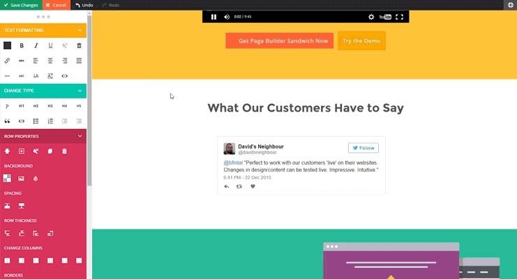
    The old interface of PBS Version 2.0  (left) vs Version 4.0’s cleaner, more efficient UI (right)

    Engaging in conversation and taking note of feedback has always been important to us, and is (and always will be) an integral part of Page Builder Sandwich’s continued growth. Out of all of PBS’ features though, we’ve received quite a number of critiques regarding the previous versions’ UI’s. All of them had one common denominator that many believed was detrimental to PBS’ functionality: the color scheme. According to most, it was too aggressive and did not compliment WordPress’ color palette. We’ve since addressed this issue in Version 4.0, constructing an improved UI with toned-down colors, all while still keeping PBS’ signature drag-and-drop UI intact.

    Mobile Responsiveness

    Another common feature that most page builders can agree upon is the need for mobile responsiveness, as devices like tablets and cellphones are increasingly dominating the market.

    Because of this, we’ve tackled mobile responsiveness in Version 4.0’s release. Viewing pages built with PBS now becomes a smoother, more efficient experience, with your page’s UI adapting to your device’s screen resolutions.

    In addition to this, PBS now also supports mobile previews on desktop. This way, you’ll be able to easily get a preview of what your page looks like in whichever mode you need to – whether through mobile or tablet – without having to use either.

    What’s more, PBS now allows users to perform changes in desktop, mobile, and tablet, without affecting the others’ screen sizes.

    What’s New: Features

    Full Page Templates

    Another thing we’ve taken note of since PBS’ launch was that users tend to build pages based off of particular niches. This is something natural when it comes to creating pages of course, but for the user, it becomes a bit of a problem when constructing these niche-based pages. For instance, eCommerce sites built with Page Builder Sandwich will probably take more time to make from scratch compared to your typical, everyday blog with a photo gallery. So since the need for these types websites has continuously been increasing, we’ve finally come up with the solution of introducing PBS’ Full Page Templates..

    How are Full Page Templates different from Pre-Designed Sections?

    PBS actually has a feature similar to the Full Page Templates, the Pre-Designed Sections. Since our team has been aware that there are users who lack the time to design and layout their pages and sites, the Pre-Designed Sections were built for this specific purpose. The Pre-Designed Sections are small, individual layouts professionally designed to be mixed and matched together to build a page. However, while they are pre-designed, they aren’t full page, and are not niche-based.

    The Full Page Templates are different in that they’re designed to be used for an entire landing page, and they’re laden with features that commonly go with a particular niche. For example, upon accessing PBS’ Hotel Template, you’ll find that with it comes a map, contact details, and sections specifically designed for enumerating the hotel’s amenities. Similarly, the PBS Fashion Template includes a carousel feature for showcasing fashion ensembles for modern shops. These templates can also be tweaked and adjusted to suit the user’s needs and taste, of course.

    Easier Access to Third-Party Plugins

    WooCommerce, Advanced Custom Fields, Events Calendar, Instagram Feed, Contact Form 7, NextGen Gallery, among others, are now more accessible with Version 4.0. This means that if you have these plugins activated in your PBS-run site, you can now add them with more ease.

    Highly Requested Elements and Features: Enhanced Functionality and More Design Features

    In the span of a year, we would regularly receive suggestions and requests for features that are currently in-demand in the page builder market. Among these include Parallax Scrolling, Video Backgrounds, Ken Burns Backgrounds, features that increase the aesthetic value of your page; and elements such as Pricing Tables, Testimonials, Countdowns, and Milestones to enhance your page’s functionality. With the release of Version 4.0, we’ve finally accomplished these and more. We’re sure your PBS experience will be even more worthwhile this time around.

    What’s Next for PBS?

    We’ve come a long way since our initial launch in January 2016. We’ve made major improvements, and while the task isn’t an easy one, it’s certainly very rewarding. Version 4.0 is only the beginning of even more improvements in PBS, and this 2017, we’ll continue to work hard to make sure that PBS keeps getting better and better. For now though, we hope that you can make full use of these new features, and that they’ll make your experience with PBS all the more worthwhile.

    Happy Site-Building!

  • Celebrating Page Builder Sandwich’s First Birthday with a Bang!

    pbs-v4-ad-3 Yep, that’s right: Page Builder Sandwich is having its very first birthday on 14 January, 2017. Along with our ongoing Holiday Sale (30% off for a limited time, no promo code needed), PBS has a couple of surprises in store for you, and the team can’t wait to share them with everyone.

    For the past year, we’ve grown a lot thanks to the support of awesome pals, some very helpful reviews, and our newly found friends in the PBS Slack community. We couldn’t forget about you guys– the PBS users themselves, who’ve helped us reach this milestone. And so to celebrate, we figured: what better way to give you guys an even better experience than the release of PBS Version 4.0? Cue the confetti.

    In case you missed it, the current version, Version 3.0, has undergone some major changes and improvements. This includes the cleaner, smoother, and more user-friendly interface, plus better responsiveness. For Version 4.0 though, we’ll be throwing in even better stuff! So brace yourselves, because things are going to be a lot more fun, festive, and functional with the upcoming release in January.

    Full Page Templates Feature

    First up in our list of major features are the brand-new Full Page Templates. While PBS is commonly used to build all sorts of different pages, we’ve taken into serious consideration that our users operate their sites under different niches (and therefore different types of websites). Different users have different needs after all, whether for business or personal ventures. That’s why we’ve decided to address this with the upcoming Full Page Templates feature.

    pbs-v4-ag-2 So how do these Full Page Templates work? Simple. For Version 4.0, we’ll be releasing a bunch of awesome templates. These will be split into different categories; each designed for a specific niche. The templates will include elements, layouts, and features for corporate pages, portfolios, eCommerce sites, or just the usual personal blogs (among others) so as to perfectly suit whatever site you need.

    So for example, if you’re running a restaurant, and need a page or website catered (no pun intended) to that kind of business, you can simply choose the restaurant template. And because PBS allows for flexible customization, you’ll still be able style it to your heart’s content. And since your chosen template (in this case, your restaurant) will come with specific features designed specifically for a restaurant-themed business site, it will also come with PBS elements that attend to that type of site’s needs: like an entire section for the menu, a delivery feature, and social media buttons, and a lot more. Now picture something like this for your particular niche– if you’re running a corporate office, or a personal business, or even just a portfolio– don’t worry. With Version 4.0, we’ll be releasing templates for those as well. No doubt they’ll come in handy on your next site-building venture!

    More Elements, More Options

    Along with the new Full Page Templates, we also have a bunch of other stuff coming up! As we always say, PBS exists because we believe that creating amazing, stunning things doesn’t have to be as difficult as everyone makes it out to be. With this in mind, we urge you to take a look at our other upcoming features, so you can see for yourself just what all the neat, wonderful pages and sites you’ll be able to create with PBS!

    Parallax Backgrounds

    Parallax scrolling is a technique used to create a unique, 3D background effect for your browser. It makes for a brilliant eye-catcher for any website, and when done the right way, can definitely boost up your audience count. Still not convinced? Check out this cool website by FireWatch that executes the parallax effect to perfection.

    Video Backgrounds

    Video backgrounds are also a popular effect used on websites, particularly on home pages, landing pages, and hero headers. They’re equally stunning as well, and there’s a reason they’re all the rage, trust us! And with the latest PBS update, you’ll be able to get the chance to give video backgrounds a spin as well. Go ahead and use them to reel your audience in and get more site visits!

    Date Countdown

    For Version 4.0, we’ll also be releasing the all-new Date Countdown. It’ll include your basic features such as setting in the exact date and time you’re counting down to, plus the ever-present flexible customization options we’re sure you’ll love.

    Social Icons

    Want to encourage your audience to spread word about your posts on social media? Fear not, because PBS has your back! With the new social icons, readers will be able to share your website and your content with a simple click of a button.

    We have more in store for you, though! Including:

    • Ability to add posts to your content
    • Progress bars
    • Count up numbers
    • Elements for WooCommerce, Advanced Custom Fields (ACF), Contact Form 7
    • Testimonials
    • Pricing Tables
    • Click to action
    • Image Boxes
    • Icon Boxes
    • Free Image Searching and Downloading
    • Ability to add Custom CSS
    • …and More!

    Responsiveness

    And finally, on top of all of these cool new features, PBS will also be priding itself with even better responsiveness.

    pbs-v4-ag-1 In the past, viewing and editing your PBS page on mobile didn’t exactly prove to be a walk in the park– font sizes wouldn’t match up, images weren’t proportioned- overall, we knew we had to work on PBS’ UI on mobile, and that’s exactly what we did. We’ve worked on this particular feature and have had it adjusted so that it’s not only better-looking in terms of UI, but smoother and more accessible as well. Now you’ll be able to view and edit your site on mobile with zero fuss. Your eyes will definitely thank you, and your audience definitely will, too.

    Smoother, Better, More Awesomesauce.

    To conclude, we’re sincerely grateful for all of your support and loyalty to PBS, and we hope you’re as excited as we are, because all of us are in for a great ride!

    So do these upcoming updates meet your expectations? Is there anything else you’d like to suggest for v4? Leave us a comment below and we’ll see what we can do!

    To stay tuned on more updates on v4 (and other awesome stuff), subscribe to our newsletter below by hitting the ‘Subscribe’ button! No worries- you can unsubscribe any time.

    Hoping you guys had a great holiday season,

    The PBS Team

    Happy Site-Building!

  • Holiday Sale: Get 30% Off on ALL Licenses for a Limited Time!

    Yep, you heard that right! Page Builder Sandwich is having an early holiday starting today, 17 December 2016, up until 1 January 2017! That’s right- we’re giving away 30% off on ALL licenses for 15 days straight! No coupon code needed. Happy Holidays indeed.

    "Christmas ornaments - HBW" by Bhavna Sayana is licensed under CC BY
    “Christmas ornaments – HBW” by Bhavna Sayana is licensed under CC BY

    Along with this, we’d also like to take this opportunity to announce PBS’ upcoming first anniversary on the 14th of January. We’ve got a ton of great things in store for you, and we hope you’re as excited about them as we are! Here are just a few of them:

    • Parallax Scrolling
    • Video Backgrounds
    • One-Pager Templates
    • Responsive Controls
    • Custom CSS Styling

    We’ll be releasing an article with the entire list of new features to expect for the anniversary update soon. Subscribe to our newsletter below to get notified on the new update!

    Happy Holidays and Happy Site-Building!


  • PBS BLACK FRIDAY SALE: 30% OFF ON ALL LICENSES!

    page-builder-sandwich-black-friday-deals

    It’s that time of year again where we count all the great things that we’re thankful for– and adding to that list of course, is the ever famous Black Friday sale! All the discounts, coupons, and amazing deals in the cyber market are up for grabs during this time, and that includes Page Builder Sandwich’s huge Black Friday and Cyber Monday sale which starts today, November 24, up until November 29, 2016!

    That’s right. We’re giving out a 30% discount for ALL Page Builder Sandwich licenses for 5 days! So hurry up and grab this deal while it lasts! Black Friday literally only comes once a year, after all. Use the coupon code BLACKFRIDAY2016 to avail of this promo!

    Until then, Happy Shopping, Happy Site-Building, and Happy, Happy Thanksgiving!


  • Social Media Strategy: Its Important Role in Site Building

    social-media-strategy-its-important-role-in-site-building

    A few decades ago, scientists and professionals kept racking their brains out trying to find a better alternative to snail-mail. We had beepers for a while, as well as those too-large cellphones we couldn’t keep in our pockets. But while nostalgic at best, technology from the past is most definitely no match to the communication methods of the 21st century. Now, in the year 2016, our friends, family, and colleagues, can be contacted in a little more than a second. As the cliche goes: “Everything’s literally at the touch of our fingertips”. Literally.

    Slowly veering away from tradition?

    It’s hard to deny just how much traditional routines we’ve had to give up due to the fast-paced innovations of today. It’s taken us a bit of getting used to (especially for the older generations), but truth be told, this isn’t exactly a bad thing. In fact, it’s the opposite.

    For example, in 1993, the amount of time and effort it would take a baker to inquire about a new oven model would usually take weeks, if not months. Now, the same task can be achieved in 2016 by simply browsing the oven manufacturer’s website. Additionally, if the same oven company announces they’re going to have a sale the following weekend, and the baker wants to tell their friends about it, all they’d need to do is post about it on Facebook, Twitter, or other popular social media websites. In this day and age, we’ve all succumbed to this routine at some point in our lives, so we’re pretty confident that you’re familiar with the process.

    Case in point, social media is a great way to get word out in the open about almost anything. Its influence today is incredibly powerful, and because of this, your presence online can be a key factor to the success of your site-building journey, as well as its maintenance. In fact, magazines regularly sold in newsstands— like Time and The Economist– have their content available both through physical copies and online ones, which ensured reaching an even broader audience. Likewise, if an influential person coming across your site, and find that they love your content (or at least find it relevant enough to share), they’ll most likely be spreading your content through other social media outlets as well.

    Keep in mind though, that it doesn’t exactly need to take a person of influence to spread word about your site; merely sharing your stuff by yourself (or with the help of a few others) via social media can open a lot of doors for you too, whoever your target audience may be. In fact, an article from BrandWatch.com cites that 2.3 billion people (out of the world’s total population of 3.17 billion) are present in social media.

    That’s a lot of people. Rest assured, your target audience is going to be in that demographic.

    Extending Social Media’s Functionality

    Apart from getting your content out in the open, social media’s relevance also extends to staying up-to-date with the latest trends in any audience or market. This will hold especially true when gauging what your audience’s wants and needs are, and will extend further into how you can reach and cater to them better; remember, reaching out is always and important factor to your site’s success.

    While you may not magically gain 15,000 followers on the first month or even in the first years of your site, having an online presence active on social media accounts will surely give you a significant boost in the long run, one way or annother. Remember: Rome wasn’t built in a day, so stay determined!

    Possibly more

    A premium video on Treehouse.com cites that compared to e-mail and traditional promo events, social media is twice as effective than any other means of reaching out to the audience. Indeed, social media remains a powerful tool that can make a huge difference in your audience reach. What’s groundbreaking with social media is that of most of the time, it’s free (and thank God for that). So use it to your advantage!

    Happy Site-Building!

  • Version 3.0: Rethinking How a Page Builder Should Work

    version-3-0-rethinking-how-a-page-builder-should-workIt’s been 10 months since we’ve unleashed Page Builder Sandwich to the public. We now have around 6,000 active installs, and that’s quite an achievement for us. We’ve gotten a ton of feedback because of it as well, both good and bad. The consensus however, is that people enjoy how easy it is to build layouts and create their content compared to the other page builders out there.

    A large amount of the feedback we got were feature requests, and we’ve added in a lot of those features the past few months. But as we kept doing so, we were also began slowly changing the user interface in the process. And, consequentially, we were also changing the user experience… for the worst. It had come to the point though that we needed to rethink the interface, because it simply did not work smoothly anymore, and the different features did not jive together with it too.

    The Defunct Interface

    In the previous versions of PBS, we wanted everything to be in the form of buttons. Why? Because buttons are easy to use. You just… click on them. On the older versions of the inspector (the sidebar on the image above), clicking a button would increase a value, then shift+clicking a button would decrease it. That sounds easy enough. But with the addition of carousels, tabs, maps and other new elements and features, all those buttons became a mash of different icons with different designs, and kinda started looking more like hieroglyphics than a cool interface. This wasn’t a problem for seasoned users, but it’s quite intimidating to look at if you’re new to PBS.

    Next, there were a couple of problems showing up on the inspector. The original idea was to make everything simple and available inside the inspector. And by everything, I meant everything – from turning text into headings, to changing background colors, font colors, you name it. In its current state however, the inspector now contains a lot of options that will have you use the mouse wheel to scroll up and down consistently. Quite different from the inspector I formerly hoped to make for users.

    Lastly, we recently introduced shortcode mapping for your favorite plugins. This feature required us to create text fields, number sliders, checkboxes, and additional new option types needed to make your shortcode editing experience more pleasant. Initially, it was a good idea, and yes, it made manipulating shortcodes easier for you. But again, this feature deviated from our “buttons only” interface. In retrospect, it was really impossible to use only buttons for changing shortcode attributes. Now, in the latest version, we ended up with 2 types of controls: the buttons and the shortcode fields.

    There are a few more reasons that made us decide that our interface was no longer effected (or suited for our needs), but the above points are the major ones. One thing was always for sure though: we knew that had to update the interface.

    Defining How A Page Builder Should Ideally Work

    Instead of jumping in and changing things right away, we took a hundred steps back to take a look at the whole page builder experience. We wanted to bring in a new life to the interface. Truthfully, we didn’t want to keep rebuilding it year after year. It’s  exhausting and definitely does not bring significant help to the WordPress community. This time, we decided to do things slowly and carefully. We’ve studied every corner of Page Builder Sandwich and what makes it a good page builder, and finally  fleshed out the whole editing experience into a few core concepts.

    Essential Concept #1: Typing Directly in your Content to Edit Stuff

    One of the main reasons for installing a page builder is to get out from the constraints of the backend text editor of WordPress. It’s not that the backend editor isn’t good, but when creating your webpages, it doesn’t immediately show you what your webpage would look like to your site visitors, nor does it allow you to layout your content outside a one-column layout. You can only see your text there and some images, but none of the more elaborate stuff (e.g. contact forms). You can add shortcodes, yes, but they won’t show up in their rendered form*.

    * There are plugins being made by others to address this such as Shortcake UI, but that’s beside the point.

    That’s where front end page builders come in. They bring the editing experience out from the backend, and into the front end, with you editing your site the way your visitors would really see it. As Pippin would phrase it: What you see is what you get (WYSIWYG).

    Another good thing about being a frontend editor is that it allows you to edit your text directly. Typing in headings and paragraphs gives the ease of using the usual word processor in website building. Buttons and tab labels should be also changeable by simply clicking on them and typing.

    This is the area most other page builders don’t deliver well on. Most of them force you to type inside a text field to edit everything. Again, this shouldn’t be the case in real frontend page builders. Typing and editing text directly has been a strong point of Page Builder Sandwich since version 2, and we made sure that this is still upheld in version 3.

    Essential Concept #2: Utilizing the Mouse for Quick Tweaks

    The mouse is a powerful tool that often gets neglected in page builders. Often times, page builders use it to allow people to drag stuff around and drop them in different locations, or to click on buttons or input fields. While this is okay, there is so much more that you can do with the mouse in terms of page building.

    For one, there is awesome visual feedback in using the mouse as the tool in editing the page, especially in adjust visual properties like margins, paddings and sizes. Now, tweaking your elements becomes a natural experience.

    In PBS version 3, you will be able to adjust a number of things using your mouse. You can adjust margins/spacings between individual elements, the paddings within your columns, as well as the sizes of images, icons and maps. We’ve also replaced buttons that allow you to change numerical values into sliders.

    Essential Concept #3: Text Should be Easy to Style

    If you take a step back from your monitor, you’ll notice that most of what you add in your webpages are text content. Yes, we do have images and icons in there to accompany them – and lately we tend to add in larger images in our sites. But the majority of the important content are all text: headings, bullet lists, paragraphs, quotes, etc. Alongside it is how we style our text to suit our designs. We either change their sizes and colors, or make it bold or italicized. This is for our content more readable, relevant, and attractive to our respective readers.

    Because we style the text often, buttons which allows us to change styles should be very accessible. They shouldn’t be tucked inside a pop up box that we need to open up first. Most page builders suffer from this sickness. In order for their user interface to be labeled as ‘clutter-free’, even the most-used options are shielded in plain view.

    To solve this, we took a look at the most commonly used word processors. We noticed that they usually have a row with a ton of buttons near the top of the screen used to format text and copied the same layout for version 3. We now have a row of all the text styling buttons always present on the top of your screen. This makes styling really quick and close to your second nature in text editing.

    Essential Concept #4: Advanced Styling Options Should be Flexible Yet Easy to Understand

    The bottom line with a page builder is that it should allow people to create stunning designs easily. This means that we should provide a lot of different settings and options without compromising a difficult learning curve. Being able to adjust margins, paddings and styling text are great, but those can only do so much. You’ll need much more elaborate options to get the job done, options like background images, patterns, borders, fixed backgrounds and more. Stacking in all of those different settings can get a little overwhelming, so we’ve simplified some of them and organized them in categories to make things friendlier in version 3.

    Essential Concept #5: Shortcode Support

    Lastly, let’s not forget that our page builder stands on top of WordPress. We should embrace the platform and its features and not restrict them or deviate from them. One huge feature that WordPress provides are shortcodes. It doesn’t mean that the whole content should be composed of shortcodes – that would be messy – but instead we should just be compatible with them. A lot of plugins and themes use shortcodes, and it would be such a loss if ignored them all. In fact, shortcodes gives the users utmost flexibility when it comes to creating pages.

    We introduced a few weeks ago our shortcode mapping system, and because of it we have mapped hundreds of shortcodes from hundreds of plugins. We have prioritized the most popular plugins found in the WordPress plugin directory, so chances are you’ll encounter them in your own sites. This has only strengthened in version 3, and we will continue to improve this on the way forward.

    Conclusion

    We’ve taken all those essential properties above and built them into Page Builder Sandwich version 3. It’s the best page builder we have built for WordPress so far. It’s more intuitive and more natural to use, it performs faster, easier to use, and more friendly than ever.

    If you have any thoughts on an essential page builder feature, let us know by commenting it below.