
 What you put in the top of your front page has a huge impact on the success or failure of your website. Put the wrong thing in, and you’ll probably see your visitors quickly navigating away from your site. Put the right content there and you may see your sales go up.
This article isn’t an all-in-one guide for creating above the fold content, nor is about an all-encompassing rule on what you should put in. Rather, I will give you a few tips, recommendations and a little bit of helpful research about this topic.
לפני שנצלול ישר פנימה, כדאי לדעת תחילה איך נקרא החלק העליון של עמוד הבית שלכם. יש לו שם טוב יותר מאשר "החלק העליון של האתר שלכם".
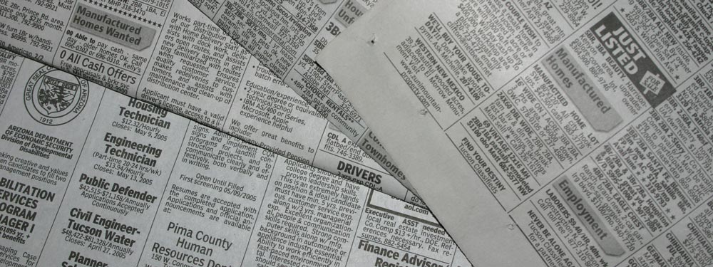
״Above the Fold״
זה נקרא Above the Fold (מעל לקפל). למה? כי בימים עברו, כשלבני האדם היו הדברים האלה שנקראים עיתונים, הם היו בדרך כלל מקופלים לשניים כך שרק החלק העליון היה גלוי לעין מיד. אותו חלק עליון, או החלק ש"מעל לקפל", הכיל את הכותרת/ות החשובה/ות ביותר של היום, ולאחר מכן כשפותחים את העיתון רואים את שאר הכותרות הפחות חשובות. באופן דומה באתרים, החלק העליון של האתר שלכם הוא הדבר הראשון שאנשים רואים, ולאחר מכן כשגוללים מטה רואים את שאר האתר, בדומה לפתיחת קיפול של עיתון.
אם נישאר עם הדוגמה של העיתון, נניח שאתם הולכים ברחוב ורואים מוכר עיתונים. כשאתם רואים את העיתון ואם הכותרת מעניינת, ייתכן שפשוט תקנו את העיתון כדי לראות את השאר. זה בעצם אותו הדבר עם אתרי אינטרנט: אם מבקרים יעברו באתר שלכם וימצאו את התוכן שמעל לקפל מעניין, הם עשויים להשתכנע ולגלול למטה או לצפות בשאר האתר כדי לראות עוד.
המחקר של נילסן
Earlier I said that your above the fold content may make or break your site. Nielsen Normal Group has written a few research articles about this across the years. I’ll quote the summary of their article The Fold Manifesto: Why the Page Fold Still Matters
The average difference in how users treat info above vs. below the fold is 84%.
If you just got confused about the wording of the quote, I did too at the start. Let me clarify: That study doesn’t mean that 84% of people do not scroll down, on the other hand I’ve seen other research say that most people do scroll down to the bottom of the page. It also doesn’t mean that the lower part isn’t important. Instead it means that the behavior of your visitors in your site is largely impacted by your content above the fold.
זה הגיוני מכיוון שהאזור העליון של אתר אינטרנט הוא הדבר הראשון שרואים.
אז כשיודעים עד כמה התוכן שמעל לקפל בעמוד הבית שלכם חשוב, מה כדאי לשים בחלק העליון של האתר שלכם?
גשו ישר לעניין
הציגו מיד במה האתר שלכם עוסק. עמוד הבית שלכם והאזור שמעל לקפל הם עורק החיים של כל האתר שלכם. אם המבקרים שלכם ירגישו אבודים, הם ימהרו לעזוב ולסגור את הלשונית. אם אתם מחברים של ספר חדש, כתבו שאתם כאלה והציגו לראווה את הספר האחרון שלכם. אם אתם מארגני חתונות, כתבו שאתם מארגני חתונות שתעניקו למבקר את החתונה הכי בלתי נשכחת שתהיה לו אי פעם. או אם אתם בונים אתר למלון הקטן שלכם, כתבו שאתם מקום ה-bed and breakfast הטוב ביותר בעיר. (אשתמש בדוגמאות אלה בהמשך).
המבקרים שלכם לא צריכים לנחש במה האתר עוסק. הם צריכים להבין זאת מיד, ורק אז הם יגללו למטה כדי לראות פרטים נוספים.
רתמו את המבקרים שלכם באופן מכוון
לאחר מכן עליכם לחשוב על המטרה בפועל של האתר שלכם. מהי הסיבה להקמת האתר שלכם מלכתחילה? לא משנה מהי הסיבה, עליכם להציב גם אותה מעל לקפל.
בואו ניקח את הדוגמאות הבודדות שהזכרתי לעיל. עבור מחבר של ספר חדש, סביר להניח שתרצו יותר חשיפה. אם יש לכם ספר דיגיטלי בחינם, תוכלו למקם כפתור כדי שהמבקרים שלכם יוכלו להוריד אותו. עבור מארגן החתונות, תרצו שאנשים יצרו איתכם קשר לגבי השירותים שלכם, הזינו את מספר הטלפון שלכם או טופס יצירת קשר. או עבור המלון הקטן, הציבו טופס הזמנה יחד עם מספר הטלפון שלכם.
עבור Page Builder Sandwich, אני רוצה שאנשים יכירו את התוסף טוב יותר, ובסופו של דבר יהפכו ללקוחות. לכן יש לי שם כפתור שמאפשר למבקרים להתנסות בדמו מיד, וכפתור נוסף לרכישת התוסף.
עיצוב מעל לקפל
עכשיו כשאנחנו יודעים מה לשים, הגיע הזמן להחליט על העיצוב. באופן אישי, אני מעדיף תוכן נקי ומחולק לחלקים, ומכאן הרקע האחיד בעמוד הבית שלנו. אבל זה גם רעיון טוב ללוות את התוכן שלכם שמעל לקפל בתמונה או בסרטון כדי להפוך אותו לחיוני יותר.
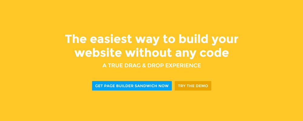 Here’re a few examples of what you can do about your front page.
Add a background image. A large background image behind your large statement is a great eye-catcher and can further encourage visitor engagement. For new book author, maybe adding a background image illustrating the setting of his free ebook would entice people more.
Add an introduction video. Admit it, people can be lazy, especially when it comes to reading. So if your site is a bit complicated, it might be a good idea to add a short video that introduces your site/product quickly. For the wedding organizer, then this can be a video of their latest wedding. Or for our site for example, we can add in a quick intro about the features of our plugin.
Add a video background. This is a bit of a trend nowadays, but I find it appealing at times. If this suits your taste, then this might be a good idea.. I know PayPal had a video background before in their site. For the small hotel, you can put in a stationary video of a scenic area of your hotel as the backdrop.
לסיכום
יצירת תוכן מעל לקפל עבור עמוד הבית שלכם אינה קשה, אך היא דורשת מעט מחשבה ובדיקות כדי לעשות זאת נכון. אם כבר יש לכם אתר ואתם מרוצים ממנו, אך יש לכם שיעור עזיבה (bounce rate) גבוה ב-Google Analytics שלכם, אז אני ממליץ לכם לנסות ולחשוב מחדש על התוכן שלכם שמעל לקפל בעזרת הטיפים שלמעלה.
If you have tips on creating above the fold content, kindly share them in the comments!
Page Builder Sandwich can Help You Design Your Front Page & Above The Fold Content
Page Builder Sandwich is a WordPress plugin that allows you to create any design you want without writing any piece of code.


 Now you can download the Lite version of Page Builder Sandwich from the

 אני שמח להודיע שהחל מגרסה 2.4, תוכלו כעת לערוך את התוכן שלכם ב-Frontend באמצעות Markdown!
 בשבוע שעבר שחררנו את גרסה 2.1 שתיקנה באגים רבים והוסיפה את תיבת הדו-שיח של עורך הקישורים של וורדפרס ל-Page Builder Sandwich.
 There may be times where you want to add supporting videos from YouTube or Vimeo into your site. Or maybe you want to add Tweets from Twitter, or content from other websites like Flickr and Instagram. You can
 שנה טובה לכולם!
