
 What you put in the top of your front page has a huge impact on the success or failure of your website. Put the wrong thing in, and you’ll probably see your visitors quickly navigating away from your site. Put the right content there and you may see your sales go up.
This article isn’t an all-in-one guide for creating above the fold content, nor is about an all-encompassing rule on what you should put in. Rather, I will give you a few tips, recommendations and a little bit of helpful research about this topic.
본론으로 바로 들어가기 전에, 먼저 첫 페이지의 맨 윗부분을 무엇이라 부르는지 알아두는 것이 좋습니다. 사이트의 ‘맨 윗부분’이라는 표현보다 더 나은 명칭이 있습니다.
“스크롤 없이 볼 수 있는 영역(Above the Fold)”
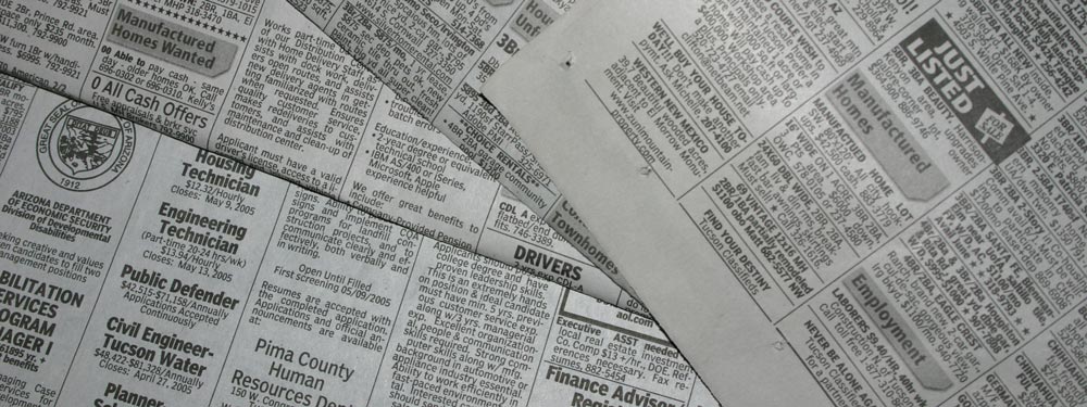
이를 ‘Above the Fold’라고 부릅니다. 왜일까요? 초기 시절 인류에게 신문이라는 것이 있었을 때, 신문은 보통 반으로 접혀 있어 상단 부분만 즉시 보였기 때문입니다. 이 상단 부분, 즉 접힌 윗부분(above the fold)에는 그날의 가장 중요한 헤드라인들이 실렸고, 신문을 펼쳤을 때 나머지 덜 중요한 헤드라인들을 볼 수 있었습니다. 마찬가지로 웹사이트에서도 사이트 상단은 사람들이 가장 먼저 보는 영역이며, 신문을 펼치듯 스크롤을 내리면서 사이트의 나머지 부분을 보게 됩니다.
신문 예시를 계속 들어보자면, 길을 걷다가 신문 가판대를 보았다고 가정해 봅시다. 신문을 보고 헤드라인이 흥미롭다면 나머지 내용을 보기 위해 신문을 살 수도 있을 것입니다. 이는 기본적으로 웹사이트에서도 동일합니다. 방문자가 여러분의 사이트를 둘러보다가 스크롤 없이 볼 수 있는 영역의 콘텐츠가 흥미롭다고 느끼면, 매력을 느껴 아래로 스크롤하거나 사이트의 나머지 부분을 더 둘러볼 것입니다.
닐슨의 연구
Earlier I said that your above the fold content may make or break your site. Nielsen Normal Group has written a few research articles about this across the years. I’ll quote the summary of their article The Fold Manifesto: Why the Page Fold Still Matters
The average difference in how users treat info above vs. below the fold is 84%.
If you just got confused about the wording of the quote, I did too at the start. Let me clarify: That study doesn’t mean that 84% of people do not scroll down, on the other hand I’ve seen other research say that most people do scroll down to the bottom of the page. It also doesn’t mean that the lower part isn’t important. Instead it means that the behavior of your visitors in your site is largely impacted by your content above the fold.
웹사이트의 상단 영역이 가장 먼저 눈에 들어오는 곳이기 때문에 이는 자연스러운 현상입니다.
그렇다면 첫 페이지의 상단 첫 화면 콘텐츠가 얼마나 중요한지 알았으니, 사이트 상단에는 무엇을 넣어야 할까요?
본론으로 곧장 들어가기
여러분의 사이트가 어떤 곳인지 즉시 보여주세요. 첫 페이지와 스크롤 전 영역은 사이트 전체의 생명줄입니다. 방문자가 길을 잃은 듯한 느낌을 받는다면 빠르게 돌아서서 탭을 닫아버릴 것입니다. 신인 작가라면 본인이 작가임을 알리고 최신 저서를 소개하세요. 웨딩 플래너라면 방문자에게 생애 가장 기억에 남을 결혼식을 선사하겠다고 적으세요. 또는 작은 호텔을 위한 사이트를 제작 중이라면 마을 최고의 B&B(숙박 겸 조식 제공 숙소)라고 적으세요. (아래에서 이 예시들을 더 활용하겠습니다.)
방문자가 이 사이트가 무슨 사이트인지 추측하게 해서는 안 됩니다. 즉시 이해할 수 있어야만, 아래로 스크롤하여 더 자세한 내용을 확인할 것입니다.
의도적으로 방문자의 참여 유도하기
다음으로 웹사이트의 실제 목적에 대해 생각해 보아야 합니다. 애초에 웹사이트를 개설한 이유가 무엇인가요? 그 이유가 무엇이든, 해당 내용 또한 스크롤 없이 볼 수 있는 상단 영역에 배치해야 합니다.
앞서 언급한 몇 가지 예시를 들어보겠습니다. 신인 작가라면 더 많은 노출을 원할 것입니다. 무료 전자책이 있다면 방문자가 다운로드할 수 있는 버튼을 배치할 수 있습니다. 웨딩 플래너라면 사람들이 서비스에 대해 문의하기를 바랄 테니, 전화번호나 문의 양식을 넣으세요. 또는 작은 호텔이라면 전화번호와 함께 예약 양식을 넣으세요.
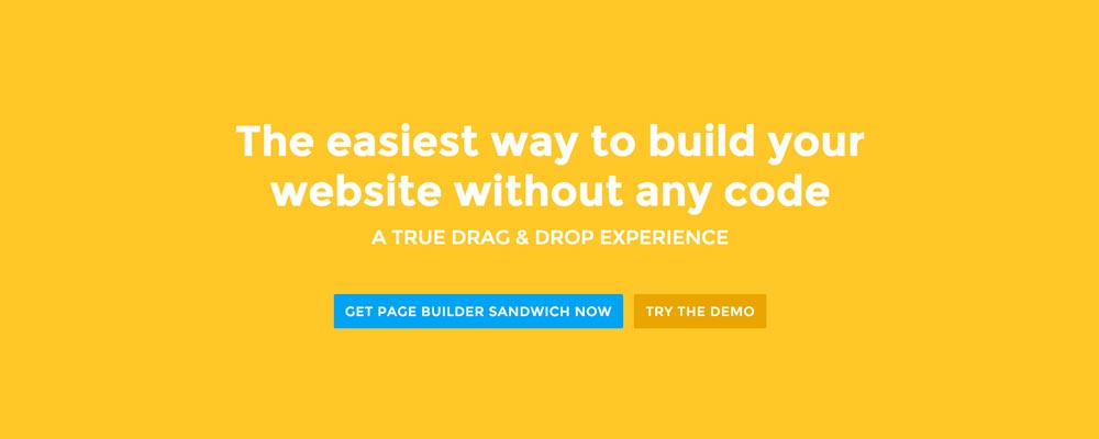
Page Builder Sandwich의 경우, 저는 사람들이 이 플러그인을 더 잘 알게 되고 궁극적으로 고객이 되기를 바랍니다. 그래서 방문자가 데모를 바로 체험해 볼 수 있는 버튼과 플러그인을 구매할 수 있는 또 다른 버튼을 배치했습니다.
상단 첫 화면(Above the Fold) 디자인하기
이제 무엇을 넣어야 할지 알았으니 디자인을 결정할 차례입니다. 개인적으로는 깔끔하게 구획된 콘텐츠를 선호하기 때문에 첫 페이지에 단색 배경을 사용했습니다. 하지만 상단 첫 화면 콘텐츠에 이미지나 비디오를 곁들여 더욱 생동감 있게 만드는 것도 좋은 방법입니다.
 Here’re a few examples of what you can do about your front page.
Add a background image. A large background image behind your large statement is a great eye-catcher and can further encourage visitor engagement. For new book author, maybe adding a background image illustrating the setting of his free ebook would entice people more.
Add an introduction video. Admit it, people can be lazy, especially when it comes to reading. So if your site is a bit complicated, it might be a good idea to add a short video that introduces your site/product quickly. For the wedding organizer, then this can be a video of their latest wedding. Or for our site for example, we can add in a quick intro about the features of our plugin.
Add a video background. This is a bit of a trend nowadays, but I find it appealing at times. If this suits your taste, then this might be a good idea.. I know PayPal had a video background before in their site. For the small hotel, you can put in a stationary video of a scenic area of your hotel as the backdrop.
결론
첫 페이지의 상단 첫 화면 콘텐츠를 만드는 것은 어렵지 않지만, 제대로 하려면 약간의 고민과 테스트가 필요합니다. 이미 사이트를 구축해 두었지만 Google 애널리틱스에서 이탈률이 높게 나타난다면, 위의 팁들을 활용해 상단 첫 화면 콘텐츠를 다시 고민해 보시길 권장합니다.
If you have tips on creating above the fold content, kindly share them in the comments!
Page Builder Sandwich can Help You Design Your Front Page & Above The Fold Content
Page Builder Sandwich is a WordPress plugin that allows you to create any design you want without writing any piece of code.