
 What you put in the top of your front page has a huge impact on the success or failure of your website. Put the wrong thing in, and you’ll probably see your visitors quickly navigating away from your site. Put the right content there and you may see your sales go up.
This article isn’t an all-in-one guide for creating above the fold content, nor is about an all-encompassing rule on what you should put in. Rather, I will give you a few tips, recommendations and a little bit of helpful research about this topic.
ก่อนที่จะเจาะลึกเข้าไป เป็นการดีที่จะรู้ก่อนว่าส่วนบนสุดของหน้าแรกของคุณเรียกว่าอะไร มีชื่อเรียกที่ดีกว่าคำว่า ส่วนบนสุดของเว็บไซต์คุณ
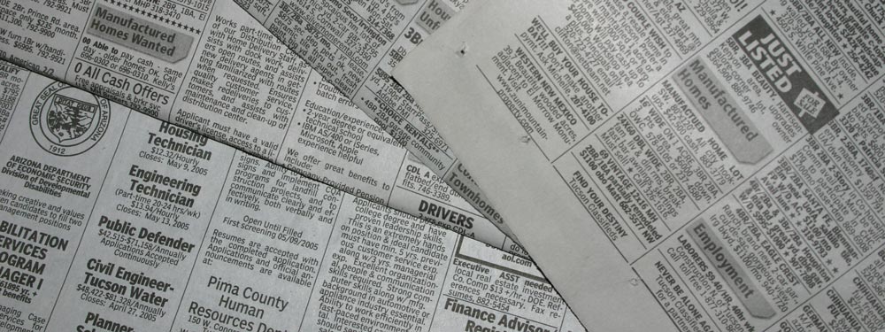
“Above the Fold”
มันถูกเรียกว่า Above the Fold ทำไมล่ะ? เพราะในยุคแรกๆ ที่มนุษยชาติมีสิ่งที่เรียกว่าหนังสือพิมพ์ พวกมันมักจะถูกพับครึ่งเพื่อให้เห็นเฉพาะส่วนบนได้ทันที ส่วนบนนั้นหรือส่วน “above the fold” จะมีพาดหัวข่าวที่สำคัญที่สุดของวัน จากนั้นเมื่อคุณคลี่มันออก คุณจะเห็นพาดหัวข่าวอื่นๆ ที่มีความสำคัญน้อยกว่า ในทำนองเดียวกันสำหรับเว็บไซต์ ส่วนบนสุดของเว็บไซต์คือสิ่งแรกที่ผู้คนมองเห็น จากนั้นเมื่อคุณเลื่อนหน้าจอลงมา คุณจะเห็นส่วนที่เหลือของเว็บไซต์ คล้ายกับการคลี่หนังสือพิมพ์ออก
จากตัวอย่างหนังสือพิมพ์ สมมติว่าคุณกำลังเดินอยู่บนถนนและเห็นคนขายหนังสือพิมพ์ เมื่อคุณเห็นหนังสือพิมพ์และหากพาดหัวข่าวน่าสนใจ คุณก็อาจจะซื้อหนังสือพิมพ์นั้นเพื่ออ่านเนื้อหาที่เหลือ ซึ่งโดยพื้นฐานแล้วก็เหมือนกันกับเว็บไซต์ หากผู้เยี่ยมชมผ่านเข้ามายังเว็บไซต์ของคุณและพบว่าเนื้อหาในส่วน above the fold นั้นน่าสนใจ พวกเขาก็อาจจะเปิดใจและเลื่อนลงหรือดูส่วนที่เหลือของเว็บไซต์คุณเพิ่มเติม
งานวิจัยของ Nielsen
Earlier I said that your above the fold content may make or break your site. Nielsen Normal Group has written a few research articles about this across the years. I’ll quote the summary of their article The Fold Manifesto: Why the Page Fold Still Matters
The average difference in how users treat info above vs. below the fold is 84%.
If you just got confused about the wording of the quote, I did too at the start. Let me clarify: That study doesn’t mean that 84% of people do not scroll down, on the other hand I’ve seen other research say that most people do scroll down to the bottom of the page. It also doesn’t mean that the lower part isn’t important. Instead it means that the behavior of your visitors in your site is largely impacted by your content above the fold.
เรื่องนี้สมเหตุสมผล เนื่องจากพื้นที่ส่วนบนของเว็บไซต์คือสิ่งแรกที่คุณเห็น
เมื่อรู้แล้วว่าเนื้อหา above the fold บนหน้าแรกของคุณมีความสำคัญเพียงใด แล้วคุณควรใส่อะไรไว้ที่ด้านบนสุดของเว็บไซต์กันแน่?
เข้าประเด็นอย่างตรงไปตรงมา
บอกให้ชัดเจนทันทีว่าเว็บไซต์ของคุณเกี่ยวกับอะไร หน้าแรกและพื้นที่ above the fold คือหัวใจสำคัญของเว็บไซต์ทั้งหมดของคุณ หากผู้เยี่ยมชมรู้สึกสับสน พวกเขาก็จะรีบผละออกไปและปิดแท็บทันที หากคุณเป็นนักเขียนหนังสือหน้าใหม่ ให้เขียนบอกว่าคุณเป็นนักเขียนและนำเสนอหนังสือเล่มล่าสุดของคุณ หากคุณเป็นผู้จัดงานแต่งงาน ให้เขียนว่าคุณคือผู้จัดงานแต่งงานที่จะมอบงานแต่งงานที่น่าจดจำที่สุดเท่าที่ผู้เข้าชมจะเคยมี หรือหากคุณกำลังทำเว็บไซต์สำหรับโรงแรมขนาดเล็กของคุณ ให้เขียนว่าคุณคือที่พักพร้อมอาหารเช้าที่ดีที่สุดในเมือง (ผมจะใช้ตัวอย่างเหล่านี้เพิ่มเติมด้านล่าง)
ผู้เยี่ยมชมไม่ควรต้องมานั่งเดาว่าเว็บไซต์นี้เกี่ยวกับอะไร พวกเขาควรจะเข้าใจได้ในทันที และเมื่อนั้นเท่านั้นที่พวกเขาจะเลื่อนลงไปดูรายละเอียดเพิ่มเติม
ดึงดูดผู้เยี่ยมชมของคุณอย่างมีเป้าหมาย
ถัดไป คุณต้องคิดถึงเป้าหมายที่แท้จริงของเว็บไซต์คุณ อะไรคือเหตุผลในการสร้างเว็บไซต์ขึ้นมาตั้งแต่แรก? ไม่ว่าเหตุผลนั้นคืออะไร คุณต้องใส่มันไว้ในส่วน above the fold ด้วยเช่นกัน
ลองดูตัวอย่างเล็กๆ น้อยๆ ที่ผมกล่าวถึงข้างต้น สำหรับนักเขียนหนังสือหน้าใหม่ คุณอาจต้องการการเป็นที่รู้จักมากขึ้น หากคุณมีอีบุ๊กฟรี คุณก็สามารถวางปุ่มเพื่อให้ผู้เยี่ยมชมดาวน์โหลดได้ สำหรับผู้จัดงานแต่งงาน คุณต้องการให้ผู้คนติดต่อคุณเกี่ยวกับบริการต่างๆ ให้ใส่หมายเลขโทรศัพท์หรือแบบฟอร์มการติดต่อ หรือสำหรับโรงแรมขนาดเล็ก ให้ใส่แบบฟอร์มการจองพร้อมกับหมายเลขโทรศัพท์ของคุณ
สำหรับ Page Builder Sandwich ผมต้องการให้ผู้คนรู้จักปลั๊กอินนี้มากขึ้น และกลายมาเป็นลูกค้าในที่สุด ดังนั้นผมจึงมีปุ่มที่ให้ผู้เยี่ยมชมทดลองใช้งานเดโมได้ทันที และอีกปุ่มหนึ่งสำหรับสั่งซื้อปลั๊กอิน
การออกแบบส่วน above the fold
เมื่อเรารู้แล้วว่าควรใส่อะไร คราวนี้ก็ถึงเวลาตัดสินใจเกี่ยวกับการออกแบบ โดยส่วนตัวแล้ว ผมชอบเนื้อหาที่แบ่งเป็นสัดส่วนอย่างสะอาดตา จึงใช้พื้นหลังสีทึบบนหน้าแรกของเรา แต่มันก็เป็นความคิดที่ดีเช่นกันที่จะใช้รูปภาพหรือวิดีโอควบคู่ไปกับเนื้อหาในส่วน above the fold ของคุณ เพื่อให้ดูมีชีวิตชีวามากขึ้น
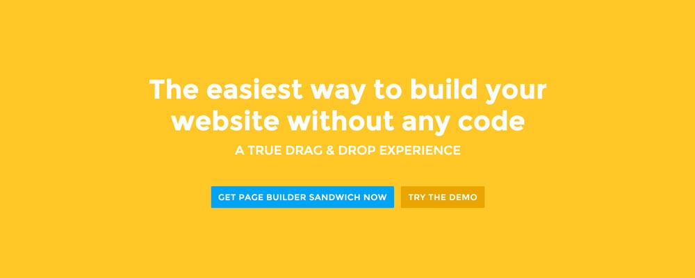 Here’re a few examples of what you can do about your front page.
Add a background image. A large background image behind your large statement is a great eye-catcher and can further encourage visitor engagement. For new book author, maybe adding a background image illustrating the setting of his free ebook would entice people more.
Add an introduction video. Admit it, people can be lazy, especially when it comes to reading. So if your site is a bit complicated, it might be a good idea to add a short video that introduces your site/product quickly. For the wedding organizer, then this can be a video of their latest wedding. Or for our site for example, we can add in a quick intro about the features of our plugin.
Add a video background. This is a bit of a trend nowadays, but I find it appealing at times. If this suits your taste, then this might be a good idea.. I know PayPal had a video background before in their site. For the small hotel, you can put in a stationary video of a scenic area of your hotel as the backdrop.
สรุป
การสร้างเนื้อหา above the fold สำหรับหน้าแรกของคุณไม่ใช่เรื่องยาก แต่ต้องอาศัยการคิดและทดสอบเพื่อให้ทำได้อย่างถูกต้อง หากคุณมีเว็บไซต์อยู่แล้วและวางโครงสร้างไว้ตามนั้น แต่คุณมีอัตราตีกลับ (Bounce Rate) สูงใน Google Analytics ของคุณ ผมขอแนะนำให้คุณลองทบทวนเนื้อหา above the fold ของคุณใหม่ตามเคล็ดลับข้างต้น
If you have tips on creating above the fold content, kindly share them in the comments!
Page Builder Sandwich can Help You Design Your Front Page & Above The Fold Content
Page Builder Sandwich is a WordPress plugin that allows you to create any design you want without writing any piece of code.