In a few short months, we’ll be relaunching as Frontly Builder.
At the moment, it’s still under some heavy development. But even so, we’re crazy excited to show you guys what we’ve been up to. Here, we’ll be talking about why we’re making the switch, how Frontly’s going to be different from PBS, and what you need to look out for.
From Page Builder Sandwich to Frontly Builder
Before the idea of Sandwich, we noticed a little pattern with page builders everywhere: A lot of them were difficult to use.
For example,some of these builders would have you go through numerous pop-ups and other settings if you want to add something as simple as an image, a row, a button.
And if you wanted to change a column’s settings, clicking on the edit button takes you to yet another pop-up that requires you to input settings like size and margins through dropdown options thataren’t very flexible.
It was frustrating because we knew thatpage builders should exist to make things easier for users, not the other way around.
Other WordPress Page Builders
This is how we came up with Page Builder Sandwich.
We wanted to introduce a builder that was going tomaximize users’ experiencewhen creating webpages, allowing them tocreate awesome things the fast and easy way.
We received lots of great feedback that allowed Sandwich to evolve. And the more our audience grew, the more suggestions we received on how we could further improve the plugin.
We were in a state of constant development, and we loved it.
Page Builder Sandwich has true front-end power, and so will Frontly Builder.
Redefining What It Means to Run on TRUE Frontend
Sandwich’s evolution was constant.
Apart from the feedback (both negative— things we could work on; and positive ones— which we knew we had to retain), Sandwich’s capacity to grow increased, too. We kept finding more and more ideas and solutions to further improve PBS.
And the more wants and needs from PBS arose, the more our code’s main foundation got tweaked.
Imagine an actual sandwich with all of your favorite toppings.
Sure, it’d taste great, but how is it going to fit in your mouth? How is it going to serve its main purpose— to be eaten?
This is kind of what happened with PBS.We realized that so much more could be done with itwith an even more efficient, stronger foundation. That we could take it further.
As we mentioned, Page Builder Sandwich is in a constant state of evolution.
Frontly is the next step to that evolution.
You’ll still get an awesome support team, theme and plugin compatibility, and more.
So what makes Frontly different from Page Builder Sandwich?
We’ve been working really hard to maximize Frontly’s development. The goal now is to make it an insanely better version of PBS — to embody what it means to operate on true front-end.
Right now, we’re focusing on further improving Frontly’s UX and UI. We’ve worked on giving it a smoother look, a more user-friendly experience, and features that’ll let you build professional-looking websites in even less effort and less time.
While we’re crazy excited to show you guys what we’ve come up with,we wanna make sure everything is just right for you.So leave us your email to get first dibs on updates, tips and trick, and big promos on the release date.
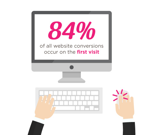
In a previous article, we mentioned that 84% of website conversions occur on the first visit. And during this first visit, the average site visitor is only going to stay on your website for about 10 seconds.
That means that’s all the time you have to make a good impression, convince your visitors to stay on your site, and to (hopefully) convert that site visit into a lead.
Kind of puts on the pressure when you think about it.
But not to worry- landing pages help you do just that. More specifically though, well-crafted landing pages help you to do just that.
So what are they?
In the simplest terms, a landing page is any page that gets traffic from anywhere other than the usual pages on your site (like your Homepage, FAQ, or Contact Us page).
The difference between these “usual pages” though, is that landing pages reel in your audience using content that creates a sense of urgency – like call-to-action buttons and promo pages, for example – and they do it all in one page with a specific goal set in mind: They make your audience take action.
And if all goes as expected, you get to convert your audience and site visitors into leads. This is called lead generation.
Landing pages are a crucial part of any website, especially when you’re trying to build an audience, and generate leads. They’re a huge factor in generating revenue as well.
What do they look like and when do I start making one?
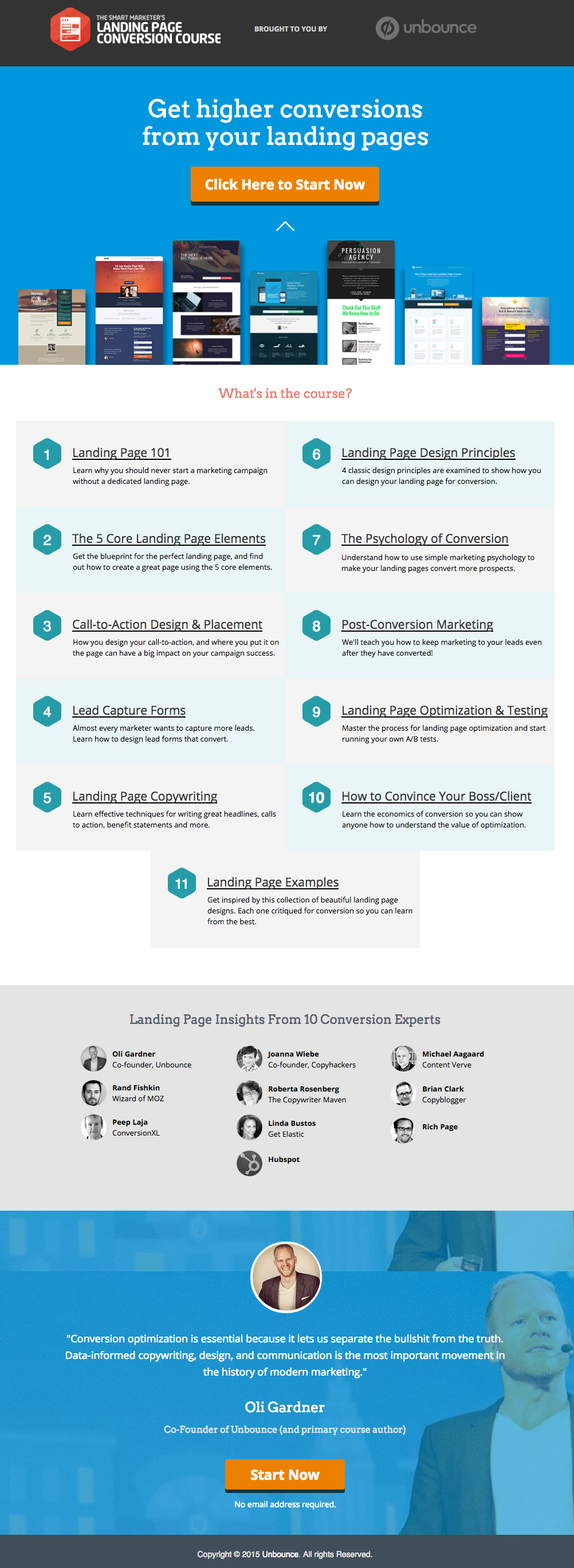
Here’s an example of a great landing page from Unbounce, which we really like:
This has all of the right elements you need to execute the perfect landing page: it’s got just the right amount of text (which is really helpful for boosting SEO), and it’s packaged in a way that it’s not too heavy or intimidating for site visitors.
The imagery is great as well, and the placement of the two call-to-action (or CTA) buttons give the visitors just enough cues to sign up for their service. Not too little, but not too much either.
(Tip: the Unbounce landing page looks pretty fancy – maybe even a tad intimidating if you’re trying to replicate a similar style on your own landing page – but you could actually create page that’s similar and as awesome-looking using PBS).
MAKE YOUR OWN LANDING PAGE: If you’re new to design, First Site Guide’s Elements & Principles of Design Cheat Sheet proves to be friendly and reliable for beginners.
Take note though, that Unbounce’s example isn’t the only way you can create your landing page.
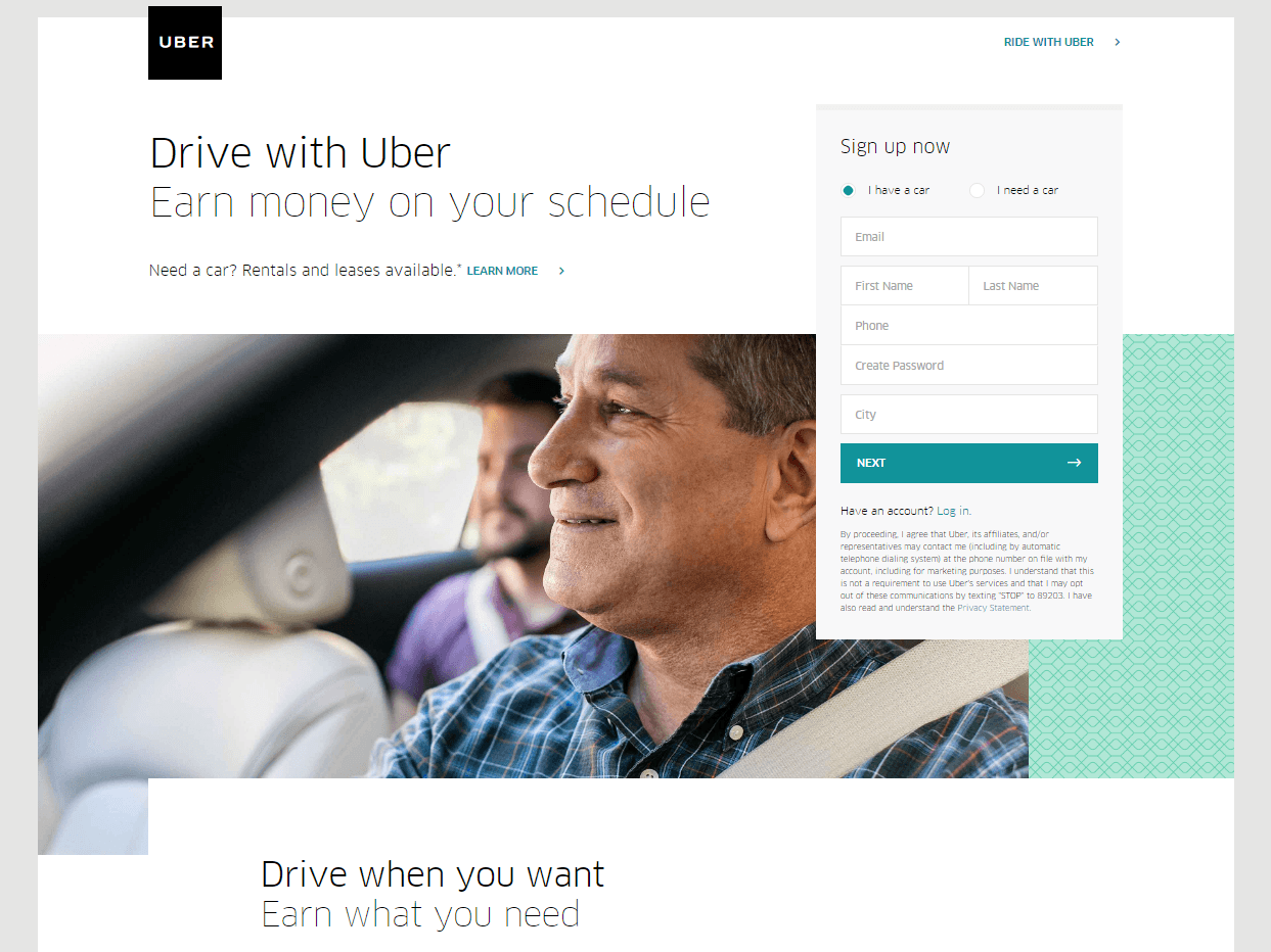
You can always go for a simpler, cleaner look, like Uber’s landing page below:
The text’s placement, along with the sign-up forms look crisp and clean. There’s also minimal distractions on this landing page, which prompts its visitors to sign up right away.
MAKE YOUR OWN LANDING PAGE: First Site Guide’s Psychology of Color Cheat Sheet is a huge helA, which can help you balance out the right kind of colors that create a minimal yet classy effect for your landing pages.
You can have more than one
This is a little tricky because you have to learn how to strike a balance, but if you think it’ll help generate more leads, you can actually build more than one landing page. Again, different landing pages cater to different needs.
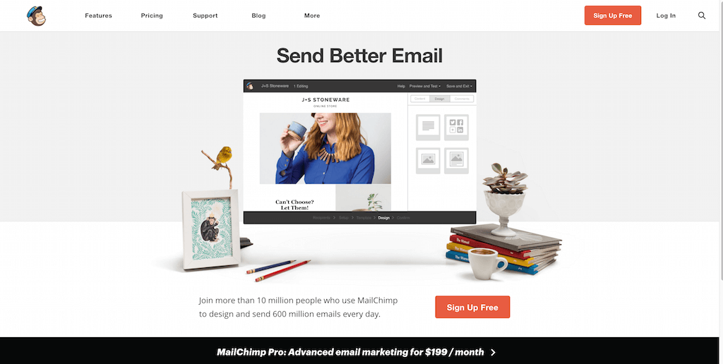
Take this one (out of many) from MailChimp for example, which urges its audience to sign up to their services for free:
(It worked by the way, as we use MailChimp for our newsletter service, too).
Take note of the text – it’s straight to the point, and addresses the target’s audience needs in just three simple, albeit powerful words; enough to catch the visitor’s attention, and convert into a lead.
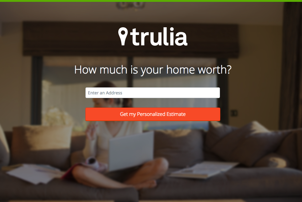
Here’s another from Truila, which helps its users get an estimate of how much their houses are worth.
Unlike the previous examples, Truilia doesn’t offer a catch to their customers in this particular landing page. They simply offer to give the visitor a chance to test out their service.
Again, take note of the copy: no fluff, and it gets straight to the point.
Usually, landing pages like these direct you towards another, one that has more information about what the website is offering. This is also a great technique used to capture more leads.
MAKE YOUR OWN LANDING PAGE: Did you know that “Under Construction” pages count as landing pages, too? This blog post by First Site Guide teaches you how to make one.
More doesn’t always mean merrier
It’s important to remember that the problem isn’t the lack of landing pages per se – but the lack ofwell-created, successful landing pages.
Any website can make a bunch of them, but that doesn’t automatically render successful lead conversions.
Again, the business of landing pages is very tricky– so if you can afford to invest in studying the art and science behind it, it’s highly recommended that you do.
Here are some websites that’ll be really helpful in your journey to creating landing pages
Landing Folio
http://www.landingfolio.com/
Landing Folio is an extensive gallery that’s really useful when it comes to getting inspiration for landing page designs. They also offer some kick-ass, friendly courses on how to perfect the art of creating landing pages. Plus, all the designs are pretty and fun to look at as well.
First Site Guide is one of the most resourceful websites on the internet, especially if you’re new to the web and want to make something out of it. They have resources ranging from lists of tools that create content, product reviews and comparisons, infographics, friendly video tutorials, and more. Definitely helpful if you’re just starting out on creating your first landing page.
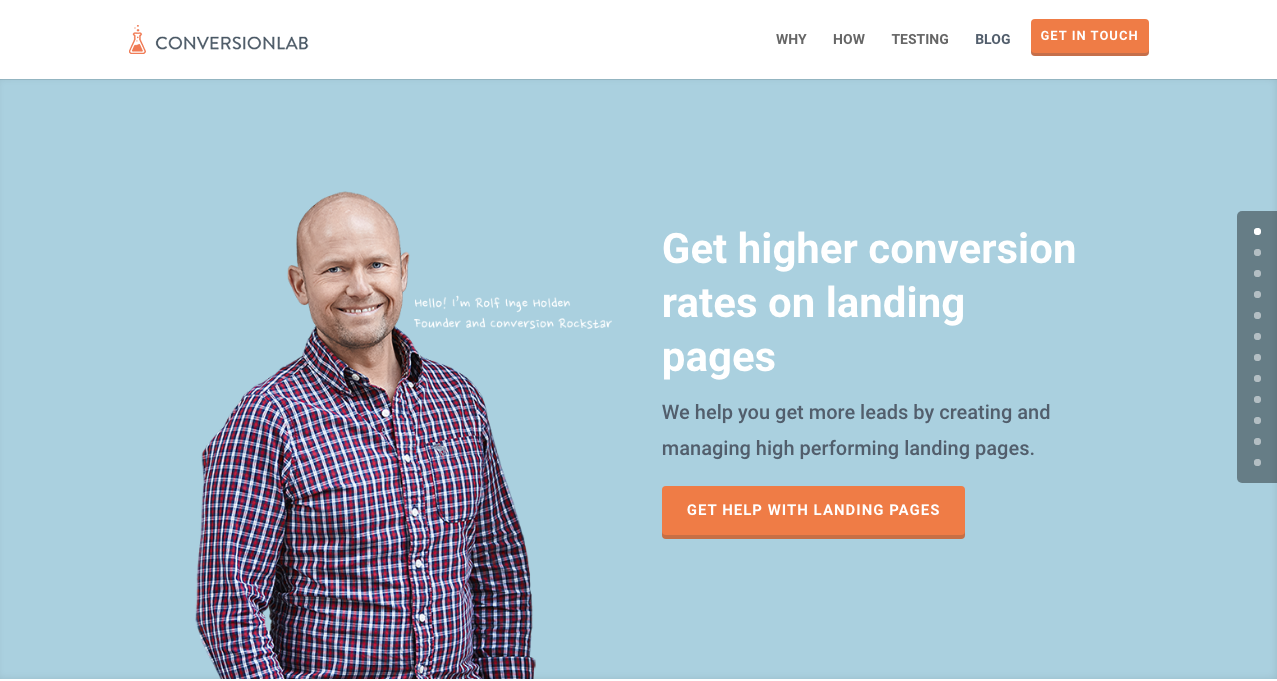
Apart from the fact that their own landing page is pretty well-crafted itself, Conversion Lab does exactly what they say they do: they help you get conversions. They also help out with testing too, which is crucial to any website that’s trying to raise their conversion rates.
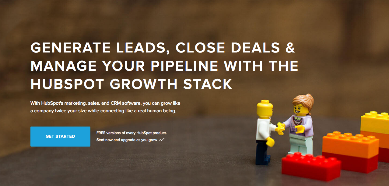
Hubspot is an all-around help site that lends you a hand in almost anything and everything related to online marketing.
They have a diverse collection of articles that range from creating business plans, to content and inbound marketing, and of course- landing pages. It’s a great resource for anyone still new to the realm of digital marketing.
Conclusion
Landing pages can be really tricky, especially if you’re just starting out in any kind of business.
But remember that it’s worth your time to invest into learning how they work and how to make them. Why? Because they generate leads, and leads generate revenue.
Take note that digital marketing trends are changing rapidly. You have to keep with these trends in order for your business to not only survive, but to also thrive.
Do you have any other tips or resources that you’d like to share with us? Comment below, or send us an email at [email protected] if you’d like to get featured as a resource in one of our articles.
Black Friday and Cyber Monday are coming in a couple of days (5 to be exact), but you’ll find that a bunch of websites have already started announcing their discount deals every which way. WordPress tools and plugins are definitely no exception.
So while it’s still (relatively) early, we’ve compiled a list of the best deals we could find for WordPress Black Friday 2017, with essentials you need to make a WordPress site– all within your budget.
Without further ado, here are 5 generously discounted tools and plugins that you’re going to need to build your first basic WordPress website.
Cloudways
Cloudways is a managed cloud hosting platform that’s quick to start, easy to manage, and made to scale. It’s feature-rich, plus it lets you choose your server resources, allowing you to get your site up and running within minutes.
Enter the coupon code HOLIDAY25 upon checkout to get a 25% discount on Cloudways for 3 months, valid until 28th November 2017.
Yoast SEO is one of the most popular (if not most trusted) search optimization plugin for WordPress, and for good reason too. With over 7 million installs, it’s probably the most comprehensive SEO tool in the digital market, and their millions of users (ourselves included) can attest: you simply can’t go wrong with a plugin as functional as Yoast.
While they haven’t announced this year’s Black Friday coupons yet, they’ve made an announcement in one of their articles that they’ll definitely having a sale on November 24 and 25.
WP Rocket offers a good range of caching functions, giving your site the performance boost that it needs. It’s a breeze to configure as well, so it’s great for beginners as it only requires minimal effort for setup.
This year, they’re having their biggest sale yet: 35% off on ALL their licenses.
WeDevs is a collection of nifty WordPress plugins and extensions. They’ve got a pretty solid community, and been around since 2008. For Black Friday 2017 (and the succeeding holidays this year), they’ve put together a list of WordPress Holiday Deals, including a ton of discounts and coupons for awesome WP themes.
First Site Guide is a resource site and tool that contains easily accessible knowledge on how to create your first website, both on WordPress and off of it. It also has great infographics that guide you through the basics of blogging, design, and marketing as well. And best of all, you get this good share of site-building knowledge for free.
We’ll also be featuring a how-to landing page article soon, with awesome resources from First Site Guide, so be on the lookout for that in the following weeks!
We definitely don’t want to miss out on all the fun. So this 2017, we’re giving you guys 33%-off on any license. Just use the promo codeCYBERMONDAY33 upon checkout to start building your site today!
But what does a 403 error mean, and why is it occurring in Page Builder Sandwich in the first place?
The 403 Error Explained
The most common cause of the 403 error is when security plugins aren’t configured in a particular way or standard.
Like WordFence, most security plugins from WordPress restrict some actions if they’re suspected or proven to be malicious. These scenarios usually occur on your WP Admin or WP Login page, or show up as pop-ups alerting you that you don’t have authorization to view your page.
Here’s what the pop-up will look like if you ever encounter it on Sandwich:
So what does this mean? Is Sandwich safe to use? Is WordFence bad? And does the 403 error warrant bad points for both Wordfence and Page Builder Sandwich?
Well, no.
All of this just means thatWordfence is extra careful when scanning your external plugins.
And that’s actually a really good thing, especially since they’re a security plugin.
WordFence is Legit…
WordFence is one of the most popular security plugins for WordPress. It has over a million active installs, so chances are, it’s probably installed on your WP website, too. They exist for a great cause: Not just tokeep your website safe, but to also reduce security risks, and improve your website’s security overall.
tl;dr WordFence is legit.
…And So is Sandwich. But Why Does It Need Whitelisting?
It’s not just Sandwich that WordFence blocks.
Other plugins and URLS require whitelisting (the inverse of blacklisting) on WordFence, too. Some more popular plugins might have been allowed already by Wordfence.
So what’s happening behind the scenes, and where is the 403 error coming from?
Ajax Functions and Page Builder Sandwich
Page Builder Sandwich performs ajax functions throughout your editing experience. Certain plugins do, too.
W3Schools expounds on ajax a little further:
AJAX is a technique for creating fast and dynamic web pages. It allows web pages to be updated asynchronously by exchanging small amounts of data with the server behind the scenes. This means that it is possible to update parts of a web page, without reloading the whole page.
Chart taken from W3Schools
In Page Builder Sandwich, the ajax calls range from getting shortcode mappings, rendering shortcodes to saving your changes. This might cause you to experience problems , such as the 403 error, problems with saving your output, or unrendered shortcodes. This is the time that you might need to whitelist ajax calls specific to Page Builder Sandwich.
Whitelisting Page Builder Sandwich on WordFence
To white list PBS in Wordfence’s Firewall, add an entry in the Whitelisted URLs area with these parameters:
URL: /wp-admin/admin-ajax.php
Param Name: main-content
Param: POST Body
For multisite WordPress installations, it’s a good idea to include your site’s folder name in the URL above. For example: /my-multisite/wp-admin/admin-ajax.php
After adding these values, the 403 Error should be properly addressed, and you should be able to save your output and generate rendered shortcodes again.
This is what it should look like under your WordFence Firewall settings:
Ta-da!
Conclusion
Yes, Page Builder Sandwich is safe to use.
More than that, it only performs ajax actions when in editing mode, and it’s compatible with external plugins and themes (as long as they’re at par with WordPress’ coding standards).
WordFence Security is no different.
But what’s great about them is they give WordPress users the opportunity to keep their sites safe and secure, with the additional option to let you decide which plugins are, and aren’t.
Every morning on my way to work, there’s a barista that hands me my coffee with the worst poker face imaginable. This is a daily ritual for the two of us.
And if this particular coffee joint wasn’t conveniently en route to the office, I’d have probably switched my caffeine go-to-place a long time ago.
Now, this barista has an equivalent in the online support community.
But because you can’t see poker faces during e-mail and live chat exchanges, they’re a little less obvious to pinpoint. But trust me, they exist.
Good customer service is key for your business growth, yes. But just customer support isn’t enough.
You have to provide good service (if not excellent) that makes your customers feel important, because they are. After all, they’re why your business exists.
However, not everyone understands that it isn’t enough that customer service is merely provided without quality.
In fact, even if it’s a given that companies have support teams behind them, recent statistics show that 68% of customers leave a company because they don’t think that it cares about them (when it should).
But what is it that actually warrants good customer support, and how do you maintain it?
From a fellow support specialist to another, here are some key factors in keeping your customers — and by extension, your business — happy.
1. Take advantage of negative feedback
Whether it’s in the tech industry or otherwise, you’re always going to receive feedback regarding your product one way or another. But take heed: not all of them are going to be things you want to hear.
And you have to be prepared for that.
More than preparation though, what you need to do is to embrace and take advantage of negative feedback.
Sooner or later, you’ll be bombarded with complaints, feature requests, and comments of disapproval.
Take note of them.
It’s crucial to listen and be open about any and all comments that come your way– positive or otherwise. These comments indicate what your product or service lacks, giving you the opportunity to fulfill the needs of your audience or market.
For example, If you get numerous complaints about your user interface being hard to navigate around, then it means you have to change your user interface.
If this is the third time in a month that you’ve gotten a complaint about your product’s poor performance, then it’s probably a good idea to huddle up with your team and prioritize how to address said performance issue.
In other words, negative feedback is good. They’re opportunities for you to further improve your product; to draw inspiration from your customers’ disapproval. This will help your business and your product grow even further, and the more that happens, the happier both you and your customers will be.
2. Let them know that you’re human
One thing that really irks me is getting rigid-sounding e-mails that come off as auto-generated responses.
Huge companies usually rely on actual auto-generated responses and bots, but that’s because their brands are already well-established and trusted in the market.
Now, if you’re like us, who have actual people providing customer support, it’s important to let your audience know that you’re human too- that they can approach you, that they can ask for help, and that they can get a genuine reply that doesn’t sound like a copy-pasted, pre-formatted response.
For one-on-one e-mail support, one tip I have is to never say anything to your customer that you wouldn’t otherwise say in real life. That means it’s time to drop phrases like “Greetings!” or “We humbly apologize for the delay in response”.
Personally, I feel that the extreme formality gives off the impression that you’re not providing support because you care– you’re providing support simply because it’s your job and have to.
And that’s a huge no-no.
So unless it’s written in company policy, remember to make an effort to let your customers know and feel that they can talk to you. That you’re there to actually help, and not just spew out robotic responses because somebody else is paying you to.
3. Never leave them hanging
This one’s probably a no-brainer.
Never, ever leave your customer hanging without a solution- or at least a quick fix- to their problem.
Sometimes though, issues without direct solutions can be unavoidable. For instance, let’s say a customer inquires about a feature that you know isn’t going to be released any time soon.
What do you say?
“Sorry, we don’t have that feature. Bye.
Regards, Support”
Well… that simply won’t do.
If you have to provide small alternative solutions, do so. If your customer is asking for something in pink, and you only have it in red at the moment, be honest, but also tell them what they can do in the meantime.
“We’ll contact you again once we have more colors available!” and follow through.
4. Fast responses are important- but so are efficient ones
Yes, it’s important to respond to your customers ASAP. But just sending out a reply isn’t enough.
Your responses should contain essence, and should provide your customers with a solution or an alternative for the issue at hand (see #3). Neither one works without the other.
Yes, your customers are in a hurry – but providing them with a half-assed response is just as bad as not replying at all (and it’ll probably even come off as worse, because once you hit the “send” button, there’s no going back).
5. Avoid making promises you can’t keep
“Don’t worry. We’ll have that fixed for you in an hour!”
If you take any longer than that, both you and your company’s reputation are doomed.
While it’ll initially sound appealing to your customers, not being follow through could warrant more damaging reaction.
If you know you’re going to take 24 hours to provide a fix, be honest, and tell them. They’ll be happier with a working product that takes a while to finish, than a rushed one that barely works.
Conclusion
So the secret to providing good customer support? Never underestimate it.
Your customers are your driving force, and are of utmost importance.
Treat them as such.
And the next time you seem adamant in investing on good customer support, remember these words from Neil Patel:
“Smart business owners know that every customer relationship lost, either to a competitor or otherwise, costs them an average of $289 each year.
And if you’re thinking you can just make up for that cost with new customers, think again. Turns out, it costs six to seven times more to acquire a new customer than it does to retain an existing one.”
Keeping your audience reeled into your page (and successfully generating leads) is a different story altogether, though.
Don’t get us wrong. Lots of sites can achieve this without a worry, but that’s usually because they spend a significant amount of time and research doing just that.
In contrast, some sites admittedly have a little trouble pulling it off, and more often than not, some of them don’t know where to begin. But don’t worry – Page Builder Sandwich will try to lend you a hand with that very same thing.
Why is it Important to Generate Leads?
One crucial thing to remember is that generating leads takes more than just buying a domain and setting a website up.
Now, before we get too into it, take note that Page Builder Sandwich isn’t a marketing website.
But in any case, it’s important to know that there’s a science behind generating leads, and while we ourselves aren’t digital marketers, it’s essential to note that successful lead conversion also has to do with the proper execution of design and content. That’s where we come in.
“But how can you guys help with the marketing aspect of it all?”
Great question! A few weeks ago we began corresponding with Straight North, a blog that specializes in digital marketing and lead conversion. They’ve given us some really tips which we hope you guys find helpful in your site-building journey.
Now, remember thatthere could belots of factors as to why your website isn’t generating the amount of leads you’d like. The first step is toidentify what these factors are, and hopefully, this list can help you out with doing just that.
TIP #1: Create Content that Stimulates Action
According to Straight North, 84% of website conversions occur on the first visit, and only 11% convert in the second.
In other words, first impressions matter.
Much like how bad auditions don’t result in actors getting lead roles, someone’s first visit to your website could either make or break you.
That’s why it’s you and your team’s job to try and convince people to stay glued to your page.
Straight North suggests that posting copy and content (both text and images) is a great way to catch your visitors’ attention. Remember to always allot sufficient time to research on what makes good copy and good content, and never underestimate either.
Here are a couple of websites that might help you on your journey towards creating successful leads:
Wow your site visitors by using interactive PBS elements like the Carousel, or use Parallax Scrolling, and Video Backgrounds to catch their attention. Remember to execute their placement in a balanced way though, as to not overwhelm your audience.
TIP #2: Intuitive Navigation
In the realm of web development and site-building, intuitiveness in the user interface (or UI) is key.
This means that when your visitors or users find their way around your site byintuition (i.e. easy site-navigation and straightforward instructions), they’re more likely to stay glued on your site.
Now, if navigating around your website proves to be a frustrating experience, chances are your visitors might not stick around long enough to hear what you have to say, and what you have to offer them.
Straight North adds thatgetting too “clever and creative” with navigation labels is a bad idea,and suggest that you use terms like “Contact Us” for call-to-action buttons, rather than using vague labels like “Interact!” or “Dialog.” Remember thatbombarding your site with too much jargon can cause frustration to your audience as well.
So as long as navigating through your website comes to the user assecond nature, then you have one less thing to worry about when trying to convert leads.
How PBS Can Help:
Page Builder Sandwich’s UI is highly intuitive, and is akin to using a Word processor (like Google Docs and Microsoft Word). Check out ourdemo to get some inspiration on how you can apply intuitive changes to your site, too!
OTHER PAGE BUILDERS
…have too much stuff going on.
PAGE BUILDER SANDWICH
…gets straight to the point.
TIP #3: Use Relevant, Custom Imagery
Your images and how they’re presented also matter, and they matter a lot.
While it may seem trivial to some, uploading boring stock images, stretched out/pixelzed photos, or badly-presented typography is a huge factor that dictates whether your visitors stay on your site, or move to a better, more credible-looking alternative.
How PBS Can Help:
Because it’s WordPress-run,PBS lets you post high-quality photos in your website. As long as you have the right image dimensions, you shouldn’t have a problem with posting photos.
Additional lifehack: You can also check out Pexels.com and Unsplash.com to get awesome, high-quality stock photos!
TIP #4: Persuasive Credibility Elements
Skepticism is ahuge conversion killer.
That’s why more often than not, it’s always a good idea to add in elements that back up your credibility as a website (or business), like testimonials from credible sources, and logos of reputable companies or groups that you’ve worked with.So use customer testimonials, show logos of well-known customers, and include third-party mentions in your content.
How PBS Can Help:
Use PBS features to vouch for you. Display your customers’ testimonials in a Carousel, or use the Featurette element to showcase third-party mentions, or make use of the column element to effectively display logos of your well-known customers (like in the graphic above).
TIP #5: Get Personal!
Straight North says thatusing a lighter, casual tone makes all the difference when writing content (such as articles and bio’s) on your site. This lets your users know that you’re human too, and not just some bot trying to get a run for their money (which we hope you aren’t).
How PBS Can Help:
While this part is entirely up to you and your team, it wouldn’t hurt to use elements such as the Featurette, Gallery, and Image Box to liven up your bio’s as well. Adding in other PBS elements like Social Media Icons can help put a personal touch to your pages, too.
PBS’ Industry Template makes full use of the Image Box Elements for its About Us and Feature Sections.
TIP #6: Irresistible Calls-to-Action
Calls-to-Action (CTA) are a crucial part of generating leads.
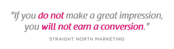
You will FAIL to capture first-visit conversions unless you ASK. – Straight North
Just asking isn’t enough, though. According to Straight North, your calls-to-action should be executed both “skillfully and persuasively”.
The trick is to have effective Calls-to-Actions plus a good combination of smart consistent placement, offers that give off substance, time-sensitive offers (giving them offers for a set, limited time will give them a sense of urgency), and most importantly, guaranteed offers.
You want your site to trust you. “Take away all arguments for delay, and conversions will increase”, Straight North says.
How PBS Can Help:
PBS’ Call-to-Action Button – as well as other elements such as the Countdown and Page Heading element – can help ease your burden regarding this task.
Executing them correctly is up to you and your team though, so make sure to give time to research about CTA placements and other marketing tips.
Here are some resources that can help boost your CTA game:
A person submitting their information to you via a form on your website is ultimately what measures a successful lead conversion.
This is why placing user-friendly contact forms on your site is of the utmost importance. They’re the ultimate “make-or-break stage of a great conversion opportunity”, says Straight North.
A couple of PBS’ third-party plugins available for shortcode mapping
So don’t intimidate your site visitors by overwhelming them with too many question forms, or have them exhaust too much energy, like having them type long sentences instead of choosing their answers from a drop-down list.
Letting them know that you value their privacy is also a must. Be sure to place clean, good-looking forms on your site so as to boost credibility.
TIP #8: Prominently Displayed Phone Numbers (or Contact Details)
Contact number and social media buttons displayed prominently in PBS’ Restaurant Template
A consistent, prominent display of phone numbers is a must if you’re a type of business that offers support through phone calls. Straight North adds that investing in toll-free numbers can also give you a good boost in conversion.
If you’re a tech company like us, then it’s also a good idea to display your e-mail address (or other ways your visitors can reach you) on your website.
How PBS Can Help:
PBS’ Full Page Niche-Based Templates have fields that let you feature phone numbers and other contact information more prominently, so that your visitors can reach you right away.
TIP #9: Continuous Testing
Straight North attests to the importance of site maintenance and testing: “No matter how good your website is in converting leads, it can always be better.”
This is true for any website, and not just one that’s attempting to convert leads. Making sure your site is in tip-top shape and that your customers are always pleased will help your business go a long way.
How PBS Can Help:
This one is up to you, but if you’d like a tip: the PBS Team continuously tests the site and page builder for any bugs, and always work to make sure you guys are satisfied. We don’t exactly have a feature for making sure you do regular tests on your site, so this one’s entirely up to you and your team.Do it, and do it well!
TIP #10: Mobile-Friendly Design
Almost everyone has a cellphone or tablet; but whileonly 23 percent of lead conversion rates comefrom mobile devices, it absolutely will not do to ignore any sort of potential conversions, no matter the percentage (leads are still leads, after all).
“Users converting from desktop view may have seen the site initially on a mobile device,” Straight North says. “Mobile conversions are (also) likely to grow as mobile Internet access continues to soar at the expense of desktops.”
You can preview your site on mobile view directly on desktop
How PBS Can Help:
Page Builder Sandwich is Mobile Responsive. You can view PBS-built sites on mobile, as well as check previews of your mobile site directly through desktop while editing. This way, you won’t have to keep switching to your phone in order to check if your site looks good on mobile.
Everything Matters in Site-Building
At the root of it all, it’s very, very important to understand that everything on your website – down to the smallest of details – has an impact on your audience.
The quality of your copy, images, your layout – all of it matters, and it matters a lot.
And one of the biggest mistakes people make when trying to trying to generate leads is this very thing: Taking small aspects of what makes up the website (like design, text, and other content) for granted.
Hopefully your website garners the success it very well deserves; it’s been built with PBS, after all.
Best of luck to you and all your endeavors, and thank you, as always, for using Page Builder Sandwich!
We’re collaborating with Cloudways, one of the most awesome managed cloud-hosting platforms on the web. If you haven’t heard of them yet, they’re pretty trusted in the WordPress community, proving to be one of the most reliable hosting services around. They have some pretty awesome features too, such as Multiple Cloud Infrastructures, Multiple Datacenters, and SSD Hosting, plus 1-click cloning, 1-click backup and restore, and 1-click domain mapping.
The good news is that we’ve teamed up with Cloudways to create an exclusive promo for Page Builder Sandwich aficionados who wanna give Cloudways a try or as a treat for existing Cloudways users! Just enter the code Just enter the code:
CWPBS15
..to get $15off when you upgrade your Cloudways account. This offer is also gives you a 1GB DigitalOcean server on Cloudways for 1 month. This is a great offer for those looking to move hosting providers, or those who want to set up new websites or web apps.
We hope you enjoy this promo as much as we enjoyed working with Cloudways!
Only a few weeks ago, we released PBS Version 4.1. This update included tweaks on the formatting bar and some text formatting updates, among others. For Version 2.0 though, while we made additional features, we decided to focus more on PBS’ overall performance.
200% Performance Increase & A Little Help from CodeInWP
What prompted this change was an article about page builder expectations from CodeInWP. It featured a short list of their favorites, reviewing them each under a specific criteria. While Page Builder Sandwich didn’t make it on the list itself, we were also briefly mentioned in the article:
With Page Builder Sandwich you won’t also lose your content and will be able to continue updating the page easily via a default WordPress editor.
Reading this is what pushed our team to improve on PBS even further. And, seeing as we weren’t included in the list, we were also curious at the same time as to what our specific shortcomings were. A little later we contacted CodeInWP to ask for a short review of PBS, and guest author Ann Taylor from gave us a very constructive and helpful reply:
“…I played around with a free version a bit. It shows a lot of promise: lots of modules, pretty intuitive UI, great WYSIWYG experience, everything is dragged around easily. However, when I had around 10 modules on the page, it became hard to continue working with it because of low editing speed…”
This great feedback prompted us further to investigate PBS’ speed and performance. We tested a lot of different scenarios and found huge speed bottlenecks. The root cause of the performance issues were the various calculations the plugin performed in order to display outlines, toolbars, and other visual editing cues. Below is a graph of the performance of PBS version 4.1 in Chrome:
Here are the important points of the graph in a nutshell:
Tall purple areas are bad
Wide purple areas are worse
We’ve sped things a lot, and now our graph for version 4.2 looks like this:
If you compare the tall and wide purple areas from the two graphs, that means that we have achieved a 200% performance increase!
4 New Elements
Our favorite thing about these 4 new elements is that they have the ability to create full webpage sections quickly and efficiently, without the need to drag elements onto the PBS workspace one by one. We’ll also give you the opportunity to choose from different styles so you have more space to customize these three new elements to fit your design needs.
Spacer Element
It’s easy to adjust element margins to get the space that you need. The spacer element can be used as an alternative to this. This is especially useful if you want certain rows to not shrink down too small in mobile screens.
Featurette Element
The featurette element can be used to create sections of your page at a faster rate. These sections can include hero headers, carousel testimonials, and other things you can use to enhance your page’s functionality.
Since all of the Featurette Elements are pre-designed, all you’ll have to do is simply drag the “Featurette” button from the Elements Tab, and choose what you want to add on your workspace from there.
Team Members Element
The team member element is perfect for showcasing your team members to your site visitors. Typically, a section like this includes a photo of a team member, as well as a short description at the bottom.
Gallery Element
This element is used to make photo galleries. Previously, you’d have to drag separate elements (such as buttons, frames, etc) to the PBS workspace one bye one in order to create a gallery. This new element does that for you though, so the process becomes hassle-free.
A Huge Thank You
Version 4.2 is one of our most important updates yet. Performance and functionality are crucial to any great plugin, after all. We’d like to thank @Ann Taylor and CodeInWP for giving us constructive feedback and wishing us luck in our journey. And for all of the PBS users, a huge thank you from us as well for your continued support.
We’ll be releasing even more updates soon (including our promised Google Fonts feature, among others), so be on the lookout for that!
Last February 2, 2017, Ann Taylor wrote the article 12 Things We Need to See From WordPress Page Builders in 2017 + Who Already Gets It Right in CodeInWP. We’ve been continuously improving Page Builder Sandwich for more than a year now: we do our research, listen to our customers, so we thought Page Builder Sandwich was gonna make it to CodeInWP’s “Who Got it Right” article. We didn’t, though, because of performance.
So we asked Ann about it, and she replied:
…I played around with a free version a bit. It shows a lot of promise: lots of modules, pretty intuitive UI, great WYSIWYG experience, everything is dragged around easily. However, when I had around 10 modules on the page, it became hard to continue working with it because of low editing speed…
So according to her, Page Builder Sandwich has performance issues. And since we always listen to feedback, we checked it out.
Testing the Performance
We needed a way to check out PBS’s performance; since PBS mostly runs on the browser via Javascript, Chrome’s Timeline profiler was the right tool for the job. The timeline profiler can identify and measure which processes are taking place in a webpage during runtime, which is perfect for finding speed bottlenecks.
We figured we should test out the most simple of steps first – running our mouse across multiple elements and rows. Simple right? We were confident that we wouldn’t run into performance issues with something as simple as this. Unfortunately, we were wrong.
Once we hit the record button, we ran the mouse for around 2 seconds on the screen, then hit the stop button. Here’s the resulting timeline from the profiler:
Lo and behold. It’s chock full of performance bottlenecks!
There’s a lot of stuff happening in the graph, but the most obvious issue is that there’s a lot of purple areas in it (which shouldn’t be the case). On top of that, these purple areas are visibly that very wide, and all seem to hit the peak of the graph. You’ll also notice that the graph is always full too, and that the purple areas almost never go down to zero. It seems like the browser is always busy doing something, and almost never resting.
But what do all of those purple areas really mean?
The profiler was kind enough to tell us that they’re called reflows. Here’s the definition of what a reflow is from the Google Developer site:
Reflow is the name of the web browser process for re-calculating the positions and geometries of elements in the document.. reflow is a user-blocking operation in the browser.
So this means that running your mouse around in PBS triggers a ton of reflows. What’s what’s worse it that each reflow pauses the browser momentarily so that it can finish doing its calculations. More reflows mean more browser pauses, and the experience becomes even more janky. In simpler terms, lots of purple areas = bad.
So it turns out Ann was right: we do have a huge performance bottleneck, so our team immediately got down to business to fix it right away.
Fixing Our Reflow / Jank Problem
Before anything else, we needed to do some research to find out just what causes this reflow in the first place. We found out that apparently, a lot of common things in Javascript can provoke the browser to cause a reflow.
Almost any function that you can use to get the width, height or position of a DOM element can trigger a reflow. Paul Irish wrote an extensive list of all the properties and functions in Javascript that can do this. The bad news is that Page Builder Sandwich uses a lot of these properties and functions, all of which cause reflow:
elem.getBoundingClientRect()
window.getComputedStyle()
window.scrollY
and a lot more…
Fix #1: Caching Expensive Reflow Processes
The most obvious solution is to NOT use those properties and functions. However, PBS relies heavily on them and we cannot make do without them.
The solution we’re left with is to trim down as much calls to those functions as possible. The hard part here was that we used those properties and functions a lot of times in different parts of PBS, and most of the time, we used them on the same DOM element multiple times. To fix this, we created our own caching mechanism for each problematic property/function.
For example, the getBoundingClientRect function gives us the current top, left, width, height, right, and bottom pixel measurements of a DOM element. We use this function all the time to calculate the location where to draw the element outlines in PBS. Here’s the caching function we created for this:
// Cache: Our client rects are kept here, we can use this to clear them later.
var elemsWithBoundingRects = [];
window.pbsGetBoundingClientRect = function( element ) {
// Check if we already got the client rect before.
if ( ! element._boundingClientRect ) {
// If not, get it then store it for future use.
element._boundingClientRect = element.getBoundingClientRect();
elemsWithBoundingRects.push( element );
}
return element._boundingClientRect;
};
Instead of calling getBoundingClientRect , we now used pbsGetBoundingClientRect . Now every time client rect gets queried, we store that value for future reference, thereby limiting the number of reflow triggers.
We also needed a way to clear the cache when the stored client rects become invalidated. The values of the stored client rect changes when the user scrolls the page or adds/changes/removes elements in the screen. So we created a cache clearing function that we can call whenever we need fresh client rect values:
var clearClientRects = function() {
var i;
for ( i = 0; i < elemsWithBoundingRects.length; i++ ) {
if ( elemsWithBoundingRects[ i ] ) {
elemsWithBoundingRects[ i ]._boundingClientRect = null;
}
}
elemsWithBoundingRects = [];
};
We also did this same caching mechanism for other expensive function calls that we usually use.
Fix #2: Grouping Together Reads & Writes Using FastDom
Implementing fix #1 increased the performance of PBS, but it wasn’t enough.
Googling a bit more, we came across an article by Wilson Page on Preventing ‘layout thrashing’. Wilson says:
Layout Thrashing (reflow) occurs when JavaScript violently writes, then reads, from the DOM, multiple times causing document reflows.
Apparently, it isn’t enough to limit your calls to specific reflow-triggering properties and functions. When you perform multiple successive “reads” and “writes” on the DOM, it also triggers a browser reflow. Here’s a typical scenario, straight from Wilson’s site:
The example above triggers 3 reflows because the dimensions of the entire page gets invalidated after a write. The suggested fix for this is to reorder the code to bunch up all the reads and writes together so that the whole thing would only trigger 1 browser reflow:
// Read
var h1 = element1.clientHeight;
var h2 = element2.clientHeight;
var h3 = element3.clientHeight;
// Write (invalidates layout)
element1.style.height = (h1 * 2) + 'px';
element2.style.height = (h2 * 2) + 'px';
element3.style.height = (h3 * 2) + 'px';
// Document reflows at end of frame
The snippet above makes fixing the problem look easy. But in reality, In PBS, reading and writing reflow-triggering stuff happens in a lot of different places in a lot of different times during the life-cycle of PBS. Re-organizing thousands of lines of Javascript code isn’t feasible.
Luckily for us, Wilson also provided a solution in his article. He created a small utility script to help with bunching together those reads and writes, called FastDom.
Here’s some code from Page Builder Sandwich that uses FastDom and also includes our Fix #1 above:
// Bunch together the reads from other threads.
fastdom.measure( function() {
// Use our cached client rect.
var rect = window.pbsGetBoundingClientRect( elem );
// Bunch together the writes from other threads.
fastdom.mutate( function() {
elem.style.top = ( rect.top + window.pbsScrollY() ) + 'px';
elem.style.height = rect.height + 'px';
elem.style.left = rect.left + 'px';
elem.style.width = rect.width + 'px';
}.bind( this ) );
}.bind( this ) );
What FastDom does is that it groups together all the fastdom.measure calls and all the fastdom.mutate calls and executes them asynchronously, effectively grouping all the reads and writes together to lessen all the reflows in the browser.
Fix #3: Accessing Style Objects Are Costly
We also found out with the help of jsPerf that some style-getting functions were faster than the others.
In PBS, we usually need to get the current value of a specific style of an element. For example, we normally use this to get the top margin:
var styles = window.getComputedStyle( elem );
var marginTop = styles.marginTop;
But, we found out that doing this is way faster:
var marginTop = elem.style.marginTop;
However, elem.style.marginTop and getComputedStyle are very different. The first one only gives us the inline styling of the element, and doesn’t take into account any stylesheets; and the second one takes into account both inline styles and stylesheets.
What’s more is that even when the getComputedStyle result was cached, it was still really slow. As it turns out, accessing the style object itself is the slow process.
Luckily for us, PBS appends inline styles to elements, and since inline styles take precedence (most of the time) than stylesheets, there will be cases where getting the inline style value would be enough. So if we combine the two methods above, we can come up with a much faster running code:
var marginTop = elem.style.marginTop;
if ( ! marginTop ) {
var styles = window.getComputedStyle( elem );
marginTop = styles.marginTop;
}
The Results of the Code Improvements
Our 3 fixes above took a lot of research, testing and actual implementation (and delayed our Fonts feature from being released), but in the end it was all worth it.
Going back to our initial test of moving your mouse across the screen for 2 seconds. Here’s the old ugly/janky timeline:
And here’s what our new timeline looks like after the performance improvements:
As you can see, there’re less purple stuff in the graph. And there’s a noticeable difference on the amount of processes being performed by the browser. The rectangular stuff on the bottom are thinner also, which means processes are being run faster than before.
If you compare the amount of tall/wide purple areas in the old and new graphs, we’re looking at a whopping 200% performance increase! We’re also seeing performance increases across the board. Not bad at all!
Take Aways & Learnings
To be honest, we didn’t think PBS had performance issues before Ann brought it up. Mainly because we were using development-centric machines and the performance bottlenecks weren’t that apparent. Looking back, checking for the performance should have been one of the top priorities. But at least now, as of version 4.3 it’s been taken cared of.
For those wanting to improve their own WordPress plugin performance, especially if you’re also using heavy Javascript, here’re my take aways from this experience:













 Lo and behold. It’s chock full of performance bottlenecks!
 As you can see, there’re less purple stuff in the graph. And there’s a noticeable difference on the amount of processes being performed by the browser. The rectangular stuff on the bottom are thinner also, which means processes are being run faster than before.
