
If there’s one thing you need to remember when building a website, it’s to never take good design for granted.
As we’ve mentioned in a previous article, a site visitor’s first impression on your website can make or break you in just a matter of seconds.
In other words, if they don’t like what they see within that timeframe, chances are they’re going to close their browser windows and direct their attention elsewhere.
Fortunately, there are a lot of ways to prevent this from happening; one of them is to familiarize yourself with good web design practices. And the good news is you don’t need to be a professional web designer in order to do so.
Because while it’s true that not everyone has a good eye for design, preventing bad design becomes easier once you know what to avoid.
Walau bagaimanapun, pastikan anda mengingati 4 kesilapan biasa dalam reka bentuk web ini. Dengan cara ini, kurang satu perkara yang perlu anda bimbangkan apabila anda akhirnya mula membina laman web anda.
Kesilapan #1: Menggunakan Lebih Daripada 3 Fon
A rule of thumb when designing websites? Try not to have too much visual elements going on within your space. Having more than 3 fonts on your site design is a surefire way to break this one rule. It’ll also overwhelm your site visitors.
Mengehadkan fon laman web anda kepada maksimum 3 adalah amalan reka bentuk umum yang dipatuhi oleh para profesional. Selain itu, ia meningkatkan tahap kebolehbacaan dan ketekalan laman web anda, yang merupakan kunci kepada kejayaan trafik laman web anda.
DON’T DO THIS:
Don’t use more than 3 fonts and try to avoid “fancy fonts” as much as possible. These tend to make your site look unprofessional and outdated.

DO THIS:
Use only 2 fonts, or a maximum of 3 if you have to. Notice how the page below looks clean and sleek, all while keeping readability and consistency all throughout the design.
Try comparing the differences between this example and the previous one. The example below with only two fonts is a website that your visitors will likely take seriously. This previous one above with the overwhelming amount of fonts isn’t.
Mistake #2: Failing to Use White Space
White space is one of the most important aspects of web design. But what is it?
Put simply, white space is literally the empty space between elements in a composition.
In other words, it’s negative space. This pertains to anything on your website that isn’t filled with text, photos, or other design elements.
Now, the problem arises when website owners want to fill all of the white space in, which is an absolute no-no.
White space matters because it gives your site visitors and readers some breathing space when going through your site. Just how it was mentioned in the first design mistake to avoid, overwhelming your website with too much design elements is more than enough reason for your site visitors to leave and for your traffic to decrease significantly. It also makes for poorly executed design.
DON’T DO THIS:
In the example below, take a look at how the text is nearing the edges of the purple section’s margin. Notice as well how all elements leave almost zero room for white space.

DO THIS INSTEAD:
 Give your site readers some room to breathe. If adding in long paragraphs is unavoidable, just remember to always take the rules of spacing into account—they’re pretty easy to remember anyway ?. It will leave your page looking cool, crisp, and professional.
Mistake #3: Designing Websites With Zero Flow in Your Site’s Content
It’s important to pay attention as to how information on your website is presented. Moreover, site content should generally follow a logical flow, taking the site viewer’s intuition into consideration.
Lihat dua contoh di bawah untuk memahami maksud kami.
DON’T DO THIS:
Unless you’re a graphic designer by profession, it’s probably not a good idea to experiment with the standard flow of your website’s sections.
Below, you can see that the site’s design lacks both visual and logical flow; everything is all over the place. You don’t want your audience having a hard time navigating through your site, either. This is another surefire way to do it.

DO THIS INSTEAD:
Notice how the sections of the website flow depending on what actions the visitor is most likely to take.

Reka bentuknya adalah intuitif dan mempunyai aliran yang logik: Pertama, organisasi memperkenalkan dirinya dan memberi maklumat asas kepada audiens; seperti perihal dan apa yang dilakukannya. Kedua, ia menambah angka yang boleh dipercayai untuk membina kredibiliti. Akhir sekali, laman web memberikan audiens nombor hubungannya dan senarai acara, mendorong mereka untuk mengambil tindakan.
Mistake #4: Trying to Fit in Every Bit of Information Onto Your Website
Menambah teks tebal yang tidak perlu di tempat yang sepatutnya ruang putih boleh menghalau audiens anda. Ingat untuk hanya mengekalkan butiran penting.
Studies find that readers only visit 20% of your webpage; everyone else outside that percentage will probably just scroll through your site.
DON’T DO THIS.
Don’t overwhelm your visitors with inconsistent, giant walls of text, especially if it means having to sacrifice your website design’s cohesiveness and structure.

DO THIS INSTEAD:
Keep your copy short and concise, and take out chunks of unecessary text if you can help it. Only keep vital information that your site visitors absolutely need to know.

Conclusion
Website design is important, and can be a huge deciding factor in whether or not you gain site traffic.
Ingat jangan mengambil mudah mengenainya. Sentiasa peruntukkan masa untuk menyelidik, dan rujuk artikel reka bentuk untuk membimbing anda sepanjang perjalanan. Tidak lama lagi, anda akan melihat trafik laman web anda meningkat. ? Semoga berjaya!
Design in less time!
Check out how much faster Page Builder Sandwich let you design your web pages.
Try Live Preview
This week’s useful resource:
CANVA has hundreds of resources that you can access on their website. Apart from useful and easy-to-follow design tips, they also have photo editing tools, graphs, and a wide range of useful resources you can use for your creative projects.
Lihat Panduan Warna yang hebat ini daripada Canva untuk usaha reka bentuk anda yang seterusnya.

 Sudah 10 bulan sejak kami melancarkan Page Builder Sandwich kepada umum. Kami kini mempunyai sekitar 6,000 pemasangan aktif, dan itu satu pencapaian yang cukup membanggakan bagi kami. Kami juga telah menerima banyak maklum balas kerananya, baik yang positif mahupun negatif. Walau bagaimanapun, kata sepakatnya ialah orang ramai menyukai betapa mudahnya membina reka letak dan mencipta kandungan mereka berbanding pembina halaman lain di luar sana.





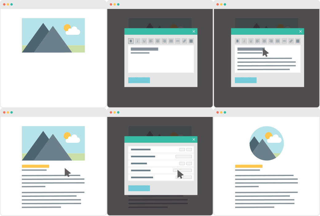
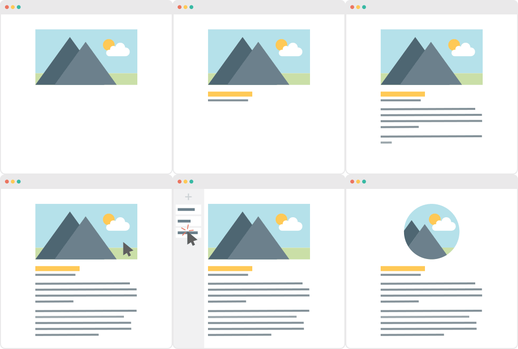



 Selepas keluaran Versi 4.0 pada Januari lalu, kami terus mengusahakan pembangunan PBS, menambahkan pembetulan dan juga penambahbaikan. Kami teruja untuk berkongsinya dengan anda, jadi inilah yang kami sediakan untuk kemas kini Versi 4.1.

 Dalam


 New in Page Builder Sandwich is the