The parallax scrolling effect is a design technique that’s relatively new in development and web design. Over the past few years since it’s hit the scene though, it’s grown pretty popular in its own right, and with good reason, too.
Мафҳуми паймоиши параллакс
Parallax scrolling is a technique wherein your web page’s background image scrolls at a slower rate compared to the foreground image. It gives the user a unique sense of depth and action while scrolling through a page when used on a website.
Without Parallax Scrolling
The elements of the web page – the text, images, buttons, etc – all scroll at the same rate as the background.
With Parallax Scrolling
The background image scrolls at a different rate as the rest of the elements in the page.
Таъсири паймоиши параллакс ба корбар
Аммо ин усул комилан нав нест ва воқеан дар аниматсияи анъанавӣ ҳанӯз аз солҳои 1920 истифода мешуд. Он инчунин дар бисёр бозиҳои видеоии классикӣ, ба монанди Super Mario brothers истифода шудааст.
Аммо дар соҳаи тарроҳии веб, ширкати Nike аксар вақт яке аз аввалинҳое дониста мешавад, ки соли 2011 паймоиши параллаксро истифода бурдааст. Аз он вақт инҷониб, истилоҳи «паймоиши параллакс» (баъзан «замина(ҳо)-и параллакс» номида мешавад) дар байни тарроҳон ва барномасозон ба як истилоҳи маъмул табдил ёфта, маҳбубияти он пайваста меафзояд.
Parallax scrolling as used in a version of Super Mario Brothers. Notice how the hills in the background move in slightly varying speeds, as compared to Mario and the other characters in the foreground.
Ин барои корбар чӣ фоида дорад
Чизи олиҷаноб дар бораи ин эффект он аст, ки он корбаронро ба ҳамкорӣ бо вебсайти шумо водор месозад ва ҳам фаъолияти мутақобилаи корбар ва ҳам ҷолибияти онро баланд мебардорад. Ва ҳангоми дуруст татбиқ шудан, паймоиши параллакс метавонад содатарин вебсайтҳоро низ зинда созад. Онро ҳатто барои эҷоди ҳикояҳои ҳайратангез истифода бурдан мумкин аст, ки фавран таваҷҷуҳи тамоми бинандагони сайтро ҷалб мекунад.
In other words, if they don’t like what they see within that timeframe, chances are they’re going to close their browser windows and direct their attention elsewhere.
Fortunately, there are a lot of ways to prevent this from happening; one of them is to familiarize yourself with good web design practices. And the good news is you don’t need to be a professional web designer in order to do so.
Because while it’s true that not everyone has a good eye for design, preventing bad design becomes easier once you know what to avoid.
Бо вуҷуди ин, ҳатман ин 4 хатогии маъмули веб-дизайнро дар хотир доред. Бо ин роҳ, вақте ки шумо ниҳоят ба сохтани вебсайти худ шурӯъ мекунед, боз як ташвиши камтар хоҳед дошт.
Хатогии №1: Истифодаи беш аз 3 шрифт
A rule of thumb when designing websites? Try not to have too much visual elements going on within your space. Having more than 3 fonts on your site design is a surefire way to break this one rule. It’ll also overwhelm your site visitors.
Don’t use more than 3 fonts and try to avoid “fancy fonts” as much as possible. These tend to make your site look unprofessional and outdated.
DO THIS:
Use only 2 fonts, or a maximum of 3 if you have to. Notice how the page below looks clean and sleek, all while keeping readability and consistency all throughout the design.
Try comparing the differences between this example and the previous one. The example below with only two fonts is a website that your visitors will likely take seriously. This previous one above with the overwhelming amount of fonts isn’t.
Put simply, white space is literally the emptyspacebetween elements in a composition.
In other words, it’s negative space.This pertains toanything on your website that isn’t filled with text, photos, or other design elements.
Now, the problem arises when website owners want to fillall of the white space in, which is an absolute no-no.
White space matters because it gives your site visitors and readers some breathing space when going through your site. Just how it was mentioned in the first design mistake to avoid, overwhelming your website with too much design elements is more than enough reason for your site visitors to leave and for your traffic to decrease significantly. It also makes for poorly executed design.
DON’T DO THIS:
In the example below, take a look at how the text is nearing the edges of the purple section’s margin. Notice as well how all elements leave almost zero room for white space.
DO THIS INSTEAD:
Give your site readers some room to breathe. If adding in long paragraphs is unavoidable, just remember to always take the rules of spacing into account—they’re pretty easy to remember anyway ?. It will leave your page looking cool, crisp, and professional.
Mistake #3: Designing Websites With Zero Flow in Your Site’s Content
It’s important to pay attention as to how information on your website is presented. Moreover, site content should generally follow a logical flow, taking the site viewer’s intuition into consideration.
Ба ду намунаи зерин назар андозед, то бубинед, ки мақсади мо чист.
DON’T DO THIS:
Unless you’re a graphic designer by profession, it’s probably not a good idea to experiment with the standard flow of your website’s sections.
Below, you can see that the site’s design lacks both visual and logical flow; everything is all over the place. You don’t want your audience having a hard time navigating through your site, either. This is another surefire way to do it.
DO THIS INSTEAD:
Notice how the sections of the website flow depending on what actions the visitor is most likely to take.
Тарроҳӣ фаҳмо буда, пайдарпайии мантиқӣ дорад: Аввалан, ташкилот худро муаррифӣ мекунад ва ба шунавандагон маълумоти асосиро медиҳад; ба монанди ин ки он дар бораи чист ва чӣ кор мекунад. Дуюм, он рақамҳои боэътимодро барои ба вуҷуд овардани эътимод илова мекунад. Ниҳоят, вебсайт рақамҳои тамос ва рӯйхати чорабиниҳои худро ба аудитория пешниҳод карда, онҳоро ба амал кардан даъват менамояд.
Mistake #4: Trying to Fit in Every Bit of Information Onto Your Website
Studies find that readers only visit 20% of your webpage; everyone else outside that percentage will probably just scroll through your site.
DON’T DO THIS.
Don’t overwhelm your visitors with inconsistent, giant walls of text,especially if it means having to sacrifice your website design’s cohesiveness and structure.
DO THIS INSTEAD:
Keep your copy short and concise, and take out chunks of unecessary text if you can help it. Only keep vital information that your site visitorsabsolutely need to know.
Conclusion
Website design is important, and can be a huge deciding factor in whether or not you gain site traffic.
CANVA has hundreds of resources that you can access on their website. Apart from useful and easy-to-follow design tips, they also have photo editing tools, graphs, and a wide range of useful resources you can use for your creative projects.
Барои иқдоми навбатии тарроҳии худ ба ин Дастури ҷолиби рангҳо аз Canva назар андозед.
Only a few weeks ago, we released PBS Version 4.1. This update included tweaks on the formatting bar and some text formatting updates, among others. For Version 2.0 though, while we made additional features, we decided to focus more on PBS’ overall performance.
200% Performance Increase & A Little Help from CodeInWP
Он чизе, ки боиси ин тағйирот гардид, мақола дар бораи интизориҳо аз созандагони саҳифаҳо аз ҷониби CodeInWP буд. Дар он рӯйхати кӯтоҳи созандагони писандидаи онҳо оварда шуда, ҳар кадоме аз рӯи меъёрҳои мушаххас баррасӣ шуда буд. Гарчанде ки Page Builder Sandwich худаш ба ин рӯйхат дохил нашуд, дар мақола номи мо низ ба таври мухтасар зикр гардид:
With Page Builder Sandwich you won’t also lose your content and will be able to continue updating the page easily via a default WordPress editor.
Хондани ин мақола маҳз ҳамон чизе буд, ки дастаи моро водор сохт, ки PBS-ро боз ҳам беҳтар гардонад. Ва чун дидем, ки ба рӯйхат дохил нашудаем, ҳамзамон бароямон ҷолиб буд, ки камбудиҳои мушаххаси мо дар чӣ буданд. Чанде пас мо бо CodeInWP дар тамос шудем, то шарҳи мухтасари PBS-ро бипурсем ва муаллифи меҳмон Энн Тейлор ба мо посухи хеле созанда ва муфид дод:
“…I played around with a free version a bit. It shows a lot of promise: lots of modules, pretty intuitive UI, great WYSIWYG experience, everything is dragged around easily. However, when I had around 10 modules on the page, it became hard to continue working with it because of low editing speed…”
Since all of the Featurette Elements are pre-designed, all you’ll have to do is simply drag the “Featurette” button from the Elements Tab, and choose what you want to add on your workspace from there.
Team Members Element
Унсури аъзои даста барои намоиш додани аъзои дастаи шумо ба меҳмонони сомона беҳтарин аст. Одатан, чунин як бахш акси аъзои даста ва инчунин тавсифи кӯтоҳеро дар поён дар бар мегирад.
Gallery Element
Ин унсур барои сохтани галереяҳои акс истифода мешавад. Пештар, ба шумо лозим меомад, ки унсурҳои алоҳидаро (ба мисли тугмаҳо, чаҳорчӯбаҳо ва ғайра) як ба як ба фазои кории PBS кашед, то галерея созед. Аммо ин унсури нав ин корро барои шумо анҷом медиҳад, аз ин рӯ раванд бе мушкилӣ мегардад.
A Huge Thank You
Версияи 4.2 яке аз муҳимтарин навсозиҳои мо то имрӯз мебошад. Охир, маҳсулнокӣ ва функсионалӣ барои ҳар як плагини олӣ ниҳоят муҳиманд. Мо мехоҳем ба @Ann Taylor ва CodeInWP барои додани фикру мулоҳизаҳои созанда ва орзуи комёбӣ дар сафари мо ташаккур гӯем. Ва ба ҳамаи корбарони PBS низ барои дастгирии пайвастаатон ташаккури бепоён баён мекунем.
Мо ба зудӣ навсозиҳои боз ҳам бештарро нашр хоҳем кард (аз ҷумла хусусияти ваъдашудаи Google Fonts ва дигар чизҳо), бинобар ин мунтазир бошед!
То он вақт, сомонасозии бобарор аз ҷониби Дастаи PBS!
Баъзе аз плагинҳои маъмултарине, ки барои харитасозии шорткодҳо ошкор шудаанд.
Сипас, мо як силсила санҷишҳои автоматиро дар коди ибтидоии ҳар як плагин иҷро мекунем, то бифаҳмем, ки оё он шорткод дорад ё на, ва сипас кӯшиш мекунем, ки ҳамаи он шорткодҳоро, аз ҷумла ҳамаи атрибутҳояшонро пайдо кунем. Ҳисоби ниҳоии маълумотҳо беш аз 2000 шорткод овард. Боз як ҳайрат. Шорткодҳои ошкоршуда пас аз он барои санҷиши дастӣ ба пойгоҳи додаҳои харитасозии шорткодҳо ворид карда мешаванд.
Барои он ки боварӣ ҳосил кунем, ки мо ҳамаи шорткодҳо ва атрибутҳои онҳоро дуруст муайян кардаем, мо бахши махсуси фронтендро барои таҳрири шорткодҳо ва атрибутҳо сохтем, ки бо истифода аз AngularJS ва Bootstrap таҳия шудааст.
Bootstrap & AngularJS interface for fixing up all the mapped shortcodes.
Мо маҷбурем ҳар як плагинро ба таври дастӣ аз назар гузаронем ва ҳуҷҷатҳои шорткодҳои онҳоро тафтиш кунем, то мутмаин шавем, ки тамоми маълумоти мо дуруст аст.
Ҳарчанд ин кор хеле заҳматталаб ва дилгиркунанда аст, доштани раванди автоматӣ ҷонибҳои мусбат низ дорад:
Тибқи омори аввалияи мо, тақрибан танҳо 1 аз ҳар 2 плагин шорткод дорад.
Ними шорткодҳои ошкоршуда атрибут надоранд (вале қисме аз онҳо метавонанд ошкорсозии бардурӯғ бошанд)
Keeping your audience reeled into your page (and successfully generating leads) is a different story altogether, though.
Don’t get us wrong. Lots of sites can achieve this without a worry, but that’s usually because they spend a significant amount of time and research doing just that.
In contrast, some sites admittedly have a little trouble pulling it off, and more often than not, some of them don’t know where to begin. But don’t worry – Page Builder Sandwich will try to lend you a hand with that very same thing.
Why is it Important to Generate Leads?
One crucial thing to remember is that generating leads takes more than just buying a domain and setting a website up.
Now, before we get too into it, take note that Page Builder Sandwich isn’t a marketing website.
Аммо дар ҳар сурат, муҳим аст бидонед, ки дар паси ҷалби муштариёни эҳтимолӣ (leads) илме нуҳуфтааст, ва гарчанде ки мо худамон фурӯшгоҳони рақамӣ (digital marketers) набошем ҳам, қайд кардан зарур аст, ки табдили бомуваффақияти онҳо инчунин ба татбиқи дурусти тарроҳӣ ва мундариҷа вобаста аст. Ва маҳз дар ҳамин ҷо мо метавонем кумак кунем.
Great question! A few weeks ago we began corresponding with Straight North, a blog that specializes in digital marketing and lead conversion. They’ve given us some really tips which we hope you guys find helpful in your site-building journey.
Now, remember thatthere could belots of factors as to why your website isn’t generating the amount of leads you’d like. The first step is toidentify what these factors are, and hopefully, this list can help you out with doing just that.
TIP #1: Create Content that Stimulates Action
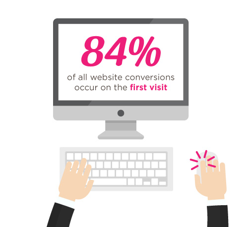
According to Straight North, 84% of website conversions occur on the first visit, and only 11% convert in the second.
That’s why it’s you and your team’s job to try and convince people to stay glued to your page.
Straight North suggests that posting copy and content (both text and images) is a great way to catch your visitors’ attention. Remember to always allot sufficient time to research on what makes good copy and good content, and never underestimate either.
Wow your site visitors by using interactive PBS elements like the Carousel, or use Parallax Scrolling, and Video Backgrounds to catch their attention. Remember to execute their placement in a balanced way though, as to not overwhelm your audience.
TIP #2: Intuitive Navigation
In the realm of web development and site-building, intuitiveness in the user interface (or UI) is key.
This means that when your visitors or users find their way around your site byintuition (i.e. easy site-navigation and straightforward instructions), they’re more likely to stay glued on your site.
Ҳоло, агар паймоиш (навигатсия) дар вебсайти шумо таҷрибаи дилгиркунанда ё асабоникунанда бошад, эҳтимоли зиёд дорад, ки меҳмонони шумо барои шунидани он чизе, ки шумо гуфтан мехоҳед ва он чизе, ки шумо метавонед ба онҳо пешниҳод кунед, ба қадри кофӣ намемонанд.
Straight North adds thatgetting too “clever and creative” with navigation labels is a bad idea,and suggest that you use terms like “Contact Us” for call-to-action buttons, rather than using vague labels like “Interact!” or “Dialog.” Remember thatbombarding your site with too much jargon can cause frustration to your audience as well.
So as long as navigating through your website comes to the user assecond nature, then you have one less thing to worry about when trying to convert leads.
How PBS Can Help:
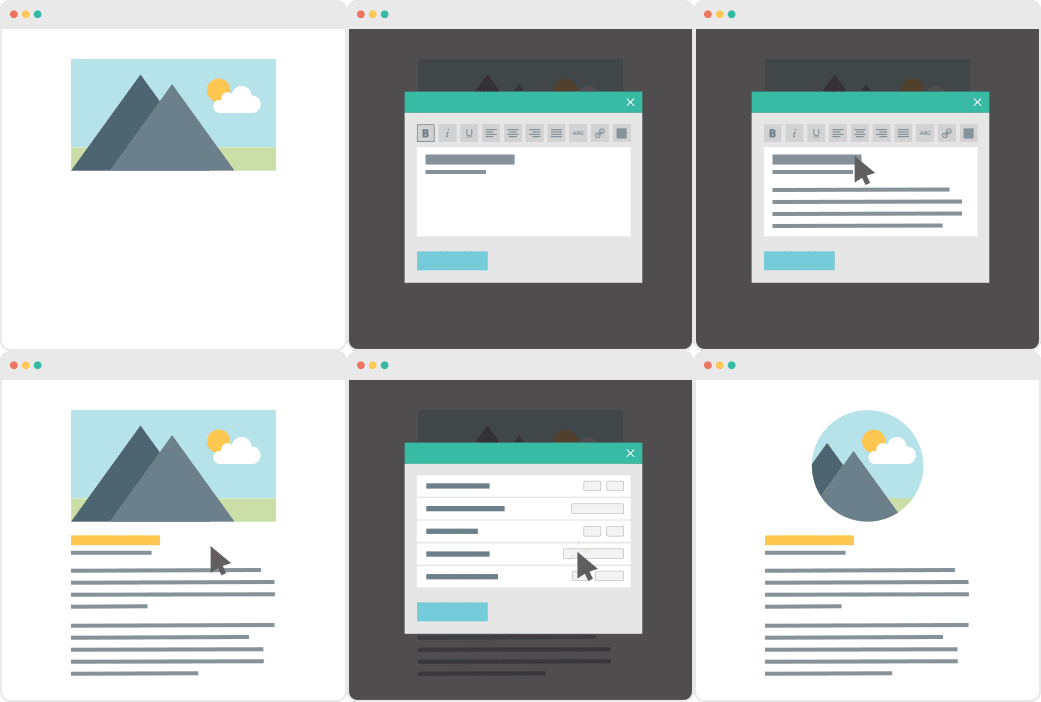
Page Builder Sandwich’s UI is highly intuitive, and is akin to using a Word processor (like Google Docs and Microsoft Word). Check out ourdemo to get some inspiration on how you can apply intuitive changes to your site, too!
OTHER PAGE BUILDERS
…have too much stuff going on.
PAGE BUILDER SANDWICH
…gets straight to the point.
TIP #3: Use Relevant, Custom Imagery
Your images and how they’re presented also matter, and they matter a lot.
While it may seem trivial to some, uploading boring stock images, stretched out/pixelzed photos, or badly-presented typography is a huge factor that dictates whether your visitors stay on your site, or move to a better, more credible-looking alternative.
How PBS Can Help:
Because it’s WordPress-run,PBS lets you post high-quality photos in your website. As long as you have the right image dimensions, you shouldn’t have a problem with posting photos.
Additional lifehack: You can also check out Pexels.com and Unsplash.com to get awesome, high-quality stock photos!
TIP #4: Persuasive Credibility Elements
Skepticism is ahuge conversion killer.
That’s why more often than not, it’s always a good idea to add in elements that back up your credibility as a website (or business), like testimonials from credible sources, and logos of reputable companies or groups that you’ve worked with.So use customer testimonials, show logos of well-known customers, and include third-party mentions in your content.
How PBS Can Help:
Use PBS features to vouch for you. Display your customers’ testimonials in a Carousel, or use the Featurette element to showcase third-party mentions, or make use of the column element to effectively display logos of your well-known customers (like in the graphic above).
TIP #5: Get Personal!
Straight North says thatusing a lighter, casual tone makes all the difference when writing content (such as articles and bio’s) on your site. This lets your users know that you’re human too, and not just some bot trying to get a run for their money (which we hope you aren’t).
How PBS Can Help:
While this part is entirely up to you and your team, it wouldn’t hurt to use elements such as the Featurette, Gallery, and Image Box to liven up your bio’s as well. Adding in other PBS elements like Social Media Icons can help put a personal touch to your pages, too.
PBS’ Industry Template makes full use of the Image Box Elements for its About Us and Feature Sections.
TIP #6: Irresistible Calls-to-Action
Calls-to-Action (CTA) are a crucial part of generating leads.
You will FAIL to capture first-visit conversions unless you ASK. – Straight North
Just asking isn’t enough, though. According to Straight North, your calls-to-action should be executed both “skillfully and persuasively”.
The trick is to have effective Calls-to-Actions plus a good combination of smart consistent placement, offers that give off substance, time-sensitive offers (giving them offers for a set, limited time will give them a sense of urgency), and most importantly, guaranteed offers.
You want your site to trust you. “Take away all arguments for delay, and conversions will increase”, Straight North says.
How PBS Can Help:
PBS’ Call-to-Action Button – as well as other elements such as the Countdown and Page Heading element – can help ease your burden regarding this task.
Executing them correctly is up to you and your team though, so make sure to give time to research about CTA placements and other marketing tips.
This is why placing user-friendly contact forms on your site is of the utmost importance. They’re the ultimate “make-or-break stage of a great conversion opportunity”, says Straight North.
A couple of PBS’ third-party plugins available for shortcode mapping
So don’t intimidate your site visitors by overwhelming them with too many question forms, or have them exhaust too much energy, like having them type long sentences instead of choosing their answers from a drop-down list.
Letting them know that you value their privacy is also a must. Be sure to place clean, good-looking forms on your site so as to boost credibility.
PBS’ Full Page Niche-Based Templates have fields that let you feature phone numbers and other contact information more prominently, so that your visitors can reach you right away.
TIP #9: Continuous Testing
Straight North attests to the importance of site maintenance and testing: “No matter how good your website is in converting leads, it can always be better.”
Ин барои ҳама гуна вебсайт дуруст аст, на танҳо барои он сомонае, ки кӯшиши табдили лидҳоро дорад. Боварӣ ҳосил кардан аз он ки сайти шумо дар ҳолати аъло қарор дорад ва муштариёни шумо ҳамеша қаноатманданд, ба тиҷорати шумо кумак мекунад, ки ба пешравиҳои калон ноил шавад.
How PBS Can Help:
This one is up to you, but if you’d like a tip: the PBS Team continuously tests the site and page builder for any bugs, and always work to make sure you guys are satisfied. We don’t exactly have a feature for making sure you do regular tests on your site, so this one’s entirely up to you and your team.Do it, and do it well!
TIP #10: Mobile-Friendly Design
Almost everyone has a cellphone or tablet; but whileonly 23 percent of lead conversion rates comefrom mobile devices, it absolutely will not do to ignore any sort of potential conversions, no matter the percentage (leads are still leads, after all).
“Users converting from desktop view may have seen the site initially on a mobile device,” Straight North says. “Mobile conversions are (also) likely to grow as mobile Internet access continues to soar at the expense of desktops.”
You can preview your site on mobile view directly on desktop
How PBS Can Help:
Page Builder Sandwich is Mobile Responsive. You can view PBS-built sites on mobile, as well as check previews of your mobile site directly through desktop while editing. This way, you won’t have to keep switching to your phone in order to check if your site looks good on mobile.
Everything Matters in Site-Building
At the root of it all, it’s very, very important to understand that everything on your website – down to the smallest of details – has an impact on your audience.
The quality of your copy, images, your layout – all of it matters, and it matters a lot.
Ва яке аз калонтарин хатоҳое, ки одамон ҳангоми кӯшиши ба даст овардани лидҳо содир мекунанд, маҳз ҳамин чиз аст: нодида гирифтан ё камаҳамият донистани ҷузъҳои хурди вебсайт (ба монанди тарроҳӣ, матн ва дигар мундариҷа).
Hopefully your website garners the success it very well deserves; it’s been built with PBS, after all.
Ба шумо ва ҳамаи ташаббусҳоятон барори кор орзумандем ва ташаккур, чун ҳамеша, барои истифодаи Page Builder Sandwich!
We’ve been getting quite a few inquiries the past week about Pre-Design Sections (and by extension, the PBS Templates), what they are, and how they can be accessed.
So in this article, we’ll be teaching you how to not only access them, but also how to maximizethese features of Page Builder Sandwich: By customizing them and making them your own.
Accessing the Pre-Designed Sections
If you aren’t familiar yet, all you have to do to access the Pre-Designed sections is to hover your mouse onto the left side of your screen, and access the Elements Inspector. This is the sidebar that lets you drag and drop elements directly onto your content area.
Say hello to the Elements Inspector!
Once it’s accessed, simply scroll down to the bottom and select Pre-Designed Sections. A library of the sections will pop up. Select one from the collection, drag and drop, and it’ll show up on your content area, like so:
From here, you can move the elements within the section around, or move the entire thing and adjust its position. And there you have it! You’ve selected a Pre-Designed Section from Page Builder Sandwich.
Now it’s time to add in your own twist:By customizing and tweaking with the elements’ settings within the selected section.
Customizing the Pre-Designed Sections
Each element’s setting within any one Pre-Designed section can be edited and customized according to your website’s needs and your personal taste.
This means everything included in your selected Pre-Designed section – like text, colors, images, buttons,everything– can be edited and tinkered with byyou.
Пас, масъалан, агар шумо аз тобиши кабуду сабзи пешфарз ва тасвири гандумзор дар бахши пешфарзи қаблан тарроҳишудаи зер розӣ набошед…
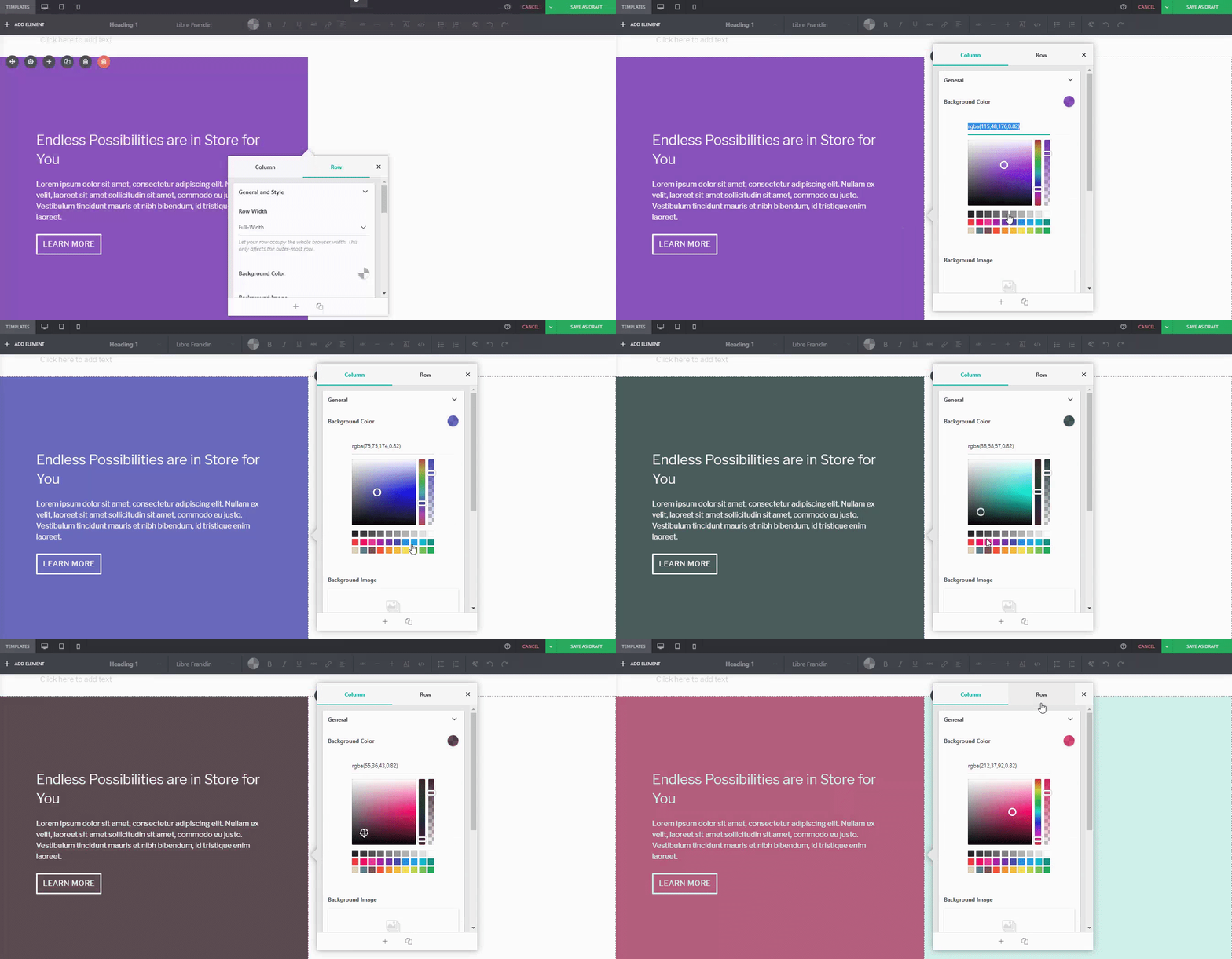
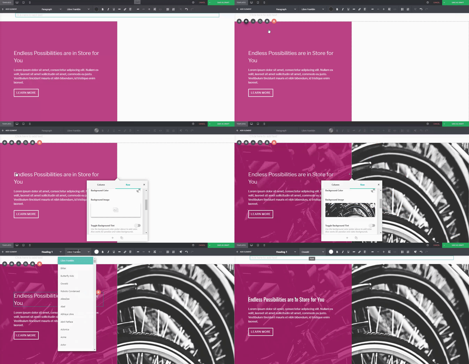
You can adjust it. For instance, if I wanted a different background tint on the left:
Or if you wanted to replace the image of the wheat field on the right:
Or even change thebutton style, margin, padding, andfont:
…You can.
Барои муқоиса:
Default PBS Pre-Designed Section
The same Pre-Designed Section, completely tweaked and customized. Notice the different font, color scheme, button style, photo, and margin width. You can actually take this further, and let your imagination run wild.
Here are a few more examples on how you can spice up our Pre-Designed Sections
DefaultPre-Designed Section from Sandwich
The same Pre-Designed Section, customized
You can do it with our Full-Page Templates, too:
DefaultTemplate from Sandwich
The same Template, customized
Conclusion
Бахшҳои қаблан тарроҳишудаи Page Builder Sandwich беш аз он чизе ҳастанд, ки шумо фикр мекунед.
Tweak and customize them to make them completely your own, or even use them as a starting point for when you don’t want to design your page from the ground up.
То даме, ки ҳодисаи ғайричашмдошт рух медиҳад. Ва сайти шумо аз кор мемонад.
Шумо китф дарҳам мекашед. Шумо шунидаед, ки ин гуна ҳодисаҳо ҳатто бо беҳтарин одамон низ рӯй медиҳанд. Ҳатто шумо мутмаин ҳастед, ки чунин ҳодиса бо Марк Зукерберг ва Дэвид Карп низ пеш аз ин рӯй додааст ва ҳардуи онҳо ҳоло хубанд, ҳамин тавр не?
Пас шумо кӯшиш мекунед, ки онро дубора фаъол созед ва дар Google бо шитобкорона роҳҳои ҳалро меҷӯед. Бори аввал кор намекунад. Бори дуюм ҳам кор намекунад – ё сеюм, ё чорум, ё ҳабдаҳум ва ҳатто бисту дуюм. Чашмони шумо аз дарки он, ки шумо комилан ва саросар нобуд шудаед, калон мешаванд; вебсайти шумо барои ҳамеша аз байн рафт. Шумо дар интернет барои дарёфти роҳи ҳал ҷустуҷӯ мекунед, аммо тақрибан ҳамаи сайтҳои дастурӣ як чизро мегӯянд:
Шумо бояд файлҳои WordPress-и худро аз аввал нусхабардорӣ мекардед.
Шумо бояд файлҳои WordPress-и худро аз аввал нусхабардорӣ мекардед.
Шумо бояд файлҳои WordPress-и худро аз аввал нусхабардорӣ мекардед.
Дар беҳтарин ҳолат, яке аз даҳшатноктарин хобҳои соҳиби вебсайт. Ин маҳз ҳамон чизест, ки мо мехоҳем аз он канорагирӣ кунем, пас чӣ гуна метавонем пеши роҳи онро гирем? Хуб, ҷавоб хеле содда аст: Мо бояд як плагини хуби нусхабардориро насб кунем.
Файлҳо дар ҷузвдони wp-content (мавзӯъ, плагинҳо ва боргузориҳои шумо)
Файли танзимоти WordPress
Пойгоҳи додаҳои WordPress-и шумо
Шарҳи каме бештар дар бораи нусхабардорӣ
WordPress танҳо бо худ системаҳои амният ва нусхабардориро барои сайти шумо надорад (гарчанде шумо метавонед тарзи ба таври дастӣ танзим кардани онҳоро омӯзед – аммо ин вақти зиёдеро мегирад), бинобар ин ёфтани роҳе барои кам кардани мушкилот ба худи шумо вобаста аст. Навсозии сайти шумо ҳамеша як амри муқаррарӣ аст (дар сурате, ки шумо хоҳед, ки чизи наве илова кунед, ба монанди плагини дигар, ё агар хоҳед, ки чизеро хориҷ кунед), ва нусхабардорӣ ҳатмӣ мебошад, магар ин ки шумо хоҳед маълумотро аз даст диҳед (ки намехоҳед). Сабабҳои дигари нусхабардорӣ кардани сайти шумо ва тақвияти амният аз он иборатанд, ки он аз ҳакерҳо эмин бошад ва касе натавонад маълумоти сайти шуморо дуздад.
“Барои ин ҳам плагин ҳаст.”
WordPress барои ҳама гуна хусусиятҳо плагинҳои бешумор дорад, аз ҷумла (бале, шумо дуруст тахмин кардед) якчанд плагин барои амният ва нусхабардорӣ. Шумо метавонед аз байни миқдори зиёди ин плагинҳо интихоб кунед; баъзе аз маъруфтаринҳо инҳоянд: BackupBuddy ва UpDraftPlus. Тақрибан дар ҳама ҷо барои ин плагинҳо (ва бештар аз он) тақризҳо мавҷуданд, бинобар ин хавотир нашавед – мӯъҷизаи интернет пуштибони шумост. Шахсан мо бо сабабҳои зерин VaultPress-ро ҳам барои амният ва ҳам барои нусхабардорӣ истифода мебарем:
VaultPress аз ҷониби Automattic сохта шудааст – ки аз ҷониби Matt Mullenweg– ҳамон шахсе, ки худи WordPress-ро таъсис додааст. Бисёре аз маҳсулот ва хидматҳои Automattic, агар на аксарияти онҳо, бехатар ва боэътимоданд ва обуна шудан ба плагинҳое, ки аллакай санҷида ва озмуда шудаанд, ҳеҷ гоҳ фикри бад нест.
Соддагӣ. Барои истифодаи он, шумо танҳо бояд ба интерфейси худ ворид шавед ва метавонед тамоми тафсилоти нусхабардориро бинед ва амалиётҳоро аз он ҷо иҷро кунед.
Ҳоло, азбаски VaultPress ба стандартҳои шахсии мо ҷавобгӯ аст, он барои мо комилан мувофиқ аст. Аммо, агар шумо аз VaultPress қаноатманд набошед, бисёр сайтҳо – ба монанди WPBeginner ва wpmudev — дар сурате, ки агар шумо ҳанӯз дар тасмимгирӣ мушкилӣ дошта бошед, мақолаҳои муқоисавии маъмулиро пешниҳод мекунанд.
Ҳамааш ба худи шумо вобаста аст
Дар ниҳоят, тасмим дар бораи муҳофизат ва нусхабардорӣ кардани сайти шумо ё накардани он ба худи шумо вобаста аст. Баъзе одамон мутмаинанд, ки метавонанд бо хатарҳое, ки сайти муҳофизатнашуда пеш меорад, рӯ ба рӯ шаванд… ва баъзе одамон нестанд – ва ин хуб аст. Охир, беҳтар аст эҳтиёт кунед, то ин ки пушаймон шавед.


 Дар


 Пас аз барориши Нусхаи 4.0 дар моҳи январи гузашта, мо корро рӯи таҳияи PBS идома дода, ҳам ислоҳот ва ҳам беҳбудиҳо ворид кардем. Мо бо хушнудӣ онҳоро бо шумо мубодила мекунем, пас ин аст он чизе, ки мо барои навсозии Нусхаи 4.1 омода кардаем.





 Инро тасаввур кунед: Аввалин вебсайти WordPress-и шумо дар ниҳоят ба кор даромад. Шумо дар тӯли моҳҳо ин қадар худро муваффақ эҳсос накарда будед. Шумо ба худ офарин мегӯед ва одамоне, ки ба шумо барои ба даст овардани самараи меҳнататон кӯмак кардаанд, низ ҳамин тавр мекунанд. Шумо плагинҳои лозимаро насб мекунед ва ба нақшагирии ояндаи вебсайти худ шурӯъ мекунед. Оянда дурахшон ба назар мерасад ва ҳама чиз хуб пеш меравад.

