In a previous article, we mentioned that 84% of website conversions occur on the first visit. And during this first visit, the average site visitor is only going to stay on your website for about 10 seconds.
That means that’s all the time you have to make a good impression, convince your visitors to stay on your site, and to (hopefully) convert that site visit into a lead.
생각해 보면 은근히 부담이 되는 일이죠.
But not to worry- landing pages help you do just that. More specifically though, well-crafted landing pages help you to do just that.
So what are they?
In the simplest terms, a landing page is any page that gets traffic from anywhere other than the usual pages on your site (like your Homepage, FAQ, or Contact Us page).
The difference between these “usual pages” though, is that landing pages reel in your audience using content that creates a sense of urgency – like call-to-action buttons and promo pages, for example – and they do it all in one page with a specific goal set in mind: They make your audience take action.
And if all goes as expected, you get to convert your audience and site visitors into leads. This is called lead generation.
랜딩 페이지는 특히 잠재 고객을 확보하고 리드를 창출하고자 할 때 모든 웹사이트에서 매우 중요한 부분입니다. 또한 수익 창출에도 큰 요인이 됩니다.
What do they look like and when do I start making one?
저희가 정말 좋아하는 Unbounce의 훌륭한 랜딩 페이지 예시를 소개합니다:
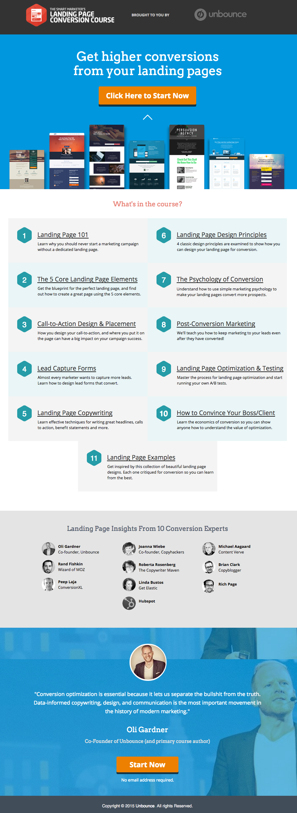
 This has all of the right elements you need to execute the perfect landing page: it’s got just the right amount of text (which is really helpful for boosting SEO), and it’s packaged in a way that it’s not too heavy or intimidating for site visitors.
The imagery is great as well, and the placement of the two call-to-action (or CTA) buttons give the visitors just enough cues to sign up for their service. Not too little, but not too much either.
(팁: Unbounce의 랜딩 페이지는 꽤 화려해 보이며, 자신의 랜딩 페이지에 비슷한 스타일을 재현하려고 할 때 약간 막막하게 느껴질 수도 있습니다. 하지만 실제로 PBS를 사용하면 이와 유사하면서도 멋진 페이지를 만들 수 있습니다).
MAKE YOUR OWN LANDING PAGE: If you’re new to design, First Site Guide’s Elements & Principles of Design Cheat Sheet proves to be friendly and reliable for beginners.
Take note though, that Unbounce’s example isn’t the only way you can create your landing page.
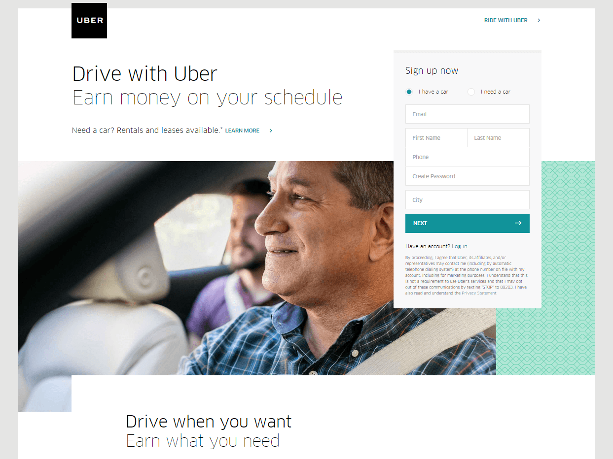
You can always go for a simpler, cleaner look, like Uber’s landing page below:
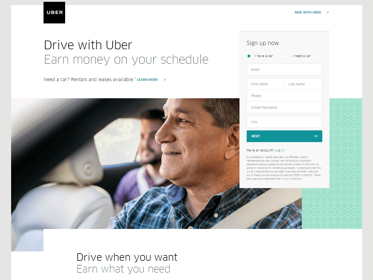 The text’s placement, along with the sign-up forms look crisp and clean. There’s also minimal distractions on this landing page, which prompts its visitors to sign up right away.
MAKE YOUR OWN LANDING PAGE: First Site Guide’s Psychology of Color Cheat Sheet is a huge helA, which can help you balance out the right kind of colors that create a minimal yet classy effect for your landing pages.
You can have more than one
This is a little tricky because you have to learn how to strike a balance, but if you think it’ll help generate more leads, you can actually build more than one landing page. Again, different landing pages cater to different needs.
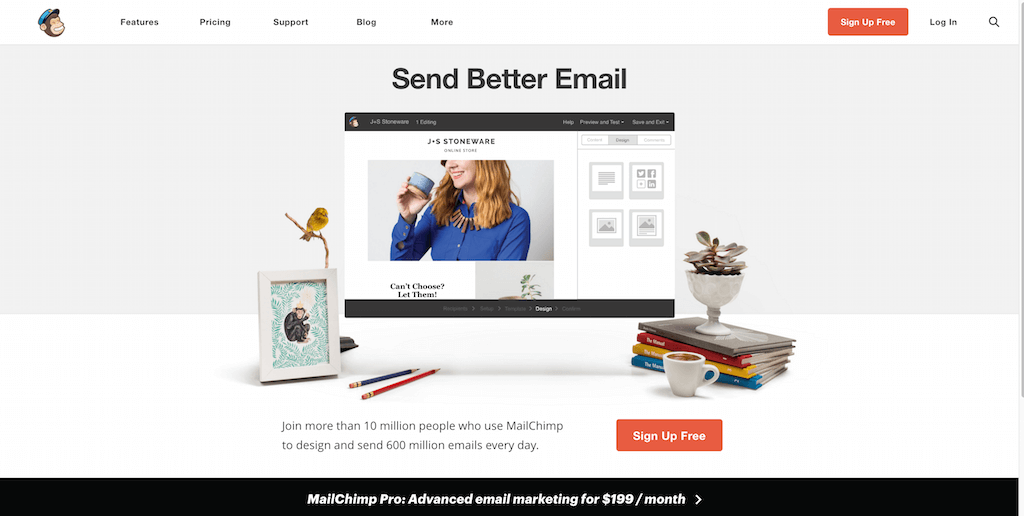
사용자들에게 무료 서비스 가입을 유도하는 MailChimp의 여러 사례 중 하나를 예로 들어보겠습니다:
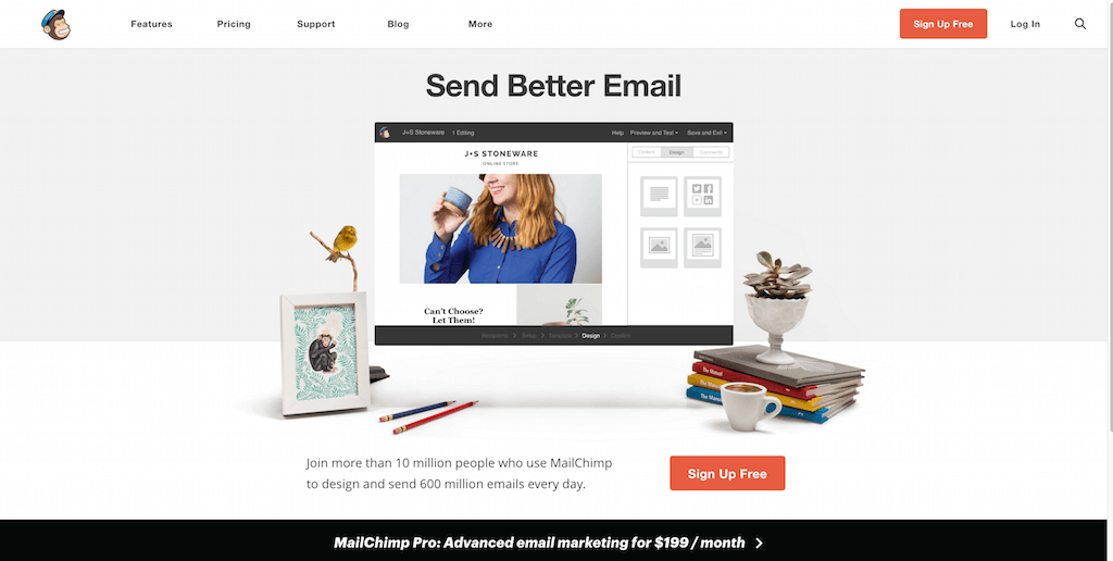 (It worked by the way, as we use MailChimp for our newsletter service, too).
Take note of the text – it’s straight to the point, and addresses the target’s audience needs in just three simple, albeit powerful words; enough to catch the visitor’s attention, and convert into a lead.
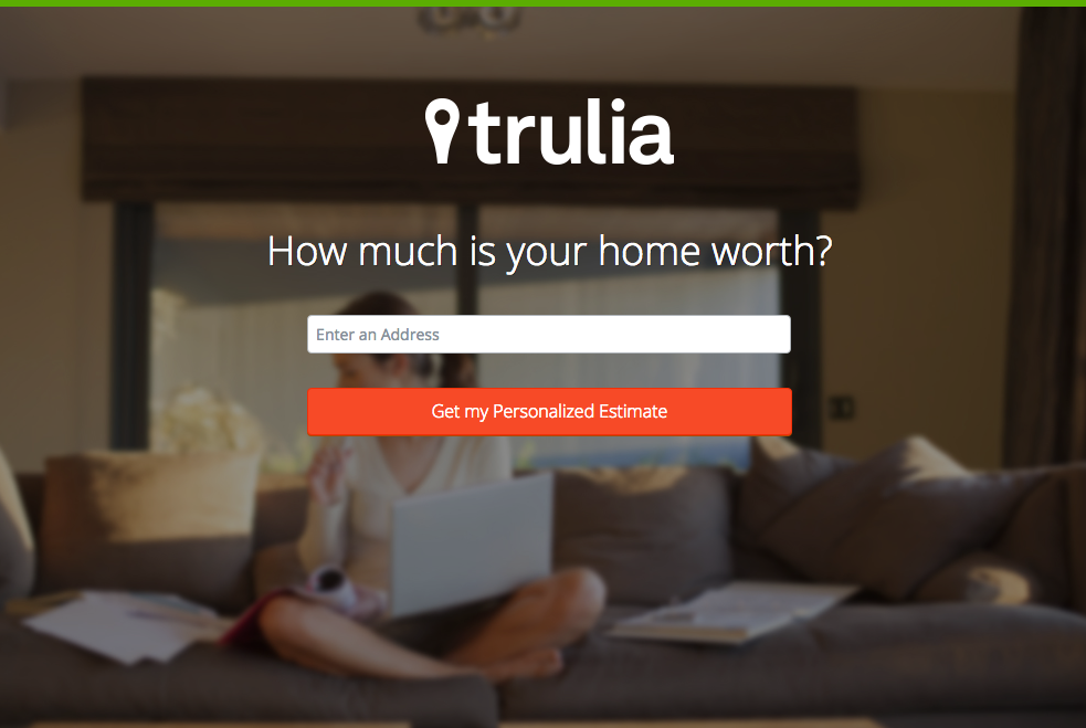
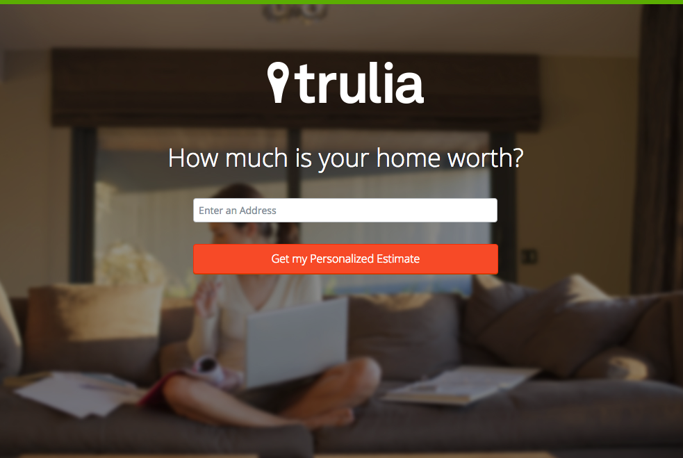 Here’s another from Truila, which helps its users get an estimate of how much their houses are worth.
 Unlike the previous examples, Truilia doesn’t offer a catch to their customers in this particular landing page. They simply offer to give the visitor a chance to test out their service.
Again, take note of the copy: no fluff, and it gets straight to the point.
Usually, landing pages like these direct you towards another, one that has more information about what the website is offering. This is also a great technique used to capture more leads.
MAKE YOUR OWN LANDING PAGE: Did you know that “Under Construction” pages count as landing pages, too? This blog post by First Site Guide teaches you how to make one.
More doesn’t always mean merrier
It’s important to remember that the problem isn’t the lack of landing pages per se – but the lack of well-created, successful landing pages.
어떤 웹사이트든 여러 개를 만들 수는 있지만, 그렇다고 해서 자동으로 성공적인 리드 전환이 일어나는 것은 아닙니다.
다시 말하지만, 랜딩 페이지 작업은 매우 까다롭습니다. 따라서 그 이면에 숨겨진 기술과 과학을 연구하는 데 투자할 여유가 있다면 적극 추천합니다.
Here are some websites that’ll be really helpful in your journey to creating landing pages
Landing Folio
http://www.landingfolio.com/
 Landing Folio is an extensive gallery that’s really useful when it comes to getting inspiration for landing page designs. They also offer some kick-ass, friendly courses on how to perfect the art of creating landing pages. Plus, all the designs are pretty and fun to look at as well.
First Site Guide
http://firstsiteguide.com
First Site Guide는 인터넷에서 가장 유용한 리소스를 갖춘 웹사이트 중 하나로, 특히 웹을 처음 접하고 이를 통해 무언가를 이루고자 할 때 유용합니다. 콘텐츠 제작 도구 목록부터 제품 리뷰 및 비교, 인포그래픽, 친절한 동영상 튜토리얼 등에 이르는 다양한 리소스를 제공합니다. 첫 랜딩 페이지를 만들기 시작했다면 분명 큰 도움이 될 것입니다.

Conversion Lab
http://conversionlab.no/
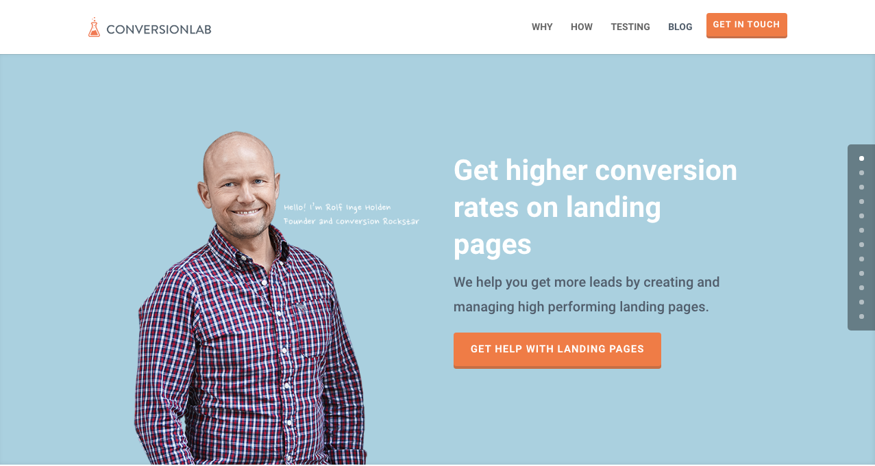
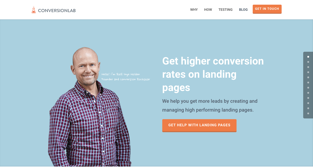 Apart from the fact that their own landing page is pretty well-crafted itself, Conversion Lab does exactly what they say they do: they help you get conversions. They also help out with testing too, which is crucial to any website that’s trying to raise their conversion rates.
Hubspot
https://blog.hubspot.com/marketing
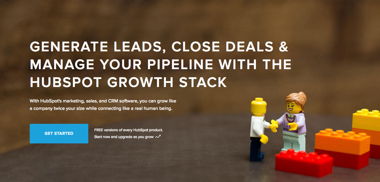
Hubspot is an all-around help site that lends you a hand in almost anything and everything related to online marketing.
사업 계획서 작성부터 콘텐츠 및 인바운드 마케팅, 그리고 물론 랜딩 페이지에 이르기까지 다양한 아티클을 갖추고 있습니다. 디지털 마케팅 영역을 처음 접하는 모든 이들에게 훌륭한 리소스입니다.
결론
랜딩 페이지는 특히 어떤 종류의 비즈니스든 이제 막 시작하는 단계라면 정말 까다로울 수 있습니다.
하지만 랜딩 페이지가 어떻게 작동하고 어떻게 만드는지 배우는 데 시간을 투자할 가치가 있다는 점을 기억하세요. 왜일까요? 랜딩 페이지는 리드를 창출하고, 리드는 수익을 창출하기 때문입니다.
Take note that digital marketing trends are changing rapidly. You have to keep with these trends in order for your business to not only survive, but to also thrive.
Do you have any other tips or resources that you’d like to share with us? Comment below, or send us an email at [email protected] if you’d like to get featured as a resource in one of our articles.
즐거운 페이지 제작이 되시길 바랍니다!

 If you’re using Page Builder Sandwich along with Wordfence Security, there’s a chance you might have encountered something called a 403 error.
 So what does this mean? Is Sandwich safe to use? Is WordFence bad? And does the 403 error warrant bad points for both Wordfence and Page Builder Sandwich?


 이런 상황을 상상해 보세요. 드디어 당신의 첫 워드프레스 웹사이트가 완성되어 정상적으로 운영되고 있습니다. 몇 달 만에 이렇게 큰 성취감을 느껴본 적이 없을 정도입니다. 고생한 스스로를 칭찬하고, 그 결실을 맺을 수 있도록 도와준 사람들도 축하를 건넵니다. 필요한 플러그인을 설치하고, 웹사이트의 미래에 대한 더 큰 계획을 세우기 시작합니다. 앞날은 밝아 보이고 모든 것이 순조롭게 흘러갑니다.

 Plugins of the same category, but with respective features, are developed and enhanced every day. This gave birth to the variety of WordPress-powered websites – and later on, websites catering to several functions. For instance, there is a number of plugins which enables a developer and/or user to create, schedule, invite an interested person to an event.

 Recent posts were made to highlight the






 Page Builder Sandwich의 최신 기능인


